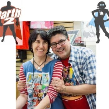
About
About 


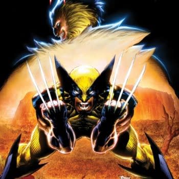
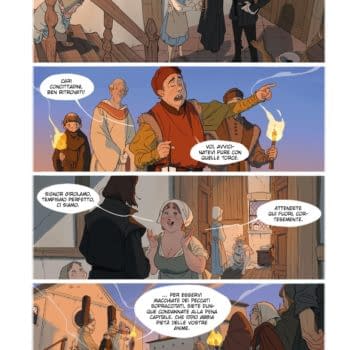
Chris Claremont takes Wolverine back To Australia for the character's 50th birthday - and probably where he should have stayed.
Posted in: Recent Updates | Tagged:
Pond Life by Martin Conaghan #2 – Ulterior Motif
 Last week, I discussed the importance of getting an endorsement for your comic or graphic novel, so this week I want to concentrate on another aspect of small press and indie comics that is often badly overlooked in favour of the material on the inside: the logo.
The logo is one of the most important selling points of your comic, and can make all the difference when attracting sales, particularly so in the case of solicitation brochures via distributors like Diamond or the casual browser at a convention or your local comic book store, where you have about a tenth of a second to make someone want to pick up your title.
I'm no designer, but I know the difference between a good cover and a bad one, and I'm more likely to pick up a title that has good typography on the front cover than something that looks as though it's been scrawled by a five-year-old or cobbled together with the free fonts included with Microsoft's Word for Windows.
As with all good things, it's easy to get it wrong, but immensely difficult to get it right. Too simple, and no-one will notice or your comic will look like an estate agent's property schedule; too fancy, and it'll look cluttered and unappealing. However, you only have to take a look around at some of the big-selling titles from popular publishers like Marvel, DC, Dark Horse, Image and Avatar for examples of top-notch logos that not only reflect the style of the interior artwork, but seamlessly compliment the cover art and overall themes of the titles. For example, The Flash logo has always had a dynamic, speed-line influenced inertia to it, while Iron Man is a solid, metallic typeface that almost feels like it has been hewn from Platinum; Spawn has a Gothic slant to it, while Scalped has a jarring effect – resembling a wood carving – and can easily be placed anywhere on the front page in any orientation without getting in the way of the cover art.
Of course, the big publishers usually spare no expense when building a brand, often utilising the immense talents of creators like Jock, HelloMuller and Rian Hughes – individuals who not only understand the complexities of design and typography, but who are invariably fine comic book artists or designers in their own right.
But it needn't be an expensive business sourcing the right logo to compliment your cover art; when I was producing Burke & Hare, I approached Rian Hughes at Device Fonts and gave him an idea of our budget – he kindly accepted to not only create the logo, but the entire cover, back cover, half cover, and he made suggestions for interior fonts and general layout of text. Not that I'm suggesting you should bombard Mr Hughes or HelloMuller with requests to make your book leap from the shelves, but it sometimes doesn't do any harm to ask – and if the money is right, they have the time, or the project interests them, you never know. All it takes is some polite, professional courtesy – and a gracious response when the answer is a refusal.
Other avenues to consider are local colleges and universities that offer courses in design; every educational establishment in the country is bursting at the seams with young artists and designers desperate to see their work on the shelves. All you have to do is ask, and if you can't afford to pay up front, it's often just as appealing for newbies to have something fresh to add to their portfolio. You just have to sell it to them. You could even make it a competition.
Of course, if you have some spare cash in your back pocket, you might want to part with it as a token of thanks for the efforts of your logo designer; personally, given the choice between 10 free complimentary comics or £40 for a few beers at the union bar… well, you get where I'm going.
It just pains me to wander around the exhibitor halls of the UK convention circuit only to find myself wandering past so many uninspiring covers produced by talented people whose speciality is not typography or logo design, but the interior art on their own book, when all it takes is a quick scan around the pages of ComicSpace or DeviantArt and a few kindly-worded emails to ask for some help.
However, before you do, make sure you have an idea of what you want from a designer, and do some homework if you're not quite sure – there is nothing worse than dealing with someone who constantly changes their mind or who simply doesn't have a clue what they want.
——————————————–
Martin Conaghan is a journalist and broadcaster at the BBC and a freelance comic book writer. The views expressed here are his own. He is also the editor of Insomnia Publications' Vigil line of historical graphic novels and the writer of Burke & Hare.
Are you a small press publisher, writer or artist? Do you have something you think might be worthy of mention on Pond Life? If so, tell Martin about it at pondlife@copydesk.co.uk
You can request to follow Martin at Facebook or Twitter.
Enjoyed this? Please share on social media!
Stay up-to-date and support the site by following Bleeding Cool on Google News today!