Posted in: Comics, DC Comics, Review | Tagged: dc, Doomsday Clock, Watchmen
REVIEW: Doomsday Clock #12 — "Selling Its Brand And Not Its Ideas"
(DC Comics, creative team: Geoff Johns, Gary Frank, Brad Anderson, Rob Leigh)
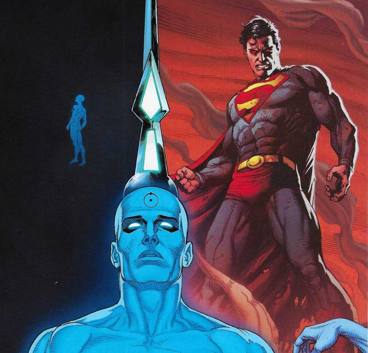
Imaging coming up with everything that went right about Dr. Manhattan's depictions in the HBO series and then smashing yourself in the face with a ball peen hammer. If you did so, you might come up with something as tedious and uninspired as this exhausting issue, positing a DC universe so fragile that any properly motivated time traveler could topple it in a free afternoon. When you add in the anomalies of this turn of events apparently being Ozymandias' plan all along (okay), this goes from "mess" to michegas very, very quickly. Like many latter-day Saturday Night Live skits, this has a great deal of fidelity to the visual stylings of the original series, and has many visual moments that are indeed striking. The ideas under those moments, however, are creatively bereft of new concepts or innovation, spouting talking points from yesteryear, selling its brand and not its ideas. Ironically, the most impotent character of all herein is Superman himself, robbed of agency and stuck in a cycle of repetition and redefinition on the terms of the times. Philosophically, this determinist perspective makes a lot of what these brightly costumes individuals do seem pretty pointless and that, kids, that ain't entertainment. It's surrender. RATING: NO. JUST … NO.
written by GEOFF JOHNS
art and covers by GARY FRANK
This is it! The final showdown between Dr. Manhattan and Superman shakes up the DC Universe to its very core! But can even the Man of Steel walk out from the shadow of Manhattan?<


