About
About 


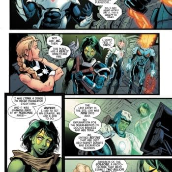
By Spencer Ellsworth Nick Roche got his start as a comics artist at IDW Publishing, illustrating and soon writing the company’s incarnation of
Posted in: Comics, Recent Updates | Tagged: ales kot, Comics, image comics, Tom Muller, wolf
'I'd love To See Invention Seeping Into Comics' – Tom Muller On Designing For Wolf, Material, Zero, Valiant, And Vertigo
By Jason Karlson
The old adage 'never judge a book by it's cover' really doesn't work in the world of comics. Up there on the shelves among hundreds of titles vying for our attention, it's the first port of call and important visual real estate for informing a potential reader and giving them a strong sense of just what the comic is all about. It's surprising then that the role a designer plays in the overall aesthetic of a comic is quite often overlooked when it comes to talking about and appreciating them.
It's not just the covers but the insides too, with more companies employing the particular talents of designers to give each of their titles it's own distinct look and feel, unifying it together. Although it's not limited to the two companies, Image and Boom! are particularly notable in just how many beautiful or eye catching books have been on comic book shops shelves in the last few years, in no small part to work of designs and design teams such as Comicraft on Kurt Busiek and Benjamin Dewey's Autumnlands, Stephanie Gonzaga's brilliant work on the Adventure Time Mathematical Editions or Fonografiks whose work graces the pages of Saga and They're Not Like Us and gives those books their unique, elegant and instantly recognisable looks.
 It's with all this in mind along with Ales Kot and Matt Taylor's new supernatural Image comic, Wolf debuting last week, that I spoke with the designer behind the title, Tom Muller (via email) to discuss his work on Wolf and Material, working with writer Ales Kot, and his particular approach to graphic design within comics.
Jason Karlson: You've previously worked with Ales Kot on his series Zero. What is it that drew you back to working with Kot again?
Tom Muller: We never stopped working together ever since we started working on Zero. All the series I'm designing with Ales, The Surface, Material, and now Wolf, gestated long before Zero ended, so we never stopped collaborating. We've got a great rapport and friendship and Ales' series allow me to experiment with the medium, which is one of the reasons why we keep collaborating.
JK: Wolf is set in LA with Kot citing it as a definite influence behind the tone of the comic, did that setting have any impact upon the design work on the comic? If so in what ways?
TM: I think when Ales first started discussing Wolf and the setting, and we were discussing visual cues, ranging from David Lynch, Trent Reznor, psychedelia, Witch house, and the neon underbelly of L.A., and obviously the description of the central characters. The idea came to me of designing the logo as something that looked like it was painted on a wall, like a tag. It felt that fits the character and the story well.
 JK: What prompted the idea behind the fantastic internal design with the graffiti, spread over the front and back inside covers?
TM: Since the first issue was double sized with 58 pages of story cover to cover, I felt it'd be an appropriate way to launch a series by going unapologetically cinematic and big with the opening and the inside covers.
JK: How does working on the design of Material differ from your approach on Zero? Which have you enjoyed working on the most, or are most proud of?
TM: The main difference between Zero and Material is that I'm the sole cover artist/designer on Material, instead of collaborating with an artist and remixing their art on the covers for Zero.
From the start we wanted the covers for Material to look much more like magazine covers, something you could envision sitting on a shelf between Wired, 032C, Businessweek, Makeshift and Riposten. We drew inspiration from 80s art publications like ZG. The intent with Material is much more adult and refined, in that we want to reach an audience beyond the traditional comic landscape.
I think it's too early to say which series gives me the most pride or enjoyment – both are very different in approach – but for what it's worth, I'm very happy we ended up doing Zero the way we did, going against the grain and showing you can push design further than what you usually see in comics.
 [Material #1 before]
JK: Does Ales have much input on work you're producing for Material or is it left up to you? What about the new series Wolf?
TM: Of course. Ales will always brief me on what the covers should reflect. Sometimes we discuss this at length, or he'll email me a one sentence description or a single keyword, which I then interpret.
With Wolf my involvement has been quite minimal compared to Zero and Material, because we're running no ads or editorial/design content; and Matt Taylor's covers are already so iconic I feel I don't need to add more than what's needed. And issues three and four Matt has started to incorporate the logo into his art, taking some work off my shoulders so all I need to do is add the rest of the cover elements like credits and indicia. Generally speaking, with all the books I'm designing for Ales I'm left pretty much to my own devices, but of course Ales will always have input to make sure we're all working towards the same goal.
JK: How do you think the role of designer is seen in the comics industry in general, do you think it's an area that is overlooked?
TM: As a designer I'm often equally interested in discovering who designed a particular logo (or series) as who the artist, writer, colorist and letterer are. More often than not designers aren't credited on series, even if they make a significant contribution which is very different from the rest of the publishing and design industry where designers and design agencies are usually credited, and often it even boosts the visibility and selling power if a client or brand can boast they collaborated with a certain designer or studio; and I'd love to see that happen more in comics. When a new high profile series (re)launches with a brand new logo I think it's fair to give a nod to the designer of that logo or series and to be fair, I do see this happen more and more, especially within creator-owned comics, and smaller independent publishers.
 [Material #1 after]
JK: Previously in talking about how the design for issue one evolve, you mentioned removing a picture from Ferguson. Was this because it was too soon after the event to be used in such a way, or was it purely for design reasons?
TM: The Material #1 cover had originally the very recognisable "Seasons Greetings" photo that became a symbol of the Ferguson riots. We had chosen that photo because it's obviously a very powerful image, and it reflects one of the storylines in the series. But in this case that photo wasn't in the public domain (i.e. free to use), so we decided to alter the cover in such a way that we kept the energy of that image, without actually explicitly using it.
JK: Has there been any theme so far from cover to cover on Material that draws them all together or is in a case of working on them on an issue to issue basis?
TM: There is an underlying theme. Ales has spoken many times on how Material is about the current state of America, or at least talks about certain aspects of it which is reflected in the single covers. The cover for the first collection released in September, which is still in development, will unify those seemingly different strands.
JK: How often is it that you find a cover you've created and is then used for previews, being changed before the final comic is released? Are you a person who can always see things that you would do differently after the fact, or happier to move onto something new?
TM: It happens a lot that between the solicitation in Previews and the actual print date I will tweak or redesign a cover. As you know when comics are solicited in Previews chances are that the actual comic hasn't even been drawn fully yet or even written, which means I'm creating the covers in a vacuum – and sometimes at very tight deadlines. The three month (actually more like 2.5 months) gives me the time to revisit and fine-tune the cover and work on the design of the issue. Sometimes when I see the color art come in I'll tweak the cover accordingly to make sure it connects with the story. One example was the cover for Zero #8, which went from something very abstract and 'spacey' to a full military camouflage pattern after I read the actual script and saw the art and colours for the issue.
In the case of Material I had designed the covers for issues one to three before we even solicited the first issue, and those designs had a very minimal masthead design (set in Franklin Gothic Condensed). But as we came closer to the publication date of Material issue one I felt that the masthead and logo weren't strong enough. I was still aiming to keep the design very iconic and clean, so I switched to a combination of Neue Haas Grotesk Display and Tiempos Headline. These decisions tend to happen from time to time in that three month gap.
 [Zero #8 before]
JK: The majority of Kot's comics you have worked on have had a political aspect to them, is there something about that area of comics or the subject matter that attracts you to them?
TM: From a purely creative point of view I feel that the political / philosophical / real world aspect of the series gives you much more possibilities to work with in that you're not bound by the genre restrictions of comics.
JK: Do you feel any more restricted with Wolf being set in a more fantasy horror environment?
TM: No, not at all. I have no problem and do enjoy switching between genres. Funnily enough, I designed both the Wolf and Wolf Moon (Vertigo Comics) logos at the same time, using similar techniques.
JK: Kot has mentioned in interviews that he hopes Material will continue for a long time, much in the way Cerebus did for instance. Do you see yourself sticking around for the long haul or foresee a time when another designer might take over?
TM: I hope so, yes. Being able to work on long-running projects gives me the opportunity to evolve, and allows me, just like any other creative in the industry to build a body of work.
JK: Work on both Material and Zero has seen yourself taking on a more central role, rather than working around an artist's image, do you enjoy this switching of the dynamic?
TM: If you look at any periodical or magazine publication, you'll note that it will always be the creative directors and designers along with editorial oversight of course, who determine the design of the magazine (physical and digital) – and its covers. They will commission photographers, illustrators and image makers to help them create their vision of what the cover should be. I approach comics the same way where possible, especially when I'm working on creator-owned books where I have a say in the creative process. When I'm designing covers, the artwork becomes another element of what makes the cover, along with the masthead, credits, logos etc. Comics retailing has evolved so that you don't need to limit yourself to the top third of the cover to get all your brand messaging across. I'm also a firm believer of being flexible with your branding and cover design in service of the story; which is something I did with Zero.
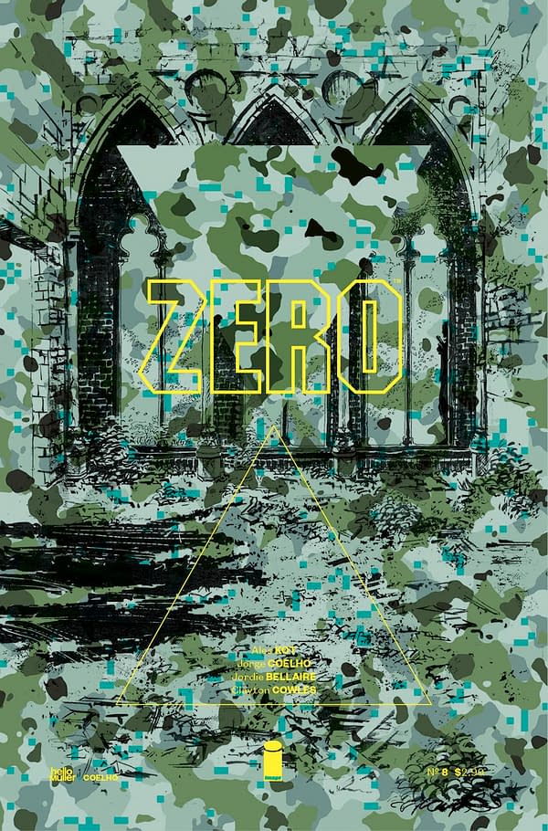 [Zero #8 after]
JK: With this increase of the emphasis of design on a book, do you find yourself having to explain exactly what you do in terms of your comics work more or less to people?
TM: It depends. Sometimes when I tell people I've designed a cover or an issue they interpret it as if I'm also responsible for the art (granted, in the case of Material I am) and I end up explaining the isolated elements and what the design actually entails. I think this is also due in part to comics reporting, when people discuss cover art (minus all the cover design elements), they often mention it's a piece of great "cover design" which is misleading in many ways. I think it's important to realise that every cover out there is put together by a designer and/or art director, either in-house at a publisher, or independently.
JK: A lot of readers follow writers or artists onto different titles rather than characters, do you ever foresee a time in the future where people might be attracted to a title because of the designer rather than the artist or writer?
TM: Possibly. Personally I'll buy a series purely for the design. Even though Nowhere Men is a great series by Eric Stephenson and Nate Bellegarde, the main reason I bought the series is because of the design by Fonografiks (Steven Finch). I've had some readers very kindly tell me that my work plays a factor in them buying a series I'm working on — which I'm incredibly thankful for, and keeps me pushing harder.
JK: Is there any title at the moment that you would like to work on, and if so what do you think you could bring to that comic in terms of the design of the book?
TM: Apart from the books I'm working on at the moment, Zero which I just wrapped up the Vol. 4 design, Material, Wolf, The Surface, and Drifter, I'm working on three other creator-owned series which will hopefully be announced in the near future, and both DC/Vertigo Comics and Valiant Entertainment keep me busy with logo designs and cover art work.
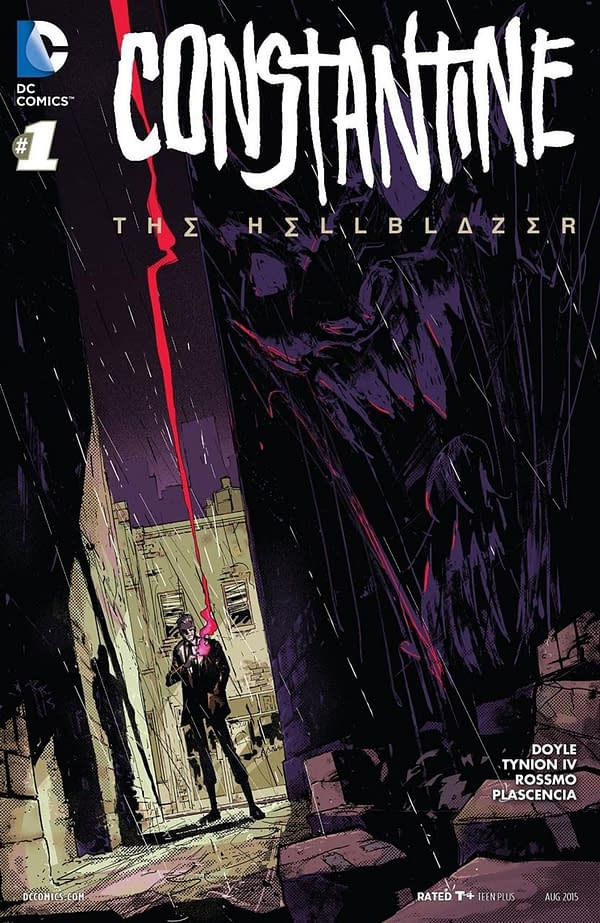
At Valiant particularly I've been involved in both logo designs (Imperium) and also steering the cover designs and art (Valiant Next variants, Book of Death and Divinity) with the editorial team; whilst at DC and Vertigo I've been responsible recently for the new Constantine logo and the upcoming Unfollow and Survivors' Club amongst others
As far as if there's any specific title or book I'd like to work on, there's nothing in specific that immediately comes to mind, but being active in large scale brand identity and digital projects outside of comics I'd love to be able to work on (re)branding a publisher across the line, from brand ID, and tone of voice to marketing applications, trade dress and digital platforms.
 JK: In the past you've had a blog, pointing on bad design work or work that simply uses a lot of boring and lazy clichés, do you feel it's an important part of working within the comics industry to keep challenging yours and other peoples work. Have you ever felt bad criticizing another designers work or come under fire for doing so?
TM: Yes I did run that blog, but I stopped updating it purely because I didn't have the time to do it properly anymore. I'd browse weekly releases and build small case studies around every cover I'd review, which took up too much time in the end – especially because I wanted to articulate and rationalise why I'd thought a design did or didn't work, rather than being a dismissive troll. I think design criticism is an important aspect of any design, and its by critical analysis you can grow and learn. So no, I don't feel bad about criticising or calling out bad or lazy design executions; and no, I haven't come under fire for doing so, because, like I just said, I don't do it in gratuitous manner.
 JK: You've also worked on a lot of magazines (Wired for instance) do you think that comics have been a lot slower to adapt and change the idea of what they can look like compared magazines? Do you have a preference on which you like to work on?
TM: Yes, I do think that in many ways comics operate at a different speed compared to the wider magazine industry. I've pointed this out many times before. I still believe comics can be much more reactive and inventive as a whole, instead of being stuck in a repeating loop where the overall global design language of comics keeps referring and outdated model of design. I see a lot of invention in publication and print design on almost a daily basis, and I'd love to see some of that invention seeping into comics.
I don't have an outspoken preference between working in magazines or comic, because again both require different approaches, and being able to work across both forces me to not fall into repeat patterns.
 JK: I've seen mentioned somewhere that on DC books you will design the logo which is that usually placed over an image for the cover, whereas with Image and creator owned books you will be involved with the entire project. Which do you prefer, or do you see them as two different areas of the same job?
TM: To be honest, a lot of my recent work with DC and Vertigo has had me involved to a certain degree on how the logo placement would work. On Wolf Moon for example I was able to send Vertigo cover mockups, which they largely adhered to. Similarly, for the upcoming Vertigo series Unfollow I designed a cover framing device and logo placement. Usually, especially with new series, the cover art is either in development or completely non-existent because I'm designing the logo so far in advance. This means that once I have finished my part and handed over the logo to the design team at DC they will build the cover and place the logo and cover elements. It's not an ideal process, which is emblematic of the industry as a whole and the serialised nature of its publications,
The bonus of working on creator owned books is that I have more control and involvement over the cover design, being able to talk to the creative team directly and yes, I do see the logo design and cover layout as parts of the same process.
 JK: Looking back on your work I realised I'd seen more of it then I thought. Designers, especially at Image seem to be getting a lot more credit for their work on comics such as being listed more prominently and on covers. Do you mind being more prominent or prefer to work more in the background?
TM: If you work on a comic, you should be credited for it and paid, obviously. End of story.
We know only two things for certain of Jason Karlson; that he was born on the wagon of a traveling show to Latverian parents, and that tales of his origins are wholely fictional. His writing style is pithy and insightful, with hints of oak and red berry, finished with earthy tones and somber notes. If he were to describe himself in a single word it would likely be self depricating. He occasionally tweets over at @marfedfolf
Enjoyed this? Please share on social media!
Stay up-to-date and support the site by following Bleeding Cool on Google News today!