Posted in: Comics | Tagged: collider, Comics, dc, nathan fox, vertigo
In The Pink With Nathan Fox's Collider Covers
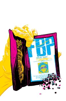
When the covers for the new Vertigo Defy initiative on Collider and Trillium were revealed at Wondercon this spring, the first thing people noticed about Collider was PINK. Something between dayglo and neon, really, but offset by black and yellow, it couldn't have popped more. It was a strong, evocative statement for the series. Issue #1 launched with the standard cover that had been revealed, and cover art for issues numbers 2, 3, 4, have been posted online by Vertigo with issue synopses for all the ogle and notice that the dayglo isn't going anywhere. It's becoming a little more varied, in fact, though the pink themes are likely to continue in the interior of the comic also. Collider, created by Simon Oliver and Robbie Rodriguez, colored by Rico Renzi, couldn't be in better hands for covers than Nathan Fox.
Fox's history in comic art is varied and has its own unusual features, though he shares some of them with a rising generation of comic artists. He's highly trained through both undergraduate and graduate programs in art, though it seems to be his time at the School of Visual Arts in New York that really helped him turn a corner on mainstream comic and illustration success. His work has appeared not only as a penciller and inker on DMZ, but in gallery shows, and spread widely across big name periodicals. He straddles fine art and comic art without de-emphasizing his comic work. He took up a teaching position at SVA starting in 2013 as Chair of the MFA in the Visual Narrative Department, joining illustrious colleagues like Matt Madden. Given the opportunity to pursue cover art on a major new series so visually distinctive seems to have given Fox a prime environment to explore his leanings toward the psychedelic. If you check out his in-progress website, you'll find it's steeped in 3D, striking, and decidedly different from many artist's websites in design with "pop ups" planned on the home page. He's an unusual artist, and likely to continue to be so, conjuring highly original impressions in his work.
Taking a look at covers for Collider #1, #3, and #4 (the art for #2 seems to be mysteriously missing from Vertigo's website now and difficult to locate online), you can pick out a few key features that are enough to make you hope that he continues as the cover artist for the series. Collider is a book about intense, unpredictable and havoc-wreaking gravity shifts occurring on Earth, and the sudden game-changing shift in the problem to possible multi-dimensional incursion. One of the series' tag-lines is "…the impossible is always possible". Fox has a tall order to fill to suggest these elastic, imaginative terms in his cover art.
Issue #1 fairly openly states themes dealing with gravity by depicting a be-goggled character seemingly hanging upside down, crowding out the pink space of the cover. But the figure's face is also pink, and his goggles emit yellow light, suggesting that an unusual lighting is surrounding everything. Fox's sketchily painted lines on the headset and jumpsuit of the figure add to the over-lit effect. There's a feeling of something pervasive and overwhelming in the lighting, and for Collider, that's all about color that burns itself into your memory. Fox knows how to render things unfamiliar, perfect for a comic where things are designed to throw you for a loop in sci-fi terms.


All the revealed covers (though I haven't seen #2) work in pink, yellow, white, and black, with a turquoise/sky blue added in progression. Many of these are colors that also pop up in the book, particularly during key moments, though the color scheme generally tends to be more "realistic" in tone. Maybe Fox had no choice in these colors, and they were dictated by a more general design sense for the series, but that becomes an unlikely assumption when you look at some of Fox's other compositions. The most telling seems to be a project he did for The Fox Is Black (.com), formerly known as Kitsune Noir in 2008. The site is dedicated to art and design in contemporary life and culture and its "weekly Wednesday" free art specifically designed as wallpaper for digital screens featured Fox's work. The art he provided is washed in psychedelic colors, including pink and orange-yellow with strong emphasis. It's a window onto Fox's artistic mindset to see his work outside of comics but so heavily engaged in pop art. A hot rod "floating", a human figure with dayglo skin, a space suffused with color: come on, now. This is the person who should be doing the covers for Collider hands down. It's all there. In fact, you can even download his screensaver for free at the site, if you're a fan of his riddle-like color-drenched modes of composition. And lets hope we get many more Collider covers like these.
Hannah Means-Shannon is a regular contributor at Bleeding Cool, writes and blogs about comics for TRIP CITY and Sequart.org, and is currently working on books about Neil Gaiman and Alan Moore for Sequart. She is @hannahmenzies on Twitter and hannahmenziesblog on WordPress. Find her bio here.


