About
About 


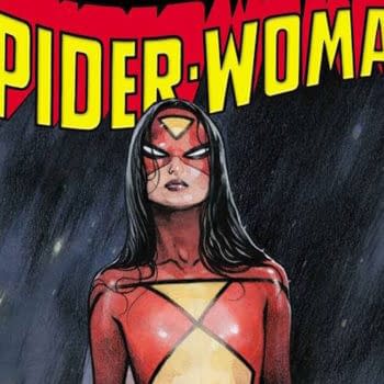
Jessica Drew, Spider-Woman, is returning in September by Dan Watters and Andrea Broccardo, from Marvel Comics
Posted in: Comics | Tagged: colouring, eisners
Countdown To The Eisners – Best Colouring
By Cameron Hatheway
While the majority of us are familiar with the basic primary and secondary colors, the colorists of the industry operate on a color wheel of epic proportions. In their secret illuminati meetings they discuss colors that the rest of us haven't even seen yet, nor could fathom the concept of their existence. A black and white comic page is a coloring book on crack in their eyes, and they're never afraid to color outside the lines. I tried being a colorist once, but apparently there's more to it than using the paint bucket tool in PS Paint. Today I'll be focusing on the Best Coloring category. If you need a reminder of what's been nominated, you can find the entire list right here, and see what I chose last time right here.
Keep in mind I cannot vote for who wins (nor can you, probably), as per the rules. However, that's not keeping me from being vocal regardless!
Who is not eligible to vote?
- Comics press or reviewers (unless they are nominees)
- Non-creative publisher staff members (PR, marketing, assistants, etc.)
- Fans
Before I get back to coloring-in the Essential Marvels in crayon so I can be eligible for next year, let the games begin!
Best Coloring
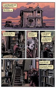
Charles Burns, The Hive (Pantheon)
When Burns colors, his coloring is crisp and pure; shading or different colors never occupy the same area for every color has its place. His coloring also helps the thick lines of the characters and images pop that much more, like a coloring book almost. It appears to be a very pristine process, and Burns uses the colors to fit the moods wonderfully.
Colleen Coover, Bandette (Monkeybrain)
Coover uses watercolors in Bandette, and the execution is flawless. Her technique even gives the comic a European feel, which is appropriate since the series takes place in France. The softer lines and colors give it a calmer tone, but can turn on a dime when the action revs up; car chases, bullets flying, bombs exploding, etc. The coloring is exceedingly remarkable each issue.
Brandon Graham, Multiple Warheads (Image)
With clashes of imagery appropriately comes a clash of colors. Graham kills it on every level of this series; the writing, the art, and now the coloring. Ranging from a few different colors on barren backgrounds to intricate suits of armor with panache, he constantly shifts tones throughout while still maintaining his favorites.
 Dave Stewart, Batwoman (DC); Fatale (Image); BPRD, Conan the Barbarian, Hellboy in Hell, Lobster Johnson, The Massive (Dark Horse)
A man with his fingers in several pies, it feels like almost every other comic book you picked-up in 2012 was colored by Dave Stewart. Filling in every inch of the page with fantastical colors, he was successful at applying different shades to everything and never letting the moment become boring and dull to look at.
Chris Ware, Building Stories (Pantheon)
Ware's coloring is similar to Burns in a way, being consistently ripe and dominant, but it feels that Ware includes a tad more pizazz with his coloring. Whether it's the shadowing to simply the sharp uniformed shapes in the backgrounds, everything is certainly colored that way for a very specific reason. Ware's constantly amazing the senses in every aspect with Building Stories.
 Who I think should win:
Dave Stewart, Batwoman (DC); Fatale (Image); BPRD, Conan the Barbarian, Hellboy in Hell, Lobster Johnson, The Massive (Dark Horse)
Dave Stewart is so good, it's gotten to a point where I can recognize him as the colorist without even having to look at the credits. Not only does he take on massive workloads every year (just look at all the titles he was nominated for), but the quality never diminishes. He experiments, and knows that the same coloring formula doesn't apply to each comic for each one is like a black and white snowflake.
He gives each title, no matter the company, 110% every single time which is why artists want to work with him; he makes their work look that much better.
Who I think could win:
Colleen Coover, Bandette (Monkeybrain)
It's incredibly difficult to spot any white on the pages, for Coover takes immense joy in coloring every single inch with wonderful watercolors. The placement of darker shades produces wrinkles on clothing and layers in hair; all unsullied without the use of lines and inks. I also love that the most radiant character (matches her personality) is Bandette while the rest of the cast and setting are a bit more muted in comparison.
From explosions to skylines, shadows to treetops, Coover did a bang-up job on the coloring throughout. Can't wait to see what she produces in 2013.
Who I think should have been nominated:
Jose Villarrubia, Captain Atom, Frankenstein: Agent of S.H.A.D.E. (DC); Sweet Tooth, Get Jiro! (Vertigo)
It feels like Villarrubia is the Rodney Dangerfield of comic book colorists; he gets no respect! No respect at all!
Who do you think should win / been nominated?
Cameron Hatheway is the host of Cammy's Comic Corner and Arts & Entertainment Editor of the Sonoma State STAR. You can color his nude body with glow in the dark paints on Twitter @CamComicCorner.
Enjoyed this? Please share on social media!
Stay up-to-date and support the site by following Bleeding Cool on Google News today!