About
About 


By Spencer Ellsworth Nick Roche got his start as a comics artist at IDW Publishing, illustrating and soon writing the company’s incarnation of
Posted in: Comics | Tagged: ales kot, Graphic Design, image, Ken Lopez, Tom Muller, trillium, vertigo, Vikings, zero
Designers Changing The Face of Comics – Zero and Trillium's Tom Muller In The Bleeding Cool Interview
In the list of those who receive credit least, or last, for their work on comics, designers may well be at the end of the line. Some readers are more aware of this travesty than others, when the truth is that it's not a competition for who should get the most acclaim for the production of an excellent book; each member of the team should be celebrated. It's just particularly egregious when someone who contributes so much to the feel and experience of a visual medium gets side-lined. Designers usually take this in stride and don't spend their lives dwelling on this imbalance; one reason for this is that their dedication to their craft and their personal satisfaction with the work they produce takes precedence. This, of course, is one of those admirable qualities that makes it even more necessary that we take the time to try to understand exactly what makes their skills so unique and how their choices affect our own reading experience.

In the past, as a reader, I had occasionally noticed the work of a designer or two on omnibus or collected editions of graphic novels, and though recognition for designers even in that format is slim, for single issues it's nearly non-existent. Thankfully, things are changing little by little as comics become recognized as both entertainment and art objects and publishers become more branding-minded in a competitive market. If they want a standout "look" for their book they not only have to go to the true professionals, but they have to give more overt credit to designers, which hopefully will trickle down into fan awareness.
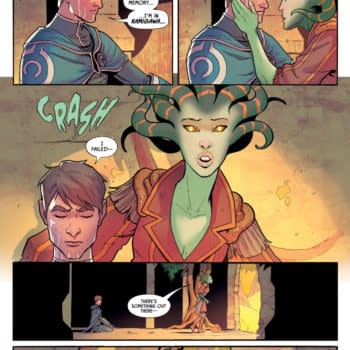
When the Image series Zero launched recently, I saw that there were nine variant covers for the first issue, and that they all had a recognizable unity to their color scheme and production values even though they were each drawn by a different artist. That's not something I had really noticed before; variant covers come in a wide array of styles, usually, and there isn't always a thematic scheme to their interrelationship. I saw on the back covers of the issues that Tom Muller was the designer on the books, but I was uncertain what choices a designer had made to create this specific "look" for Zero, or the technical aspects of that process, so, like many readers, I left my questions unanswered until Muller offered to talk about his work for us here at Bleeding Cool. I was most certainly schooled by these answers provided by Muller, and astonished by the breadth of his work. I had no idea that he had designed the iconic logo for Trillium, and it had passed me by that he was nominated for an Eisner Award for his work on Comic Book Tattoo. I think it's a safe bet that many readers will be in a much better place for celebrating design work in comics after hearing what Muller has to say about his life and work, and viewing these recent process images on his projects.

Hannah Means-Shannon: What's your background when it comes to comics? Were you a comic reader before you became a designer?
Tom Muller: I was. Still am — never grew out of it. You know how it goes. Dad brings back a comic (a Ross Andru Spidey issue with the Rocket Racer) from the news agent (I must've been around 5 or 6 years old), and I was immediately hooked. So, yes comics have always been around me, and not unlike many designers I had ambitions once to become a comic artist, but then got firmly bitten by the design bug, which has taken me on many different career paths, but the "I'd love to work in comics someday" thought was always at the back of my mind, and I somehow managed to get a foot in the door.

HMS: What was the first comics related project you designed? What made you decide to pursue design work in comics alongside other projects?
TM: I got involved with comics in a bit of a roundabout way. Around 12-13 years ago I emailed Ashley Wood to tell him I loved his work and had featured his site on the site of my old local comic shop (Mekanik Strip in Antwerp, Belgium). We started talking and before long I was designing his website, which led to design work on his books — and slowly but surely people in the industry took notice and I started to collaborate with people like Liam Sharp (being the art director for Mam Tor Publishing) and Ivan Brandon (24Seven, Viking), grabbing an Eisner nomination for publication design (for Comic Book Tattoo, with Rantz Hoseley) along the way. And my body of comics work has been growing slowly ever since.
Even though I love working in comics I still feel a bit as an outsider, mainly because its not something I do full time, but one aspect of the wider design work I do — but its an important part nonetheless. I never consciously set out to become a "comic book designer", but it's a hat I love to wear from time to time.

HMS: Design work on comics rarely gets the spotlight it deserves. Do you find yourself having to explain to readers what a designer actually does to produce the finished work they enjoy?
TM: I think we're going through a really good phase in comics at the moment, where publication design is becoming a lot more interesting and I hope that readers start to take notice. I've always said that comics as a medium tends to be very insulated and self-referential — and that often shines through in the cover and logo design you see on the shelves. The same drop shadows, gradients, bevels, bad font choices, etc. I started a blog about this (which hasn't been updated in a while because I've been too busy) where I look at good and bad cover designs and point out why some designs work, and others don't.

When you look at magazine design, you see how publishers are constantly evolving with the times, adopting trends, staying modern and relevant… often doing really cool innovative stuff — and as both a designer and a fan I get a bit frustrated sometimes when I think there are so many untapped possibilities in comics. A comic cover doesn't need to look like every other comic that has come before it, you know? I both love the heritage and craft of logo and type design in comics, but at the same time I feel that if we're still holding up Steranko and Kirby as the high point in graphic experimentation in comics there's something wrong.
You don't always see designers get credited for their work in comics, unlike the creative teams on books. I totally get that it can be irrelevant in some cases, but that nod would be make readers more aware of design, and maybe more interested in that aspect of comics and design in general. I still see people talking about cover design, when in fact they're only looking at isolated cover art. Cover design is everything: art, logo, trade dress, text, etc working as a whole. Disclaimer: this doesn't mean that the art can't be very 'designed' and graphic (not the bloody kind, obviously).
After all, the logo is, and can be, a key part of the brand awareness and recognition of a book (not to mention merchandise possibilities).

HMS: Can you walk us through the time-line of a project you've worked on and explain the major choices that you made along the way?
TM: There's a very big difference between working on creator-owned vs. Corporate (DC, Marvel) comics. I do enjoy both, because they work different creative muscles. Most of the creator owned comics I've worked on are close collaborations and discussions with the creators on coming up with the best suited/coolest/most impactful design for the book. This sometimes takes months, and the bonus is that creator-owned gives you a lot of creative freedom to try and do new things. The timelines on corporate comics is always a lot denser (at least all the titles I've worked on), and usually only focus on logo design (again, YMMV). Regardless of independent comics or not, you can't lose sight that you're designing a commercial product that needs to sell and appeal to a broad spectrum of people.
Speaking of Zero, Ales (Kot) and I started talking back in February about what we could do together and how involved I'd be. Originally I was going to be the sole cover artist/designer, where each cover was going to be a design piece — but as we (Ales, Image and I) looked at the numbers Ales wanted to achieve we ended up going down a slightly more conservative route by utilising black and white illustrations created by each issue's artist, which I incorporate into the covers I design. Usually the designer will have to work around the cover art to add the logo or design elements, but in this case we've flipped the roles where I, as the designer, take the creative lead.

Speaking of which: The Viking covers I designed were all done the "traditional way" where I added the design around Nic Klein's art, but for the collected editions we also worked the other way around, where I'd lay out the cover design, and Nic would adapt his art to it.
Back to Zero then… So along the way the original cover design idea was altered, especially when I had Michael (Walsh's) cover art to work with. Once I had designed the base logo (which is malleable and behaves differently each issue), I spent quite some time sourcing material for the cover visuals. Since issue 1 takes place in the Gaza Strip, I was looking at a lot of aerial drone surveillance footage and maps, distorting imagery to create distorted, glitched lo-res infrared images based on actual Gaza maps. Those textures ended up becoming part of the word mark, and all the covers for the issue were treated this way to give you this super bright distorted glitch look as if someone was looking at it through a scope with the settings all ramped up.

HMS: When you're working with a number of cover artists, how do you manage to make design aspects consistent and recognizable while still giving the book a unified feel?
TM: A considered use of colors is one way of achieving this, and I deliberately want the covers for each individual issue to be seen as a set, unified by the visual theme that fits with the story. The artwork becomes an asset within my designs, rather than the other way around, and the graphic design is what ties the different art styles together so the covers become immediately recognisable from a commercial point of view.

HMS: Can you tell us a little about your work on logos for comics? Do you end up coming up with lots of ideas that you then eliminate to choose the most effective one?
TM: It really depends on a number of factors. You always start with exploring different creative avenues when you respond to a brief. It isn't always a process of elimination though. For Jeff Lemire's Trillium I created a few options and then one was chosen, and I refined the design together with DC Art Director Ken Lopez, whilst for Zero (or Viking, or Comic Book Tattoo) it was more about the evolution of a design and then refining it.

HMS: Do you design graphic novels as well as single issues? Are those different in terms of your development process?
TM: Yes I do, and no, not really. It all falls under publication design. The deliverables might be different, but the path from concept to product is largely the same, even though that end product never looks the same.

HMS: You teach a class on design. Do you think there's a need for more training and mentoring to develop comic design as a field?
TM: I think so, definitely. The class you're referring to is on event branding (you can enroll here) and briefly touches on designing the collateral for the San Diego Comicon launch of Comic Book Tattoo. Design is an often overlooked or badly handled part of making comics, and if comic makers know more about it, then their comics are going to look a lot better. Incidentally, I'm writing an outline for a new class (also on Skillshare) that looks at comic design.

HMS: What's an example of great design in comics or in other media that you particularly revere or keep in mind?
TM: Like I said earlier I think we're currently going through a period where design in comics is getting better and better, both on independent releases and "the big two". One of the highlight in recent memory for me, personally are the covers for The Filth by Segura, Inc. which at the time were really ground-breaking, and David Mazzucchelli's Asterios Polyp was another highlight in comics publication design for me. And I love what Brian Wood brings to his comics. Generally speaking though, I don't look at comics for inspiration when designing them. As for design that's currently floating my boat, I have 30 Years of Swiss Typographic Discourse in the Typografische Monatsblätter TM RSI SGM 1960-90, PASTOE, The Best of Milligan & McCarthy, and Pretty Ugly open. Diversity is key in good design.

HMS: I really can't thank Tom enough for taking the time to give us a window on what's not only a under discussed area of comic production but also a field not often understood by non professionals. If comics seem to have "grown up" in recent years with higher production values and a more cohesive sense of visual message, designers may well be one of the driving factors in changing the face of comics. They present comics in a way that is both approachable and dynamic for new readers and rewarding for those who believe in the visual and narrative power of the medium. Well, to be honest, I can't wait to see what Tom's next project is and this time his name on a cover may even be more likely to sway my purchase decision just as much as any of the other credits given. It probably won't be long before readers start making similar decisions on the basis of comic design, if they aren't already.
Hannah Means-Shannon is senior New York Correspondent at Bleeding Cool, writes and blogs about comics for TRIP CITY and Sequart.org, and is currently working on books about Neil Gaiman and Alan Moore for Sequart. She is @hannahmenzies on Twitter and hannahmenziesblog on WordPress. Find her bio here.
Enjoyed this? Please share on social media!
Stay up-to-date and support the site by following Bleeding Cool on Google News today!