About
About 


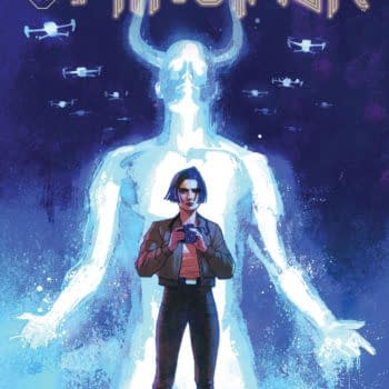
Si Spurrier and Mike Dowling's Minotaur from Ignition Press as a Planetary for the A.I. Age...
Posted in: Comics | Tagged:
The Reading Difference Between Digital and Print in Nightwing #57
When DC Comics began the Walmart Giant-Sized line, they changed their paper stock for the whole line, something Bleeding Cool reported on at the time but which it seemed was ignored by many. Not everyone is as nerdy about paper stock, I guess.
But we reported it as changing from a glossy stock to one that was slightly more newsprint, more matte, more… absorbing. And that colourists may have to change how they colour their comics to accommodate the new paper. Former Senior Art Director Mark Chiarello wrote about this last year.
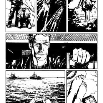
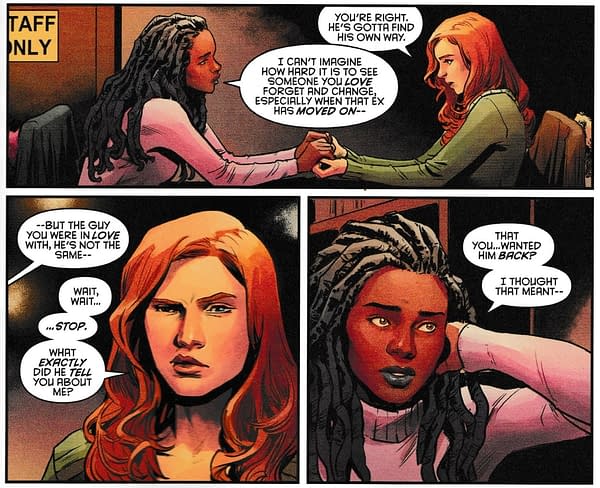
And so it happened. And DC Comics started to look different. But I wanted to highlight one title from last week, that stood out for me in this regard. Nightwing, drawn by Travis Moore with colours by Tamra Bonvillain.
Reading this comic digitally is a very different experience from reading it in print and, it seems to me, that's down to Tamra using the way colour is absorbed by the paper stock to create different emotional tones, that aren't as reflected in the digital version.
Here's a look at a digital splash from this issue,
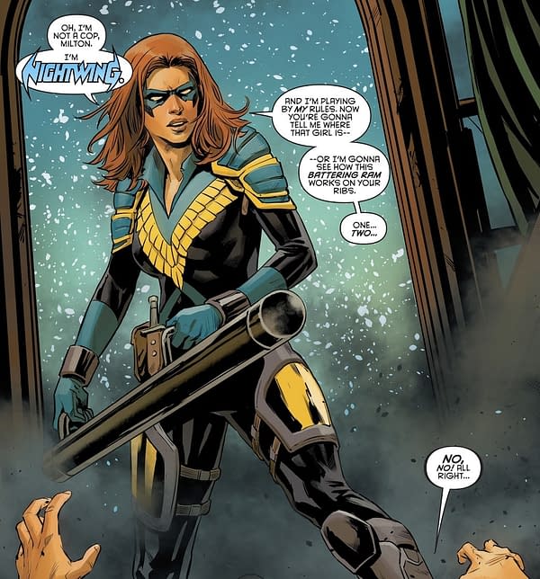
Compared with a scanned version of the printed page.
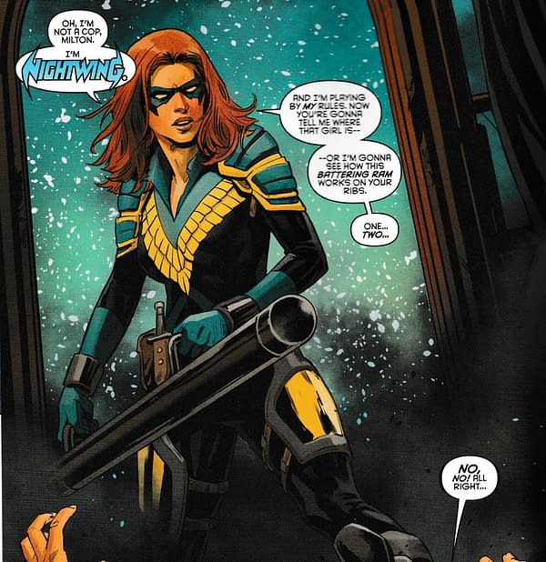
Okay, the colours appear less washed out, the hair is redder, the skin rosier, the colours more pronounced. But this is a minor example. It becomes more pronounced later in the issue… okay, let's try a while page. Digital first, scanned-in print to follow. And, yes, I know the scanning process itself creates a distortion, but I'm trying to make it as representative as I can, at least with the colours.
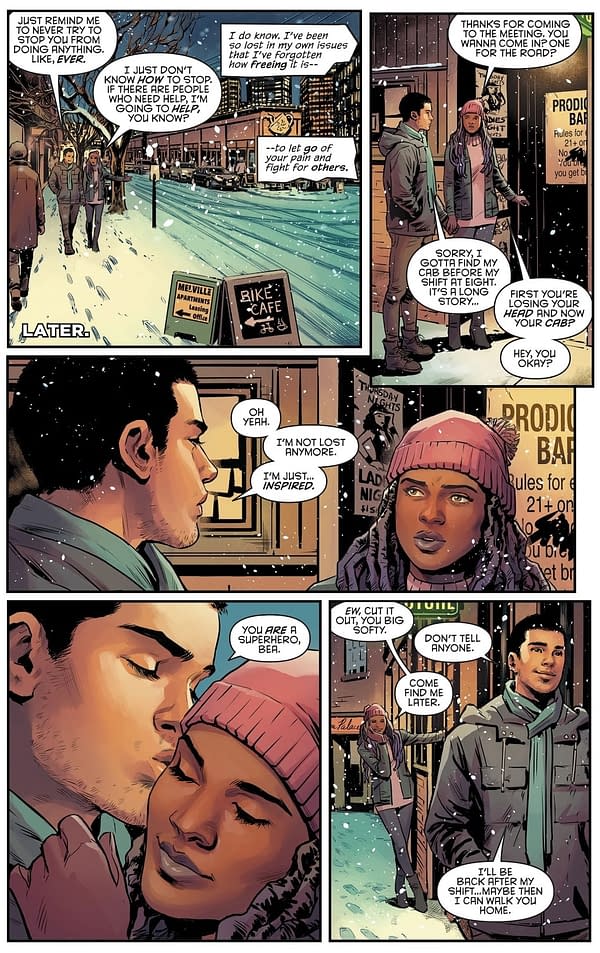
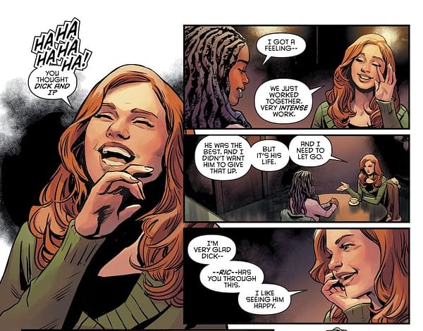
It's a similar difference but it seems, to me at least, that it's a more emotional one. We see the weather as cold and crisps, but redder, rosier faces, give a sensation of warmth within that. In the context of the scene, that might also suggest lust between the characters, expressed or not, the blood rising, cheeks blushing – whether as a result of the cold or of close contact. It feels warmer, emotionally and physically, contrasting with the cold bit of the snow. As a result, to me at least, it's a much more enjoyable – and more beautiful – scene in print than in digital, which seems washed out, colder, less empathetic.
And when red hair enters the equation…
…the difference seems palpable.
It's possible the printed colours are less 'realistic' but they form a richer, more emotional palette to paint from and, in this comic in particular, a far more enjoyable read. The texture beneath the fingers, the warmth of colour on the page, and in an issue where it is less about hitting people hard with brickbats, and more about hitting them with emotional revelation, combined with contrast of temperature of a winter night and a warm inside, reading each version seems like reading a different comic book.
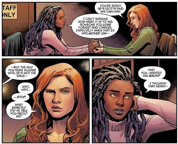
It's not alone in this. Naomi #2 coloured, pencilled and inked by Jamal Campbell has a similar trick this week, and Catwoman – the first title to receive the new paper stock – and coloured by John Kalisz also does the same. I've noticed it less in other titles – and I'm not always sitting here comparing print and digital pages. Maybe I should. And I look to be corrected over all of my assumptions by Bleeding Cool Senior Paper Correspondent Mark Seifert. But comparing this digital scene…
…with this printed scene.
Seems the world of difference. What's your experience?
Enjoyed this? Please share on social media!
Stay up-to-date and support the site by following Bleeding Cool on Google News today!