Posted in: Comics, Review | Tagged: chip zdarsky, Comics, gotg, guardians of the galaxy, kris anka, marvel, matthew wilson, Review, star-lord
Consistent, Complete Creative Vision: Star-Lord#5 Review

It's kinda interesting that I wound up getting to this review this weekend after everything that's been going on with Marvel's comments coming out of their Retailer Summit, and also a discussion earlier in the week on how rotating artists has the effect of diminishing the importance of an artist in a comic book.
Interesting, because Star-Lord is one of those series that has seen no fill-ins, has consistently used the same artist and writer throughout this run and has been better for it.
Chip Zdarsky brings his usual quirky, charming humour in this issue, but also adds in levels of romance that are more believable than some of the whirlwind romances that occur in the Marvel Universe (and also, strangely, hotter, and that worried me in all kinds of ways). Kris Anka continues to bring bold, dynamic character designs into a world that has extra added depth due to minor details that are actually pretty major details that help bring the comic a sense of honest 'world outside your window' feel. I'll go into that later. And the colours from Matthew Wilson work wonderfully to add extra layers to Anka's work.

The issue, and the series as a whole, has a sense of a creative team who have really gotten to know each other and work to each others strengths. This is shown in one level that I'm sure many will want to shoot down as superficial: the constant shirt-tearing in the fight scenes.
By this issue it's almost become an unspoken running gag: a fight starts, almost immediately the male fighters shirts get ripped open or ripped off, exposing their physique. The reason this is also a sign of a collaborative creative team: it shows Zdarsky as being patently aware of what Anka does well and what his fans love in his work – Kris Anka draws a damn fine torso.
To be clear, all his physiques are excellently rendered, and that's one of the layers of seemingly 'minor detail' that is actually major, because it brings a freshness, a reality, to his work, even if the actions involved are fantastical. Bodies are old, young, tall, squat, doesn't matter – each one is rendered expertly. Moreover, Anka displays a knowledge of anatomy and how muscles work that would make most other comic artists cry into their drinks bemoaning the aching backs they've given themselves leaning over art boards and Cintiq tablets trying to draw just one ab as well as Anka appears to do effortlessly.

Another aspect of 'minor detail actually major' is the level of thought that goes into what characters wear (when they're clothes aren't getting destroyed). Agent Brand in this series has sported a couple different looks, each one high fashion, yet totally making sense for the character and the character stays recogniseable despite different looks each time. This adds another level to the 'world outside your window' reality that a lot of artists don't think too much about including, which your brain doesn't always immediately consciously register, but in seeing it, it just adds an extra level to the proceedings.
To be honest, this is something missing in a lot of Marvel's line of late: creators allowed to really work with each other to the point of working to each others strengths and creating a run on a series that makes a statement on their skills, on the character and on the medium.
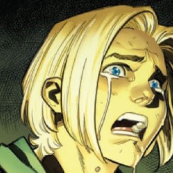
All this being said, Star-Lord is simply fun, even when the story is given some pretty strong emotional weight. This comic genuinely made me audibly sigh (in sadness, not because of how thirsty it made me), but I wouldn't want to spoil why. Read it yourself! Go on! You'll thank me for suggesting it, I swear.


