Posted in: Comics | Tagged:
Landry Walker's Writers Commentary on Game Of Thrones Clash of Kings #2
Landry Walker has a Writer's Commentary on A Clash of Kings #2, out now from Dynamite
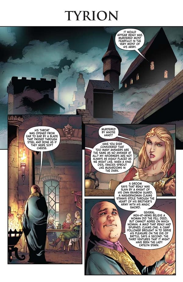
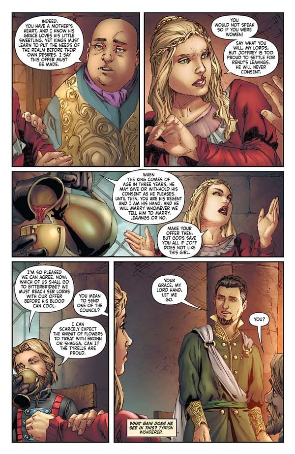
Page 1, panels 2 and 3. Good positioning here on Cersei and Varys. The directions the characters face matter quite a bit on the page. Imagine this same sequence, but with the characters reversed. It would be as if their backs were to each other. Comics are a static form of art, but creating motion and interaction between disparate images is the goal. This is a subtle but important example of how it works.
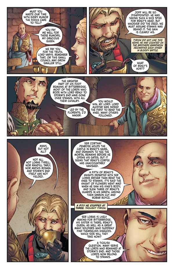
Page 2: As usual, Tyrion is drinking. I've talked about this before, but people in a conversation move, they fidget, they avert their gaze, they pick things up. You have to consider the performance of each character when laying out a page. When I script these, I take care to note the performances of each player. With Tyrion, we know he is headed towards a drinking problem. So let's show that.
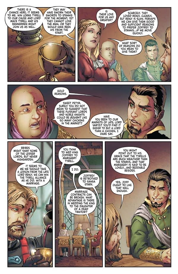
Page 3: See? Tyrion is still pouring himself cups of wine. I would suggest a drinking game where you match him, cup for cup. But that's a bad bad idea and I beg you NOT to do it. Don't!
Page 4: Sometimes you need to break up the monotony of a page where everyone is just hanging out at a table. So since we have established everyone and context gives indicators as to who is saying what, let's focus on this cup for panel. Is a cup exciting? No. But the way it breaks up the monotony is. Action doesn't just mean explosions. Sometimes it's about camera angles or even something as mundane as a tight focus on a gold cup.
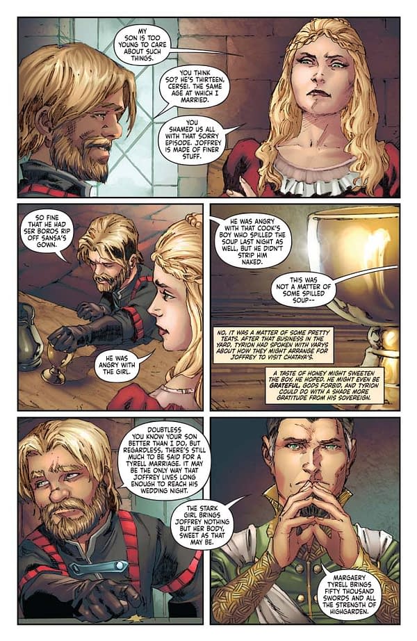
Page 5: Pouring more wine…
Page 6, Panel 4: This is pretty expert work on the parts of Mel Rubi , Ivan Nunes, and Ted Napolitano. Mel's panel arrangement takes a crowded page and, by layering the panels a bit, opens up the center of the page and lets the whole thing breathe. This is supported by the choice to leave the background here blank white, and to keep the lettering centered within the white space. These are all small touches, but they combine to a whole that is essential to the art of sequential storytelling.
Page 9: We made a decision early on not to use sound effects in this book. I stand by that decision, but it does make some moments read weird. Like this one here. Theon is getting spit on by someone with a mouth full of blood. But it doesn't translate well. We should have adjusted for that. Live and learn.
PAGE 10: Last panel. Nice open full bleed. There are so many moments in this story where a character walks or wanders or changes location. The passage of time has to be presented somehow. By opening up the panel so that it runs off the edge of the page, we help create a sense that the moment goes on for longer. It's all about crafting illusions. These are static images, but we do these things to play with your perceptions of time.
PAGE 11: Mel managed to squeeze in a flashback montage in a tier less than a fifth of the page. That's just amazing.
PAGE 15: The slow zoom in is a favorite for building tension. Probably one that's overused, but I don't care. Effective tools are effective.
Overall: This one was a crush. The issues where we have to fit three chapters into 21 pages. So often I'm staring at a scene and wondering what we can keep and what has to be cut. We can't keep everything, much as I would love to. Half my job is deciding what part of GRRM's epic makes it to the page. This was a hard one to be sure, yet when I go back and read it I am very happy with the result and I don't really notice things missing.
Due to our constraints, the storytelling in this book is a bit of a throwback to older comics, denser reads that do not rely on atmosphere and deconstructed pacing where things take a lot of time to unfold. Add in the dense text we use… the only thing we need now is to print this on some newsprint. The gritty texture and yellow tinge paper would serve the book well. The medieval world reads best to us when it reads OLD. It clicks with our preconceptions, however misplaced they might be.
That's all for this one. Follow me on Twitter (@landryqwalker)! Check out my graphic novel "The Last Siege" from Image Comics. And watch for my newly-announced all-ages superhero epic "The Infinite Adventures of Supernova", coming soon by First Second Publishing. Bye!


