Posted in: Comics, Recent Updates | Tagged: bitch planet, Comics, entertainment, image comics, Injection, star wars
Thor's Comic Review Column – The F1rst Hero: Fight For Your Life #1-2, Obsolete Heroes, Sorcery Chapter 1, Lazarus #19, Bitch Planet #5, Injection #5, Star Wars: Shattered Empire #1
This Week's Reviews:
The F1rst Hero: Fight For Your Life #1-2
Obsolete Heroes
Sorcery Chapter 1
Lazarus #19
Bitch Planet #5
Injection #5
Star Wars: Shattered Empire #1
The F1rst Hero: Fight For Your Life #1-2 (Action Lab, $3.99)
Obsolete Heroes (dannyzab.com, $4.39)
Sorcery Chapter 1 (dannyzab.com, $8.25)
By Graig Kent
Wandering through the deep and plentiful aisles of Artists Alley at Toronto Fan Expo (or, really, any large-sized convention) is a dizzying experience full of sensory overload. The multicolored sights of artists and craftspeoples' booths is hard enough to take it without the distraction of various smells of recently vended fast food, stale recirculated air and the body body odor of the multi-day cosplayer, not to mention the overwhelming noise of thousands of people all talking at once and the background din of faraway videogame booths perpetually bombarding one's senses. The people not in the periphery of Artist's Alley aren't the stars or the special guests, they're there hoping to draw at least some small amount of attention to themselves, hopefully to make enough money to pay for their booth and their trip, if not loftier goals of getting noticed and breaking into the business. But I imagine for every one person's eye that is caught, hundreds pass on by without a second glance, either their work is completely unappealing, or it otherwise is just lost in the blur of colourful sights, boisterous sounds and conflicting aromas.
My wife and I actually went into Fan Expo's Artists Alley with the specific intention of finding artist Danny Zabbal's table, hoping to commission him for a drawing in my sketchbook. Last month had seen Zabbal's first mass-published comics work in Action Lab's F1rst Hero: Fight For Your Life #1 (the second issue went on sale this past week), and with it I found a brand new artist to add to my tightly controlled list of favourites.
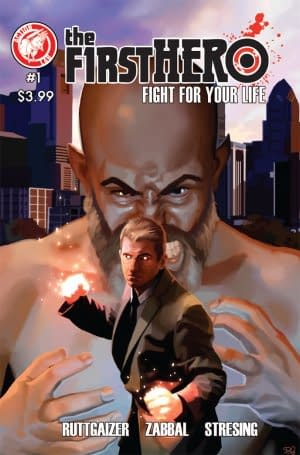
With F1rst Hero, writer/creator Anthony Ruttgaizer appears to be drawing from familiar themes of civil oppression as used in the X-Men comics since the 1960's. When Lee and Kirby did it, the hardships of being a mutant was meant as metaphor for the civil rights struggle, here Ruttgaizer seems to be using the extrahuman psychosis as metaphor for the way post 9-11 governments use fear of terrorism as a tool to remove people's rights and to justify extreme police behavior.
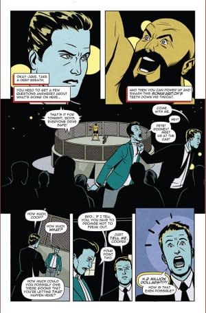
The allegory is at play in these two issues, but so far it's almost a side focus to the story at hand, which finds Jake drawn into a nefarious underworld fight club — where an extrahuman bruiser with three arms reigns supreme — thanks to an old pal of his who is deep into debt with the mob. Jake's quick temper exposes his extrahuman ability to people who can't be trusted, but it also potentially signals his own descent into terminal madness.
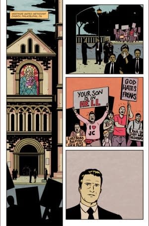
Ruttgaizer's story is both pulpy and broadly played (I sense the ironic-influence of Entourage and unironic-influence of professional wrestling throughout the first issue) while still being able to actually develop some real dramatic stakes for the character (and investment for the reader). Zabbal's style at first blush seems best suited for the more naturalistic elements of the story (like the aforementioned funeral scene) but when the time comes for the Dallas-style taking-over-dad's-business melodrama, or the office place rom-com meet-cute, or the Entourage-like bro-out, or the pro-wrestling-inspired fight sequences, Zabbal manages to deliver there too. When the tone of the story shifts into something larger-than-life, his horizons tilt, his camera angles become sharper, characters start breaking the panel walls… things just get more playful.
As much as Zabbal's work with a supportive and talented creative team in F1rst Hero marks his auspicious debut, it's not his best comics work of the year. My wife and I strolled up and down Fan Expo's Artists Alley aisles twice over looking for Zabbal without locating him. It took the assistance of a mutual acquaintance to direct us there where we were met by the artist, framed by dozens of prints of his "Obsolete Heroes" work, which the few but faithful on Instagram [link: https://instagram.com/dannyzab/] or Facebook [link: https://www.facebook.com/dannyzabbaldrawingswords] have seen. At his desk were offered two books, both somewhat unassuming by their self-published nature.
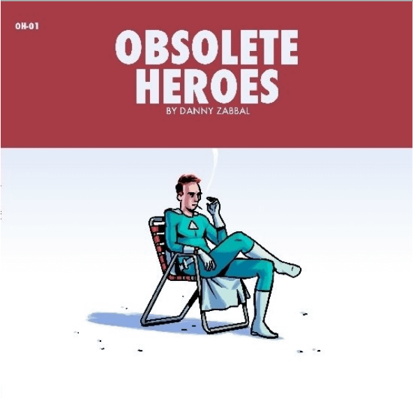

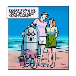
There's almost a Wes Anderson vibe to Zabbal's work here, a little out of step with time, operating in a different atmosphere, uncontemporary, despite things like flatscreen televisions and iPads creeping into frame. Like an oft-used Instagram filter, Zabbal takes modern sensibilities and places them within the framework of nostalgia, making something very modern look and feel like something from a bygone era that never quite existed. Online these are beautifully colored by Zabbal using a vibrant palette that screams '60's comics and yet doesn't outright betray a sense of being a modern work. His colors commonly place a flat background behind the foreground character really making them pop (something Fred Stresing does with his work in F1rst Hero as well). The physical collection (available from Zabbal's website) is in black and white, which, in the absence of color, allows Zabbal's deft pen and ink work to shine. Without the color filling the space, all that's left is the marvel that is the artist's many strengths. Zabbal has no problem with detail in his work, but he has a gift of knowing what details are relevant for the image to capture the scene. Sometimes the backgrounds convey an entire environment — a bar, a city scape — and sometimes they're dropped altogether to focus on a figure on a couch, the character's expression the centerpiece. In black and white, without additional distractions, Zabbal's sense of fashion and style (which largely sits in the 1960's range in formal, casual and spandex-wear, but does venture both north and south of that era) stands out.
The second book Zabbal was offering at his table, the 58-page, squarebound, black and white first chapter of Sorcery seemingly solves that minor gripe. It opens with a prologue set in 1905 featuring two characters also seen in one of the Obsolete Heroes panel, implying that perhaps Zabbal has greater plans for all his Obsolete characters (even if they're not all part of the same universe).

After such a rollicking start, the story then takes an abrupt shift in both time and tone as it jumps to 1995, following fifteen-year-old Amelia Tots as she rebels against everything she knows: school, friends, family, society. Zabbal does an excellent job of managing the transition between the two eras, setting up the exterior of a 1990's downtown Toronto club, and the interior dancing, drinking and drugs going on inside all on the first page. There's something reminiscent of Jamie McKelvie's Phonogram work in these pages, perfectly capturing the carefree partying of youth, and juxtaposing Amelia's bitter attitude against it.
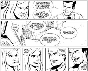
The reader is so sucked into the Tots family drama and Amelia's tangible pain that by the time Wisenheimer is reintroduced towards the end of the book, one almost has forgotten about magic and the events of the prologue. How these two seemingly disparate elements dovetail together will be part of more chapters to come, but goddamn if I can't bear to wait for them.
Sorcery is not just a great first effort but legitimately one of the best books of the year. Zabbal has crafted a natural, fully realized world, populated by people who you care about, not broadly hewn characters or archetypes. As astounded as I am by his illustrations, I'm equally stunned by his writing, which manages to navigate being affecting, exciting, emotional and funny. The quality here is top level, such that it should be published, and highly promoted, by Vertigo or Image, not sitting hidden in an artists alley or buried on Lulu.com [link: http://www.lulu.com/spotlight/dzabbal].
Besides purchasing these two brilliant books, my wife and I each commissioned a sketch from Danny Zabbal without hesitation at Toronto Fan Expo (as many others encouragingly did as well, instantly becoming prized pieces in their sketchbooks). We had to. Pretty soon we won't be able to afford one.
Graig Kent and his lovely wife also bought one of those amazing Jack Kirby Lord of Light prints from the Heavy Metal booth at Toronto Fan Expo. The vibrant blacklight piece now hangs in their dining room, sure to wow all their friends and confound their family members. Graig is also hard at work writing a new book, which if things go right you'll be hearing more about next year.
Image-A-Palooza – Lazarus #19, Bitch Planet #5 & Injection #5
By Adam X. Smith
So I decided to treat myself to a comic book splurge post-graduation, and since most of them were published by Image, this week I'm taking the opportunity to do a quick recap of the various ongoing Image books in my pull-list. Because reasons.
It's the re-view, the re-view, whut-whut, the re-view.
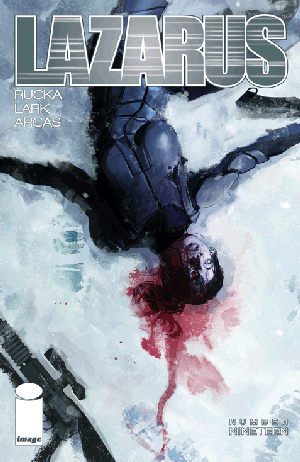
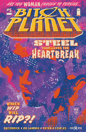
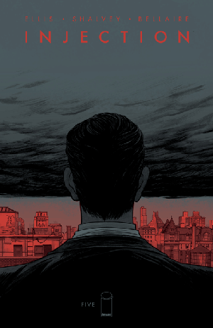
So that's the week in Image Comics. I know this isn't incredibly high on in-depth critique and barring end-of-arc reveals there's not a lot that jumped out at me personally, but that's not to say that the material across the board isn't consistently strong. Greg Rucka and Michael Lark continue to do strong female characters in a gritty dystopian future with gusto. Kelly Sue DeConnick and Valentine De Landro continue to make Orange is the New Black but in space work as a core concept, whilst slowly drip-feeding us backstory and promising greater electricity to come. And Warren Ellis and Declan Shalvey may well have created one of the darkest sci-fi horror stories since the Quatermass serials.
Some people say that if treading water doesn't feel like drowning you aren't doing what you love. But every now and then it pays to slow down and take it all in.
Adam X. Smith is now officially a post-graduate, is on track to begin his Masters and has finally started learning to drive an automobile again. The homeworld will be pleased. Check out his other writing at @ElectrolyteMag before the inevitable invasion and subjugation of the human race by the all-powerful Ragulon Empire. Mwahahahahahaha!
Star Wars: Shattered Empire #1 (Marvel, $3.99)
By Cat Taylor

Shattered Empire takes the same approach as the much better Darth Vader comic by telling a story that takes place immediately after one of the movies, but the difference is that Darth Vader adds more dimension to the character and provides details and plots that are interesting and entertaining. In addition, Darth Vader takes place in the space between A New Hope and Empire Strikes Back, which is an area that practically begs for more stories. On the other hand, Shattered Empire seems superfluous and unnecessary. What the writer, Greg Rucka, does with the first issue of this series is introduce Shara and Kes, two characters who, rumor has it, will be the parents of an important character in the upcoming Force Awakens movie. Their story in this issue begins by showing their roles in the last moments of Return of the Jedi and then continuing with the events that happened right after the movie ended. Although everybody knows that a large scale war doesn't end immediately with the death of the enemy leader, Return of the Jedi concluded with such a sense of closure and finality that a scenario picking up at the exact end of that movie naturally lacks excitement and urgency. Despite that challenge, Shattered Empire gives us Shara and Kes as part of Han Solo's squadron heading off to shut down another Empire stronghold. Without any high stakes established, or a new chief antagonist along the lines of Darth Vader or Emperor Palpatine, it's hard to care. Rucka attempts to familiarize the readers with Shara and Kes and to get us to love them as much as they love each other but by the end of the issue, nothing distinguished them from the many other background characters.
The one area where Shattered Empire does excel is the art from Marco Checchetto (a creator who has had the opportunity to draw just about everything in Marvel's catalog) and Andres Mossa. What they manage to produce is gorgeous with great detail, and the painted look that used to be reserved for only the best graphic novels. Where they really outdo themselves though is in the large panoramic battle scenes. The dogfight at the second Death Star is possibly the most well-rendered version of that scene I've ever seen outside of the movie. Although with art this fantastic, it also proves that there's no way of adequately capturing the energy of those Star Wars spaceship battles with only still images. Those scenes require the full cinematic experience to do them justice.
Needless to say, as a big Star Wars fan, I was hoping for more out of this series but the first issue doesn't give me a lot of confidence. Sometimes a series can pick up and become a lot better after the obligatory introductions are out of the way and I do think getting further away from the end of the Battle of Endor and into an entirely new scenario will help. However, this is only scheduled to be a four issue limited and that doesn't give much time to move from a hum-drum beginning into a stellar middle and end. Regardless, I'm still looking forward to the new movie trilogy and there are, and will be, plenty more stories to read and watch before then.
CORRECTION: Last week, in my review of Hank Johnson: Agent of Hydra, I stated that David Mandel pitched his idea for Hank Johnson prior to the creation of Fabian Nicieza's Bob. This information came from an interview that Mandel did with Entertainment Weekly where Mandel stated that he pitched the idea for Hank Johnson in 1998. However, according to Nicieza himself, he originally presented the idea for Bob to Mark Gruenwald in the early 1990s, even though Bob did not make his first comic book appearance until 2007.
Cat Taylor has been reading comics since the 1970s. Some of his favorite writers are Alan Moore, Neil Gaiman, Peter Bagge, and Kurt Busiek. Prior to writing about comics, Taylor performed in punk rock bands and wrote for fanzines. He is also old enough to be one of the original Star Wars geeks. So, he wants this stuff done right! You can e-mail Cat at cizattaylor@hotmail.com.


