About
About 


The bi-yearly D23 Expo returned to the Anaheim Convention Center this past weekend, and made a huge splash with the plethora of movie announcements that
Posted in: Comics | Tagged: 2015, best lettering, Comics, countdown to the eisners, eisner awards, eisners, entertainment
Countdown To The Eisners 2015- Best Lettering
 If you don't even realize you're reading the word balloons or sound effects in a comic, then the letterer is doing a fantastic job leading you throughout the story by an invisible hand. The only time you really notice bad lettering is if it doesn't fit inside the balloon properly, the font is something similar to Comic Sans, or a sound effect made no sense ("BREVOORTED!"). Without a doubt one of the most disregarded jobs in comics, a letterer has the power to make or break a comic, so you better be nice to them! In today's column, I'll be looking at the Best Lettering nominees. I'll make sure to dot my 'i's and cross my 't's for this category.
Keep in mind I cannot vote for who wins (nor can you, probably), as per the rules. Plus voting ended June 1st. However, that's not keeping me from being vocal regardless!
Who is eligible to vote?
Comic book/graphic novel/webcomic creators (writers, artists, cartoonists, pencillers, inkers, letterers, colorists
All nominees in any category
Comic book/graphic novel publishers and editors
Comics historians and educators
Graphic novel librarians
Owners and managers of comic book specialty retail stores
Who is not eligible to vote?
Comics press or reviewers (unless they are nominees)
Non-creative publisher staff members (PR, marketing, assistants, etc.)
Fans
Before I get back to lettering my Fugu Comics so I can be eligible for next year, let the games begin!
Best Lettering
Joe Caramagna, Ms. Marvel, Daredevil (Marvel)

Todd Klein, Fables, The Sandman: Overture, The Unwritten (Vertigo/DC); Nemo: The Roses of Berlin (Top Shelf)

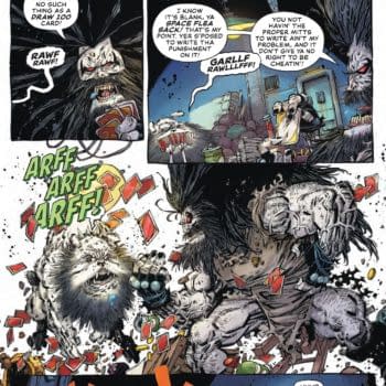
Max, Vapor (Fantagraphics)

Jack Morelli, Afterlife with Archie, Archie, Betty and Veronica, etc. (Archie)

Stan Sakai, Usagi Yojimbo: Senso, Usagi Yojimbo Color Special: The Artist (Dark Horse)

 Who I think should win:
Max, Vapor (Fantagraphics)
I really enjoyed reading Vapor because not only was the art beautiful and the story entertaining, but for the intriguing lettering Max (aka Francesc Capdevila) exercises throughout the graphic novel. The characters even joke at one point about how Nick capitalizes his name and other words when speaking, making him out to be a pompous prat. The typography itself is great, and the sound effects work well with the art. The way Max letters his works definitely stands out amongst the other nominees.
Who I think will win:
Stan Sakai, Usagi Yojimbo: Senso, Usagi Yojimbo Color Special: The Artist (Dark Horse)
You want fantastic sound effects? Sakai's big, booming calligraphy sound effects were everywhere this past year in his Usagi Yojimbo: Senso series. Not only was it impressive that the style of the effect matched the Feudal Japan tone of the comic, but the fact that you could see every brushstroke was simply another layer of magnificent artwork. Add the fact that his own signature font is always easy on the eyes, and Sakai has this award in the bag this year.
Who I think should have been nominated:
Dustin Harbin, Seconds (Ballantine Books)

Definitely matching the style and tone of O'Malley's Seconds, Harbin blended the text and sound effects in like a chameleon, while giving it a reminiscent feel of Scott Pilgrim. Everything from the captions, to the though bubbles, to the instructions on how to eat the mushrooms, it all melded together beautifully. I especially loved every "STARE" and "SMOOCH" throughout.
Who do you think should win / been nominated?
Cameron Hatheway is a reviewer and the host of Cammy's Comic Corner, an audio podcast. You can use his name as a sound effect on Twitter @CamComicCorner.
Enjoyed this? Please share on social media!
Stay up-to-date and support the site by following Bleeding Cool on Google News today!