About
About 


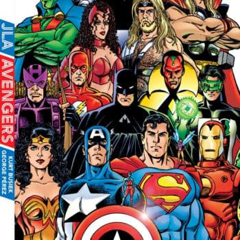
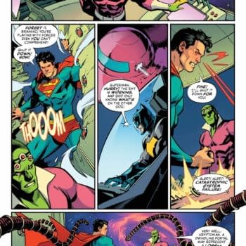
The JLA/Avengers missing moment that still bugs Tom Brevoort, revealed... or, rather, revealed three years ago
Posted in: Comics, Recent Updates | Tagged:
Rian Hughes' Logo-A-GoGo – A History of Comics Logos That Birthed the 21st Century
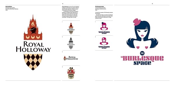
We've covered Rian Hughes' design work a lot. A few examples include Batgirl, Shadowman and the central logos for Marvel and DC Comics. Well, he has now published a massive coffee table of his comic book design work across the decades and it doubles as a history of the recent comic book industry as well, charting trends, editorial attitudes and contrasting corporate structures.
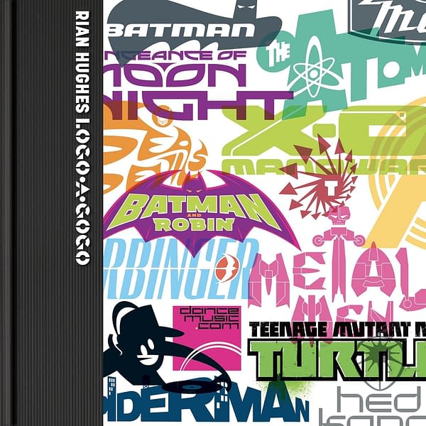
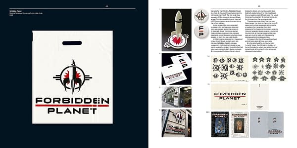
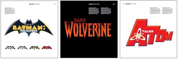
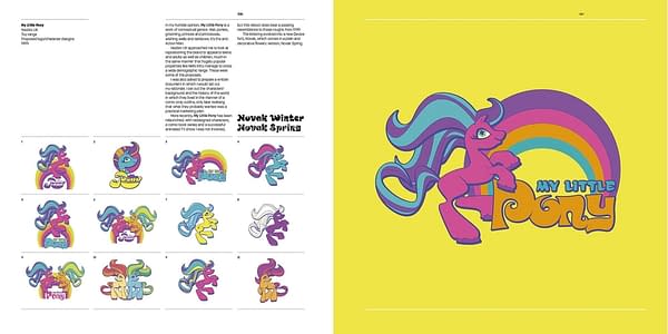
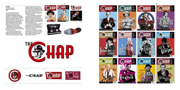
But the overall experience of reading this is one of, what he did that? And he did that? And he did that as well? Hang on – he did all of these? Not just comics as well, the Forbidden Planet logo, Gosh Comics logo, the Millenium Bug Campaign logo, so many albums and events and books and designs that you find have filled your life at one point or another. Rian Hughes has touched us all – and not been arrested.
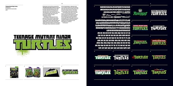
You'll find out how his design for the New Mutants logo was destroyed through Marvel's use of Photoshop rather than Illustrator or Indesign. He mentions the X-Men Utopia design was buried under other logos and typefaces and how it was adapted for further printings and collections 'sometimes crediting me.'
Or how his logo for Infinity Man And The Forever People had a version for those DC lenticular covers that would twist with different viewings – but cost stopped that from happening. How the Catalyst Prime series from Lion Forge didn't use his logos, apart from the main one, but were designed in-house, often very similar to his pitched versions.
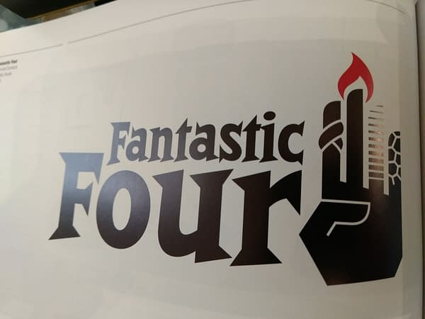
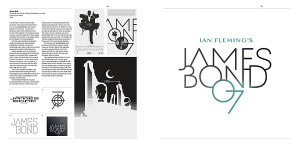
How Richard Hatch accidentally ended up paying his bar bill. And an amazing Fantastic Four logo that could have been but never was.
Then there's the constant regret of when designs are taken out of his hands and used, abused, messed up and fall into chaos… contrasted with say, his work for the Matt Fraction, Salvador Larocca and Frank D'Armata run on Iron Man, taking the whole cover and creating standout covers consistent with each other. And his work on the Marvel UPC box to change it from using six fonts in one box, 'each set in a different point size, orientation or tracking' which was 'not adopted with any consistency.'
He writes 'Many comic covers arbitrarily reposition the various design elements issue to issue, often using a bewildering variety of fonts. This tendency to chaotic inconsistency is a missed opportunity to create a stronger brand.
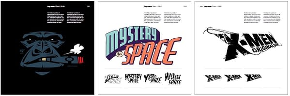
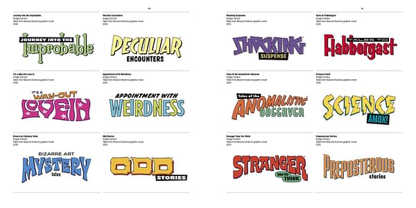
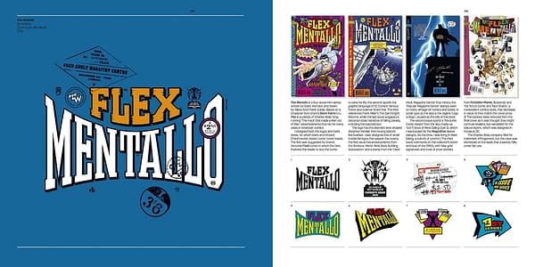
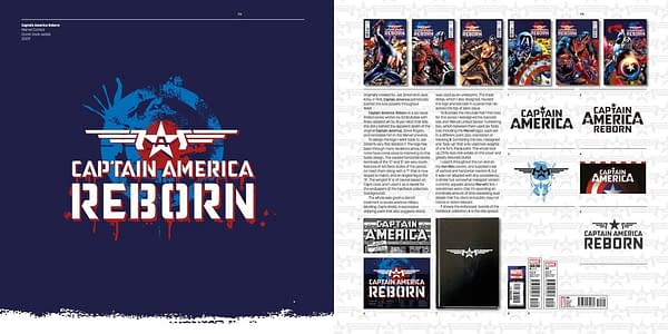
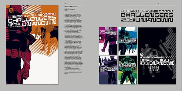
As well as the final logo in question, each is shown with a dazzling array of other unused choices and you can bet each one has a logo you would have preferred. You get to see thousands of paths not chosen and gain a great degree of respect for the work that goes into something that so many take for granted.
It's an amazing coffee table book that deserved to be read as well as flicked through. Published by Korero Press, odds are you won't find it in many comic stores which also makes it the perfect gift for the geek in your life. I would have been so happy if someone had bought me this. Why wait till Christmas?

Enjoyed this? Please share on social media!
Stay up-to-date and support the site by following Bleeding Cool on Google News today!