Posted in: Comics | Tagged: Comics, entertainment, grant morrison, jupiter's circle, Mark Millar, wilfedro detorres
The Mark Millar Character That No Longer Looks Like Grant Morrison
Back in September, Wilfredo Torres tweeted a character design for Jupiter's Circle, the Mark Milar comic from Image.
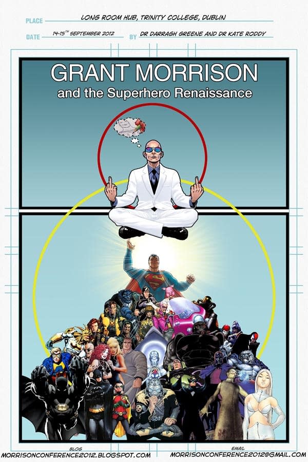
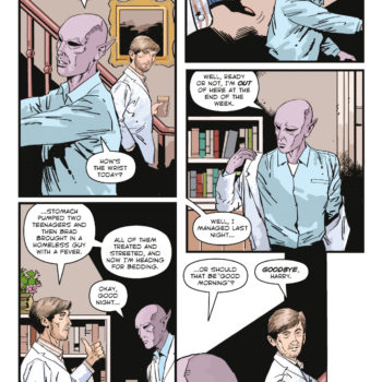
"Supervillain that may or may not look too much like Grant Morrison… yes the suit is supposed to be all white ;)"
Mark Millar denies that there is any rift between he and his ex-writing partner Grant Morrison. Grant Morrison has said that if he sees Millar, he wants to run over him at 70mph. I am assured that in Glasgow, there seems to be an almost sectarian divide over allegiance to one or the other.
Wilfredo was not to know…
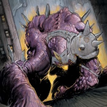
Well, by the time the book came to print, Professor Prism was no longer bald and no longer in an all-white suit.
And the change? From sktchd,
I love Professor Prism. He's completely absurd in a Batman '66 sort of way…like he's a guy who watched one too many TV shows and thought, "man, I could make an awesome criminal." For characters like that, is that pretty much just you having fun? Or are elements like that something Mark's scripts are pretty tight on?
WT: Professor Prism was a lot of fun. Mark was pretty open about what he wanted aside from the scepter so he was kind of developed on the fly. He originally looked a bit different and then Mark asked me to push it further and we finally landed on this absurd looking goofball. I would've loved to have drawn him more but I imagine his criminal career was a very short one.
Maybe some one ran him over…


