 About
About 

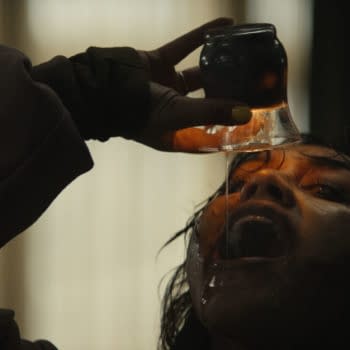
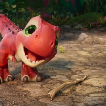
Evil Dead Burn will feature a new breed of terrifying Deadites, according to director Sébastien Vaniček. It releases in theaters on July 10.
Posted in: Clothing, MLB, Sports, TV | Tagged: #CapsOn, 47, Baltimore Orioles, chicago white sox, cleveland indians, colorado rockies, hats, Houston Astros, HRL, Milwaukee Brewers, MLB, mlb 2018, new era, new era mlb, new era throwback, new york yankees, oakland a's, opening day, toronto blue jays, washington nationals
MLB Opening Day Means #CapsOn! Here are 10 Favorites to Support Your Team
MLB Opening Day is here! The league started the hashtag#CapsOn a couple years ago, encouraging fans to post pictures of themselves supporting their team by wearing their team's logo hat. As a fan of both baseball and hats, it's one of my favorite hashtags to search every year. I love seeing everyone's different logo and style choices and which hat company they support (I like both New Era and '47). So in honor of MLB Opening Day, I chose 10 of my favorite logos and hats in the big leagues. Hopefully you share the love for some of these.
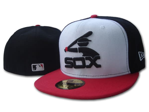
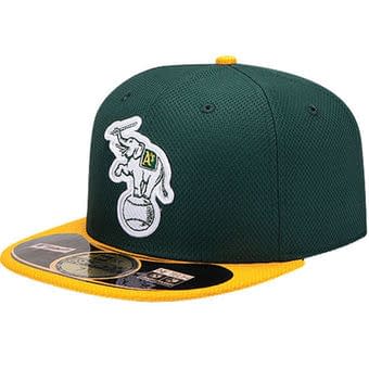
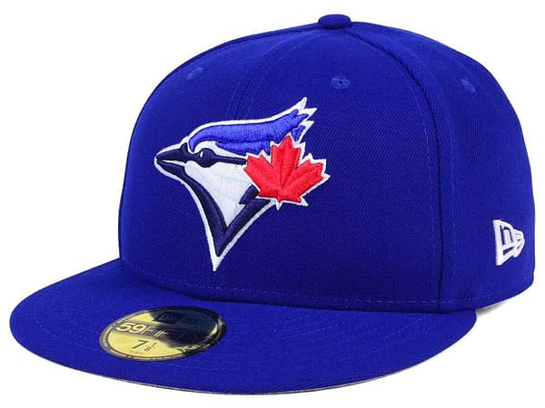
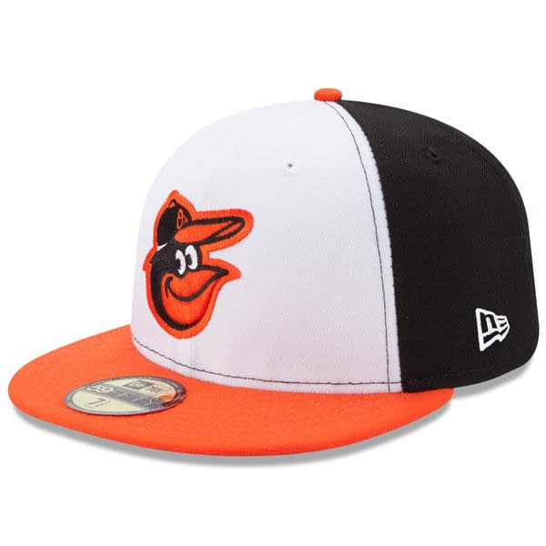
I love that old-school Chicago White Sox logo. It's so '80s, and I remember seeing pictures of it when I was a kid and thinking it was so futuristic-looking. It figures that it was designed by a fan. Two classic logos here as well: the Toronto Blue Jays all-blue hat with the bird's head and maple leaf, and the white front panel Baltimore Orioles hat with the smiling Oriole bird. The orange and black mix so well together — a classic. The other has been a favorite for as long as I can remember. I love the Oakland A's elephant logo. This one was created out of spite, but it looks so rad on the yellow and green that it's a must-have for every collection.
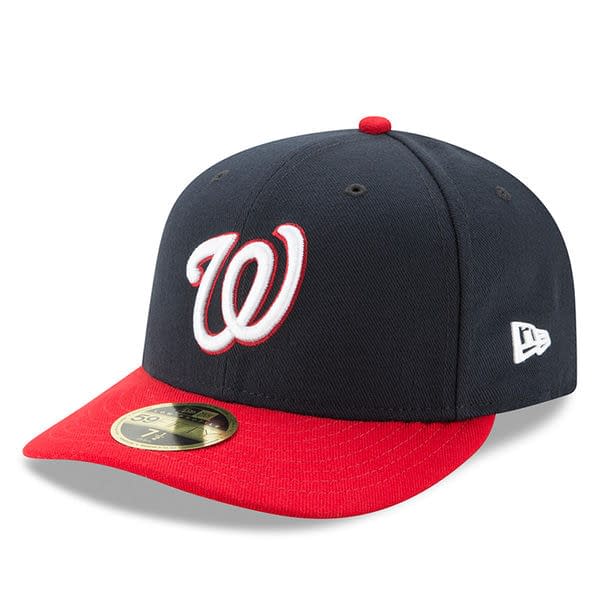
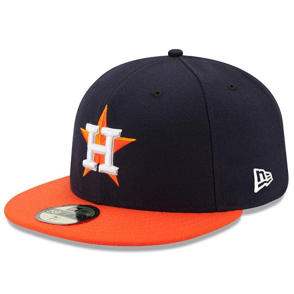
So many hats are just a letter in script to represent that team, but it doesn't look better than the Washington Nationals "W" logo. Simple and elegant, it is the perfect representation for that city and what it stands for (or is supposed to, anyway). That's the same reason why I love the current Houston Astros hat. The resilience of the Houston area after the horrible hurricane last year mirrors their baseball team. They never say die, and this hat represents that for me.
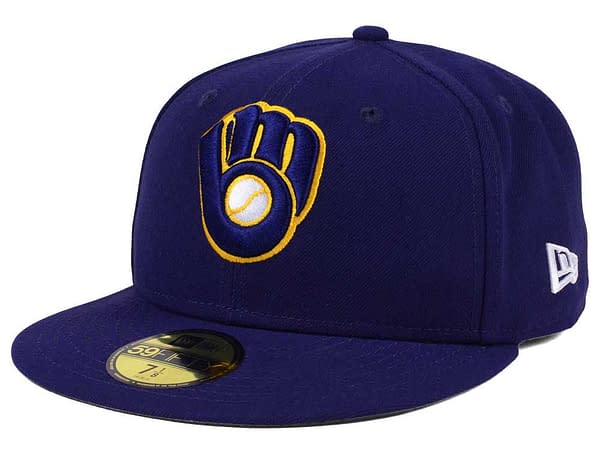
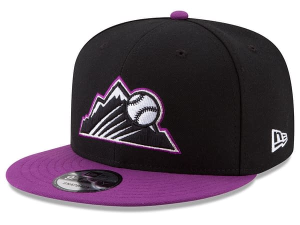
The Milwaukee Brewers glove logo just takes me right back to my childhood. It took me longer than I would care to admit that the glove is made of an "M" and a "B", but it is just a perfect, classic logo. Last year one of my favorite hat designs was the Colorado Rockies Players Weekend hat. The colors pop, the ball flying over the mountains is awesome, and I especially like the patch they put on the hats that weekend showing the progression from tee-ball to MLB. Awesome stuff.
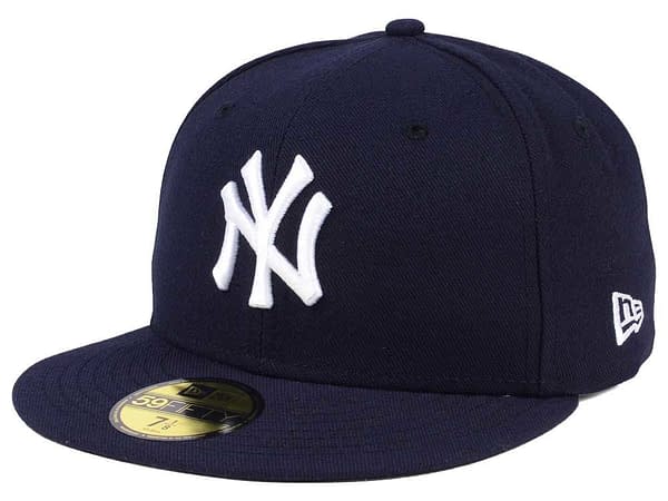
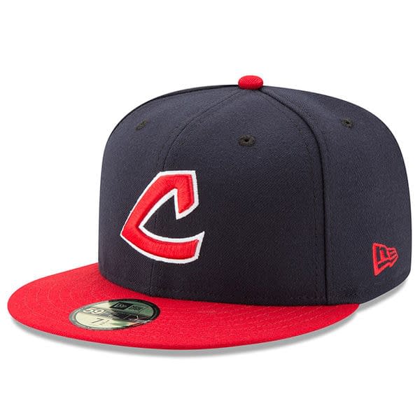
As loath as I am to admit it, there may be no more iconic MLB logo, or sports logo for that matter, than the New York Yankees' "NY". It reeks of history and legacy. And lastly, I included my hometown Cleveland Indians Crooked C design. I, for one, am okay with them doing away with Chief Wahoo — I actually prefer the "C". This is one I've had to buy a couple times from wearing it out.
What are some of your favorite MLB logos and caps? Let us know down below or tweet yours at me over on Twitter @jeremyohio.
Enjoyed this? Please share on social media!
Stay up-to-date and support the site by following Bleeding Cool on Google News today!