About
About 


By Spencer Ellsworth Nick Roche got his start as a comics artist at IDW Publishing, illustrating and soon writing the company’s incarnation of
Posted in: Comics, Recent Updates | Tagged: Comics, d'israeli, entertainment, ordinary, rob williams, titan books
'We Are Living In The Future' – D'Israeli Discusses His New Book Ordinary
Rob Williams and D'Israeli introduce a new comic from Titan on May 28th, and though the title is Ordinary, this book is quite a surprise visually and in terms of its concepts. Michael, a plumber with plenty of the burdens of life including a son who he rarely sees, is at the center of his own blast zone when the world seems to start falling apart.
The nature of the narrative, which begins to blur and shift seamlessly into remarkable premises, will leave you staring at the page, thinking "What just happened?". D'Israeli's artwork, heavily researched and carefully tailored to characterization, drives the narrative into stranger and stranger territory as reality itself morphs into the unfamiliar for both readers and characters. One thing is clear: the world is changing, and Michael's world may never be ordinary again.
We spoke to D'Israeli about his processes in developing this far-from-ordinary book.
Hannah Means-Shannon: What was it about Ordinary that first piqued your interest and made you want to get onboard with the project?
D'Israeli: I'd been talking with Rob about doing a completely different project – a hard SF deep space thing with huge chunky spaceships – and at the end of a meeting to discuss that, he mentioned the idea for what became Ordinary and asked if I'd like to think about it. I turned it down!
Heading home though, I started really thinking about it, the possibilities, the cool stuff there'd be to draw, and also, from a career point of view, the strength and simplicity of the pitch; it's easy to explain and everyone gets it straight away. It's a story about people and readers care more about people than big chunky spaceships! So when I got home I rang Rob and asked if I could change my mind and away we went.

HMS: Really specific question: how did you decide what to include in the opening shot of Michael's totally cluttered room when he wakes up? Any inside jokes or personal touches there?
D: I don't think there's anything surreal or off the wall, but I was trying to plant a whole load of clues about Michael's lifestyle – the take-away cartons and pizza boxes, empty beer cans and porn hopefully add up to this guy who's stuck in a lonely, desperate batchelor lifestyle he should really have grown out of. One detail I wanted to include was a toddler scribble by Michael's son pinned up on the wall, like the boy's now seven or eight but that's the only memento Michael has of him. Rob vetoed that though, because it created too much of an implied connection between Michael and his son.
What I wish I'd though of at the time was to have some empty cans of Jooky in the flat (Jooky was an imaginary soft drink created for an ad campaign for Sprite back in the 90's.) I reckon as something to miserably drink on one's own, JD&J (Jack Daniels and Jooky) would be just the ticket!
HMS: What did you have in mind when you visually designed Michael as a character? How did you decide on his features and conveying his personality through his appearance?
D: Rob suggested the actor Paul Giamatti as a starting point for thinking about Michael. I loved Giamatti's performance in Sideways, so I held on to that kind of stubborn down-trodden-ness (is that a word?) when I was drawing Michael. After that it's finding the body language and poses to convey that character – it's like acting, though by proxy.
Michael's clothing was pretty easy to sort out – he starts the day going out to work as a plumber, so I gave him work boots and those workman's trousers with lots of pockets and reinforced knees. It's a hot summer so I put him in a short sleeved shirt over a tee shirt – the shirt has horizontal stripes which are deliberately unflattering on someone of his build, I wanted to signal that he's kind of given up on style and is just buying the cheapest stuff he can find. Everything's also a little loose and baggy – like he knows he's going to seed and is dressing to cover that up. In contrast, the brief view we get of his partner Brian as a human shows him to be pretty buff and wearing well-fitted gear, so you get a nice contrast there.

HMS: What's the appeal of drawing dream sequences? What do you think that conveying dreams brings to a comic narrative?
D: I think dream sequences give you the chance to throw something extra into the mix – from the writer's point of view, they're a more interesting way of doing exposition, and as an artist, you can throw some wacky visual stuff in there and really let rip.
The sequence at the start of Ordinary was a real pig to do – it got re-written (and re-drawn) a couple of times. The main problem was image rights – whether we could use the likeness of Scarlett Johansson. At one point we changed her to Grace Kelly on the grounds that dead people can't trademark their images, but in the end we realised that using angles where you never see Scarlett's face works quite well in helping along the dream atmosphere. I added a sort of glow around the outlines to help visually separate the dream images from the "real" world of the story (there's another sequence later where it might be unclear what's going on otherwise). For the sequence in part one I also added a bit of foreshadowing; on the rocks in the foreground you see the Midas kid's gold toy airplane that appears a few pages later.
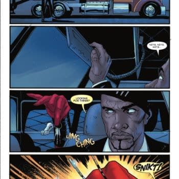
HMS: I notice that in one instance in the first issue, you use a sound affect, presenting it in rather large font, and at the same time white out the background around the characters and present them in bright red tones. What was your thinking behind that? To what extent do you think that sound and mood can be conveyed through color choices?
D: Color's a fantastic vehicle for conveying mood (also stuff like time of day and temperature). We talk about "warm" and "cool" colors, and those terms reflect emotional as well as physical "temperature."
The business with the sound effect was to get across how disruptive that single loud noise could be. The whole idea is for it to just cut across everything in the scene and change the focus. That's why I used an effect that doesn't appear elsewhere – it's deliberately jarring to try and get across the experience of the characters being jolted by this blast of sound.

HMS: Ordinary looks like it's going to contain a lot of transformation and surprising visuals. What kind of goals do you have in Ordinary to surprise the reader and how do you try to convey that in terms of panel layouts and the moments you present to the reader?
D: I'm actually keeping the art style and panel layouts of Ordinary pretty conventional – the idea is to try and make the reading experience completely transparent, so the reader is concentrating entirely on the content of the panels. The only trick I use, sparingly, is that for moments of intense action, I tilt the panel borders a little off the perpendicular. It gives a sense of everything lurching out of control.
A few people who've seen preview panels have expressed some disappointment to me that I haven't gone for a more dramatic visual style – such as I used for Stickleback or The Vort for 2000AD – but, frankly, there's so much amazing stuff in some of the panels that I didn't want the art style getting in the way of that. Interestingly, the comments I've had from people who've read the strip have been extremely positive, so I think the approach has been justified.

HMS: Were there any unique problems you encountered working on Ordinary?
D: There's a lot of real-world stuff in Ordinary – it's all pretty much set in real-world locations – and new technology means that for the first time I've actually had too much reference to handle! Between Google image search, Street View and the availability of free Sketchup models of key landmarks, I really felt that I had no excuse for fudging things in a way that I'd have just had to do ten years ago. You know, I'd have ordered a couple of picture books of New York and anything that wasn't in those would have been made up! So now, I'm looking for photo ref of a particular bridge into Manhattan, and not only are there tons of pictures out there, there are maps showing the traffic flows, and Street View lets you get the approach roads right. If you can't find a photo that gives you just the right angle, there's a Sketchup model of the whole thing (built for Google Earth) so you can get exactly the shot you want.
It can go to the point of insanity… I mean, at one point I'd not only found multiple reference shots for a particular building, I'd found a close up view of the exit, and shots of the street opposite, and I actually spent half an hour looking for a shot of the corridor inside the building before I admitted to myself I'd done enough and I could make that bit up! Sometimes you need to change stuff anyway… there'll be a bit in part 2 where Michael jumps a turnstile, but the turnstile at the real location is one of those tall whole-body ones that can't be hopped over. So I changed that to make the story work… but still, to be able to find all this stuff out so easily… it's nothing short of miraculous. We really are living in the future. I just wish we'd get the silver jumpsuits and jetpacks to go with it.
Enjoyed this? Please share on social media!
Stay up-to-date and support the site by following Bleeding Cool on Google News today!