Posted in: Comics | Tagged: jim mccann, mind the gap
Review: Mind The Gap #2 by Jim McCann, Rodin Esquejo and Sonia Oback

Mind The Gap issue two cements that there is the unknown element that was present in the first, and is in no hurry to explain that. I like this.
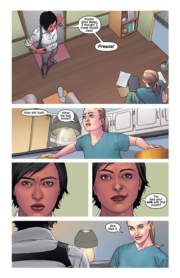
Esquejo and Oback bring a clean, less realistic, Larroca-like look to McCann's script with a keen eye for facial ticks. I'm not sure if there's photo reference in play here (or all the time, if it *is* in use) but the ability of the art team to allow us to connect to the cast is fantastic. Their use of clean lines throughout, and there's barely any more detail than there needs to be, but this is not an issue here, as you don't feel that there needs to be. My reasoning behind that sentence is that sometimes with low detailed work it can be a speed choice as well as a stylistic choice. Here I don't feel like it is for speed, but I do sometimes like me a naughty bit of background detail.
McCann's script is tight, never dwelling on a scene too long, and providing some great one liners. I can't see people complaining about hackneyed characterisations of particular groups, but then we all have our individual view points. I do like the natural humour that resides in every character, though. I think that it very much assists with readers empathy and perception of what is going on with a given individual. We do all have this, to some degree, and it's something that canny writers (most notably Brian Michael Bendis) bring to their work with relative frequency.
Perhaps that's the key to how this comic book flows so well, because it all feels natural and easy. We're absolutely fine with whatever dance the team wants to lead us on. An eager, anxious reader might not stick around three issues in to a new book with only the slightest glimpse of the truth. However, here, I think that they would (or at the very least, should) stick around, there is enough of a hook with the characters and the subtle hints at what's going on. Hopefully what I'm saying here isn't just a vague comment on shortening attention spans, though.
Focus in issue two is split pretty evenly between Elle and the Dotective/Detoctor team. Wallace and Gellar's marriage is treated with respect which is nice as there's scope for lesser writers to make things more hokey, or even insulting.
On the first page you get those clean lines from the off. Accentuated by the borderless panels it does make this book look and feel just a little different.
One problem that I've found since I started reviewing is that I notice things on re-read that I hadn't before. Check out the first panels on page one. Read quickly it actually seems fine (and it really isn't a big deal … ) but, reading it over again it does seem like the "Freeze!" came at the wrong point. I feel like Gellar wouldn't have been so surprised with the buildup that it had, where as a person bursting in and shouting "FREEZE!" would kind of shock a person. It's really fine as is, but I just noticed it and it niggled me slightly was all, and the natural character points I mentioned earlier are on show here.
To briefly go back to the design of the panels and the book: I do find a sharp difference with the design choice of the borderless panel with the London Transport ident on the chapter names. Without meaning to sound horrible, I think that it jars a little.
I like "Mind The Gap" a lot. It's fresh, funny and fearless. I like it more than I did "the unwritten" at this point, perhaps without the confidence of success you might have in a Harry Potter analogue. Issue two is a strong four out of five, and I really think that this book should be on your monthly pull.


