About
About 


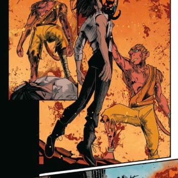
Lost Fantasy #10 hits stores Wednesday. The Great Hunters face their toughest challenge yet as Edge's assault forces them to strike back!
Posted in: Comics | Tagged: bernardo brice, La Voz De M.A.Y.O., lettering
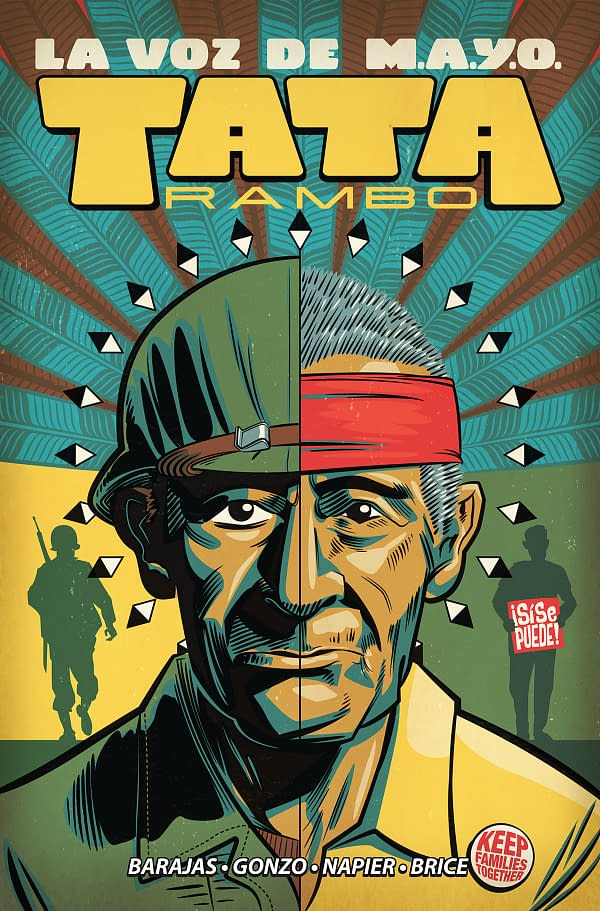
Talking About Comic Book Lettering with La Voz De M.A.Y.O.'s Bernardo Brice
La Voz De M.A.Y.O. Tata Rambo #3 is currently on Kickstarter and the trade paperback collection of the full series is due out in November. That makes it the perfect time for Bleeding Cool to speak with letterer Bernardo Brice about the comic and the oft-overlooked craft of comic book lettering.
Letterers don't get a lot of attention in the press when it comes to comics, even though lettering is an important part of making a comic. Colorists have recently gotten their names on the covers of a lot of comics, but letterers haven't. Why not? And do you think your day will come?
I have heard all kind of takes at this point. Some editors and creators are more than open to the idea, others want to avoid giving a "too many cooks" impression on their product, or even creators that believe sharing cover credit deprives them from having an "auteur voice", whatever that means. And you wouldn't believe the most moronic reason I have been given for not getting cover credit, despite being told I'd get it beforehand. So my expectations are all over the place on that matter.
I do some lettering myself, as an amateur, but for ten years now, so I like to think I know at least a little bit about it. But a lot of comic book readers probably don't know much. What are some of the things about the role that most readers probably don't realize?
Well, I have been a letterer for around five years so I'm not sure if you should take my comments as a great reference but, perhaps readers don't realize that usually great lettering is hidden within a great comic page. And that doesn't mean fancy fonts or pretty balloons, but rather a good reading flow. These days a lot of great artwork poisoned by bad lettering makes the user experience being more akin of deciphering hieroglyphs rather than reading a comic book.
Speaking of user experience, something else that perhaps readers and even creators don't realize is that letterers are the first line of defense on that matter. Unless an artist does their own lettering, Letterers are the first ones that see a comic page actually finished (even before the editor, which is the one that approves them for printing), so they have the benefit of providing factual feedback to creators involved for any problems across the board. And I hope most letterers do it but I think it's important to not only point out problems in advance but also offer potential solutions (like "rewrite this" or "move this bit to another panel") instead of waiting on the creators to notice their own mistakes and come up with the solution on their own. It saves times to all parties involved.
What tools do you use for lettering? What's your process like?
Adobe Illustrator is the usual application of choice for comic lettering. If time allows it, I also use Clip Paint Studio for hand-drawn SFXs.
My process usually involves praying beforehand so that the creators involved remember that they are working in a comic book and not in a film, an illustration, or a pin-up. When the former happens, the process is marvelous, almost like child play. The books that I'm working on right now are exactly like that, and I wish that was always the case. But as I mentioned before, since the letterer is the first one seeing the page finished, I take some moment to look at the finished work before submitting it the editor and I question myself whenever or not the reading experience of the page gets across as smoothly as possible, and give notes on any potential problems if necessary.
How do you decide what your style is going to be to suit a particular project? What are some of the things you did for this project specifically?
Usually it comes to the artist's style and the genre/setting involved. Some fonts are very "one-size-fits-all" but others can enhance more the atmosphere of the comic if chosen correctly. For example, a rough art style might benefit from a font with a similar personality for the dialogue, and a more experimental art style or unusual story setting might require a different font to fit the mood. That also applies to the captions, the shapes of the balloons and even the strokes on them. So I offer a quick lettering style guide to the key personnel involved so they have a chance to participate on the personality of the book, so to say.
In the case of La Voz, given the robust look and the 60s atmosphere, I decided to go with CC Samaritan for the word balloons to compliment that vibe. For the TPB collection I also choose to go with the Phenomena font for the location & time captions across the story, giving it a more unique retro look instead of the standard captions with italicized text inside them.
What does working on La Voz De M.A.Y.O. mean to you?
This is the first time I have worked on a full-length graphic novel based on real events, and Ramon's life and efforts are portrayed under very grounded terms, which is something I appreciate as a storyteller. And although I'm based in Chile (which makes my "latino experience" with the U.S. very different from the ones closer to North America) it's great to be involved in exploring topics in U.S. history that are largely unknown to the general public, despite occurring on relatively living memory. It's the kind of book that I think the industry needs more these days.
The trade paperback for La Voz De M.A.Y.O. is out in November, but before that there is one more Kickstarter for the third issue (in which backers can get the first two issues as well). Which version should people buy?
If you prefer collecting floppies over trade paperbacks, you should definitely back the Kickstarter. If you want to support both the campaign and the retail release, you can get digital copies now and then get the physical book in November. It's the best of both worlds!
What projects are you working on next?
I'm lettering the "Adora & The Distance" graphic novel by Marc Bernardin & Ariela Kristantina to be published under the Comixology Originals imprint this upcoming winter. Other than that I'm afraid I am buried over several NDA contracts. But I usually announce them on Twitter, and also check my website for all other ventures I have been involved.
[Editor's Note: Another of Brice's projects, Hidden Society, was announced by Dark Horse Comics at New York Comic Con after this interview was conducted.]
In your opinion, who's the greatest letterer of all time?
The one who drew that one glyph in, uh, that one cave. You know the one.
We previously spoke with writer Henry Barajas when the first issue was hitting Kickstarter, and you can read that here. You can also read the full first issue here. When you're done, head over to Kickstart to get the floppies, or preorder the trade at your local comic book store.
LA VOZ DE MAYO RAMBO TP VOL 01
SEP190069
(W) Henry Barajas (A/CA) J. Gonzo
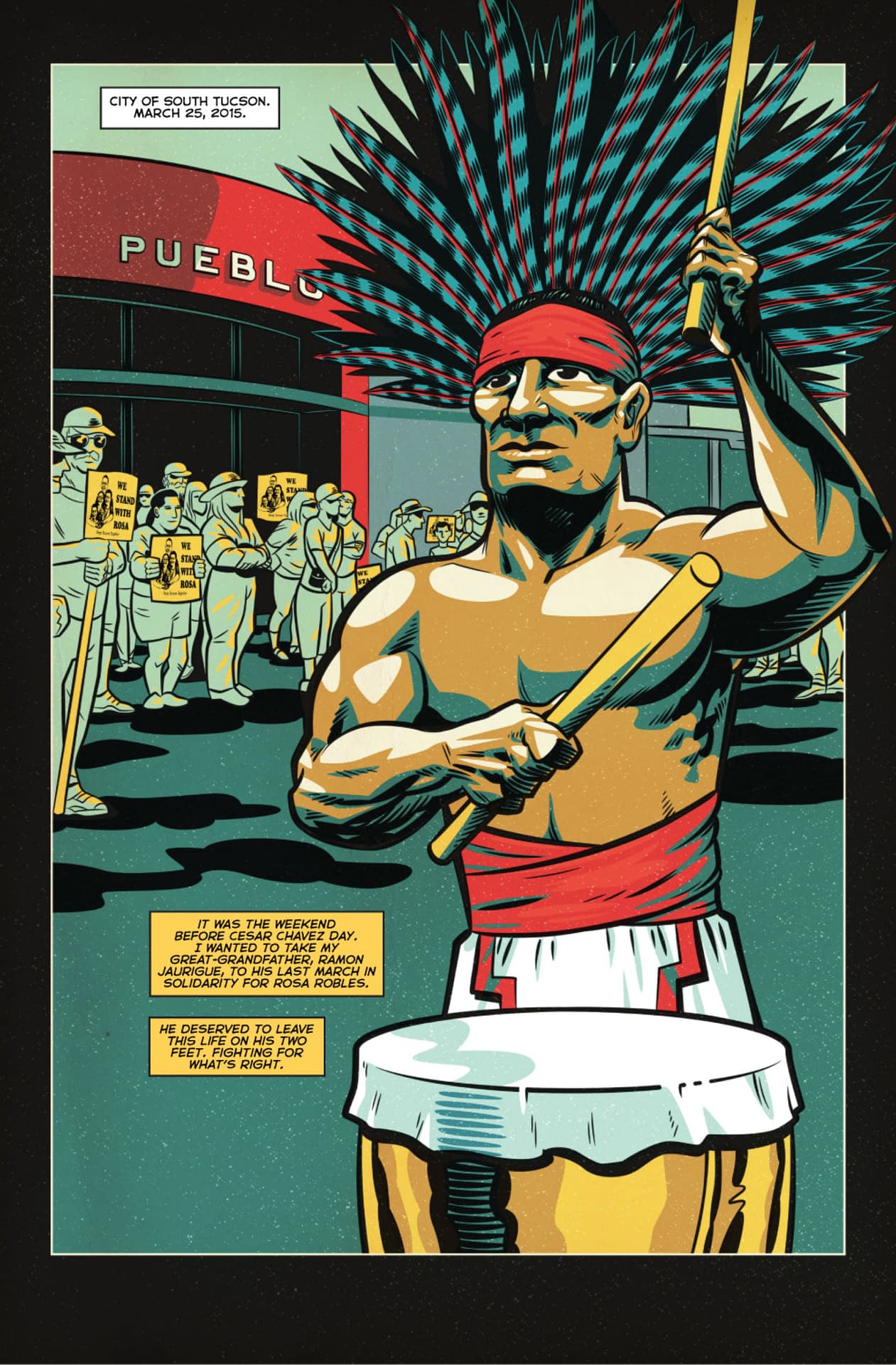
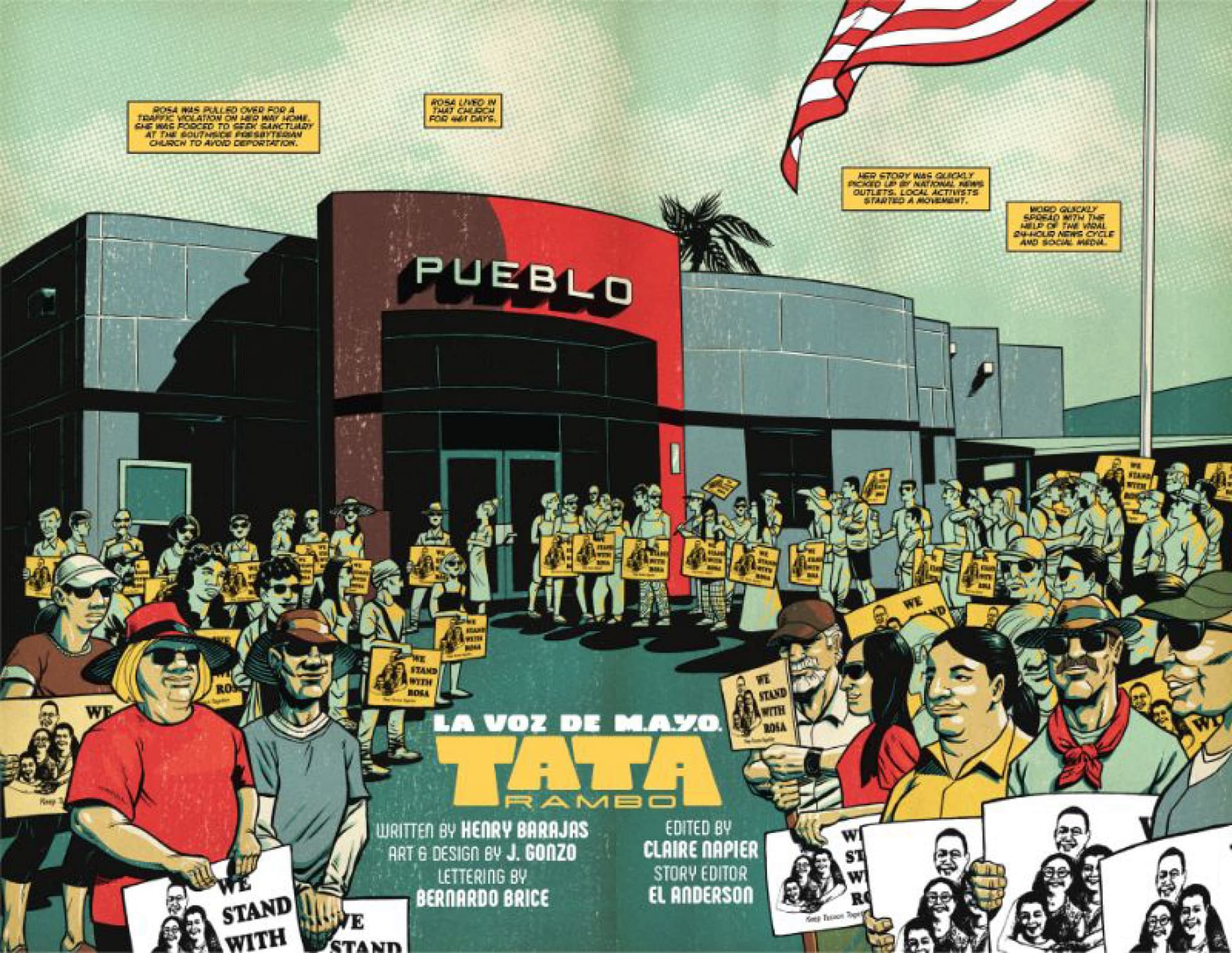
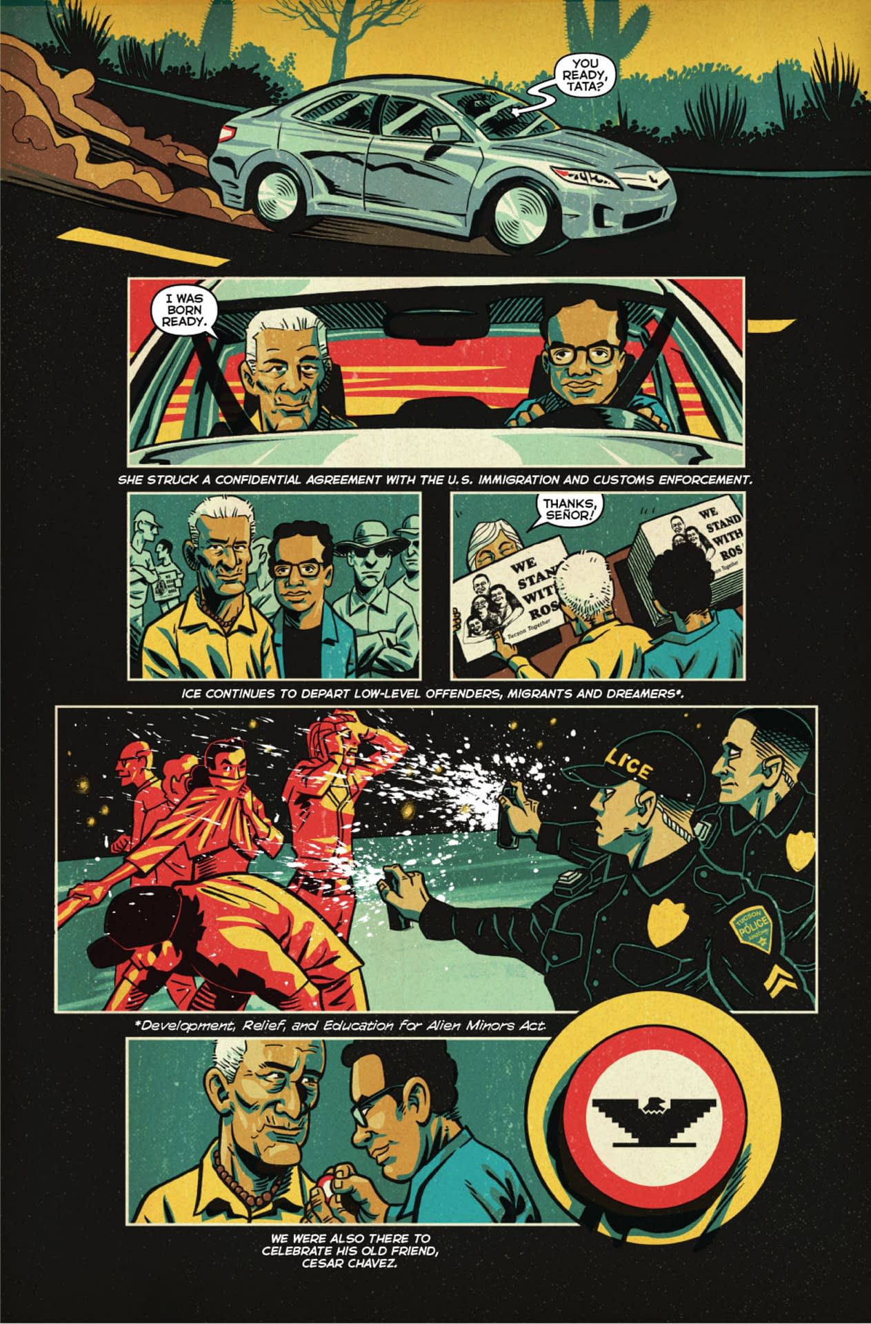
LA VOZ DE M.A.Y.O: TATA RAMBO is based on the oral history of Ramon Jaurigue, an orphan and WWII veteran who co-founded the Mexican, American, Yaqui, and Others (M.A.Y.O.) organization, which successfully lobbied the Tucson City Council to improve living and working conditions for members of the Pascua Yaqui tribe, paving the way to their federal recognition. Meanwhile, Ramon's home life suffered as his focus was pulled from his family to the wider community, and from domesticity to the adrenaline of the campaign.A resonant, neglected slice of American history is brought to life for the first time with art by J. GONZO, letter art by BERNARDO BRICE, editing by CLAIRE NAPIER, and a script by HENRY BARAJAS-the great-grandson of Ramon Jaurigue, a.k.a. Tata Rambo.
In Shops: Nov 13, 2019
SRP: $16.99
Enjoyed this? Please share on social media!
Stay up-to-date and support the site by following Bleeding Cool on Google News today!