Posted in: Comics, Image, Review | Tagged: Esad Ribic, image comics, ivan brandon, nic klein, sci-fi, vs, war
VS #2 Review: A Narrative and Visual Mess
Flynn returns to battle with a huge following, but another soldier on his team steals much of the spotlight from him. Upon his return from this fight, he finds that the world is more interested in the new soldier, and he loses sponsors.
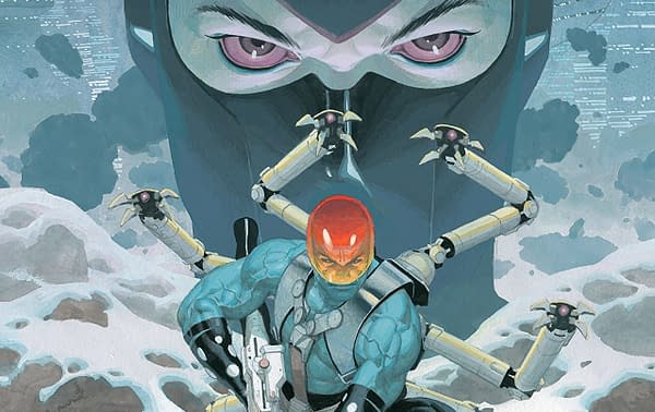
VS #2 picks up after another extended period of recovery for Flynn, as he was left barely alive in the last issue. The injury itself is not acknowledged by the comic, which left me a little confused at the beginning.
I returned to VS in the hopes that it may begin to correct a lot of the issues present in the first installment. Unfortunately, this is not the case. In fact, the problems are exacerbated, and the little charms are either absent or just less appealing.
Any attempt to follow the plot beyond the bare-bones narrative I listed above is a lost cause. The world of VS is vast and confusing, and the comic offers little in the way of explanation.
That could leave it as a character piece, but Flynn isn't an interesting character. He likes to fight and enjoys the glory. That's fine, but a character needs more than that if an audience is to care about your lead. I feel like I don't know Flynn, and, by the second issue, there needs to be something in a character to which an audience can attach. The most emotional moment we get with Flynn is when he loses a sponsor. It looks like they take his leg as part of the sponsorship, but he still has two afterwards.
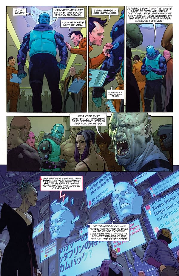
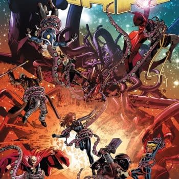
The extended fight scene is an aesthetic mess too. Discerning what's going on feels like a lost cause. This is where even Esad Ribic's artwork underperforms. Spatial relation between any two characters is impossible to determine, and the scene outside the battlefield is an overdesigned jumble. There are still moments where you can't figure out which characters are on which side. There's no tension if you can't determine what's going on. Parts of it look good, because this is still Ribic, and Nic Klein is a talented colorist to boot. However, the whole is far less than the sum of its parts.
VS #2 badly underperforms, and the first issue's positives are absent, leaving only the myriad of problems. The lead is dull, the visual design is a mess, and the story is incoherent. I can't recommend this one. Give it a pass.


