About
About 


Mike Richardson Fired From Dark Horse Comics, After Founding The Publisher 40 Years Ago... what's next? For them and for him?
Posted in: Comics | Tagged: Comics, entertainment
Chris Koehler, Creating A Legend. With Dogs.
Bleeding Cool ran some process art from the Legend comics series earlier this year along with Z2 Comics Co-Publisher Josh Frankel's essay, "What It's Like to be an Indie Comics Publisher."
It's now due out in trade paperback,and doing rather well on Amazon pre-orders it seems.
Artist Chris Koehler talks us through his process in creating the Legend TPB cover, along with his accompanying process art The essay, included as additional material in the collection, discusses how Koehler's color-blindness effects his artistic process, among other things.
I'm not a comics' artist. The component duties involved going into Legend were new to me. In a lot of comics, it seems like one person pencils, another inks, another colors, and so on. Each person has a specialization, so that an efficient group of like-minded artists create pages by combining their finest qualities. This is not something I am fit to do. My pencils look like chicken scratch, my inking is done in more tones than a colorist would want to work with, and my colors… if it's not clear that I'm colorblind then you're giving me too much credit.
What I can do is make images. I am a terrible team player, but a functional lone wolf. As an illustrator, I've learned to lean into my strengths and mask my weaknesses. I work in a way that is completely unique to me and make images that I can feel a distinct ownership of, for better or worse. All this is to say: my process is as unorthodox as it is confusing. Let's take a look:
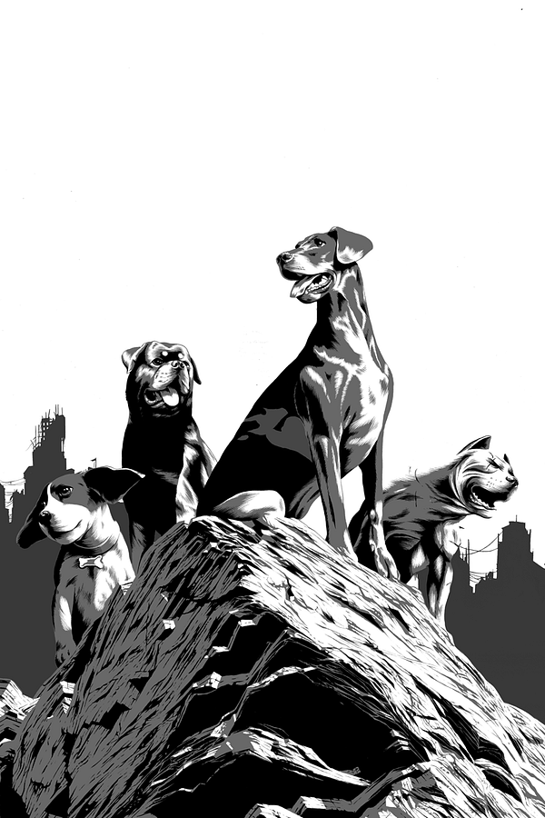
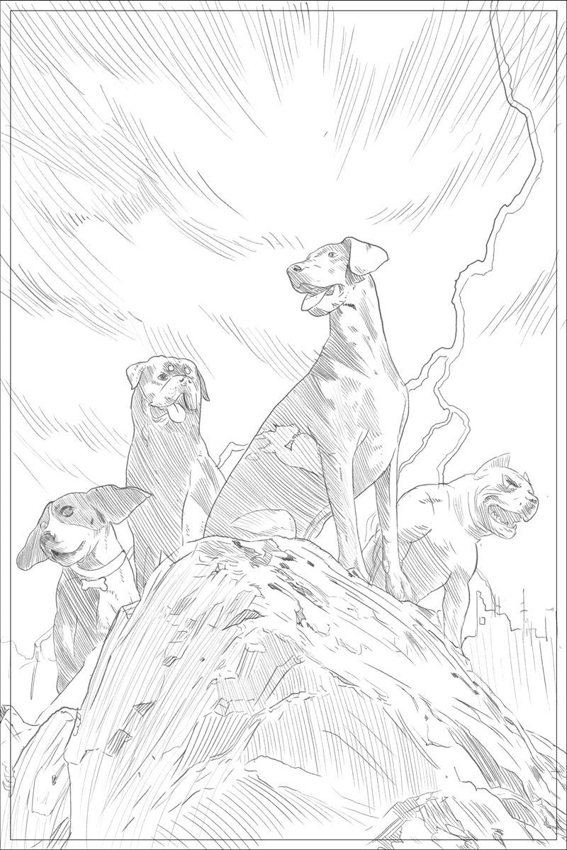
1- Thumbnails
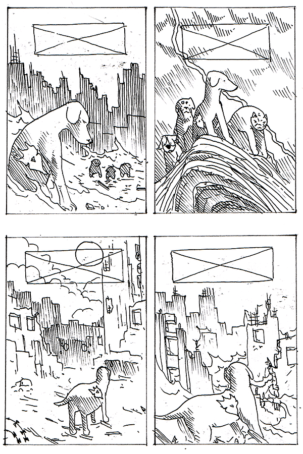
This is the ideation stage, trying out different concepts. Mostly to see if an idea translates visually at all and to try out compositions and elements.
2- The Final Sketch
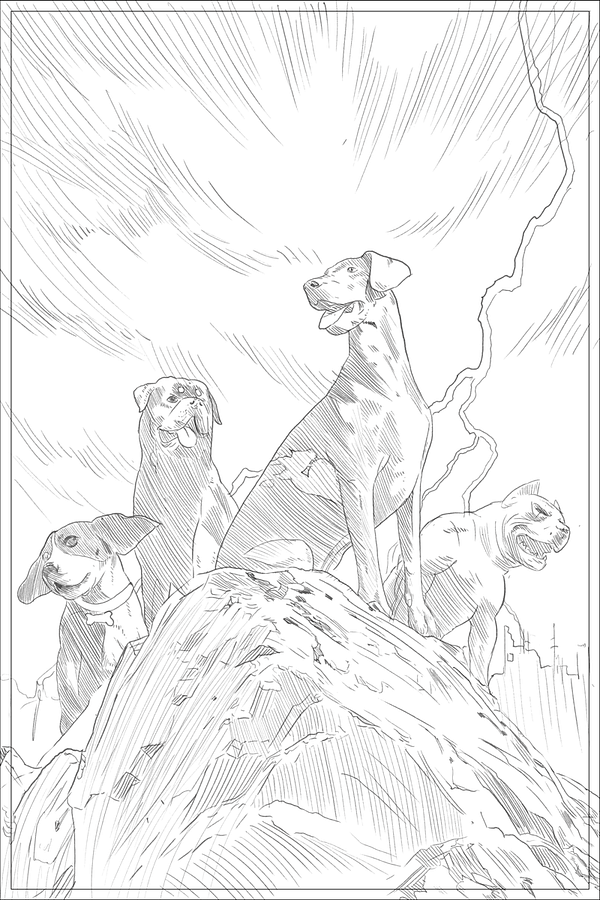
Once an idea is picked, I refine it into a final sketch. This resolves all details and value. There is almost nothing left to chance after this. All of the creative decisions, with the exception of color, have been resolved.
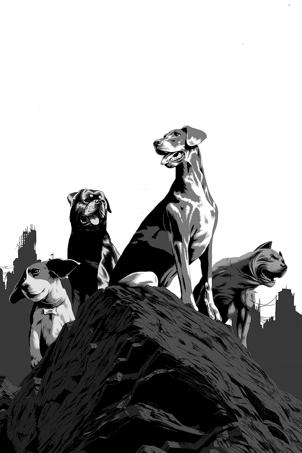
3- Inks
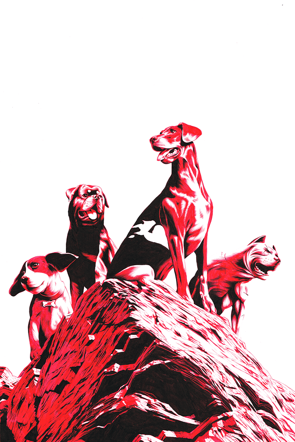
The actual components are inked on separate sheets of paper in red and black. I use red because it is the most malleable color to manipulate in Photoshop. It flattens to a single color channel.
4- Greyscale
I flatten the values, composite the separate drawings, and convert to greyscale. This simplifies the next steps.
5- Tones
After flattening the piece to three tones (black, 50% grey, white), I add in mid-tones and different values.
6- Texture
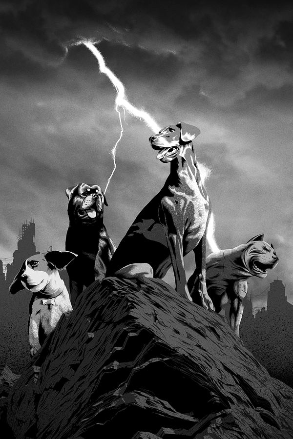
On top of the values, I add in texture with spatter brushes and scans of my own spattering. This gives the image a more organic feel and adds some grit.
7- Color
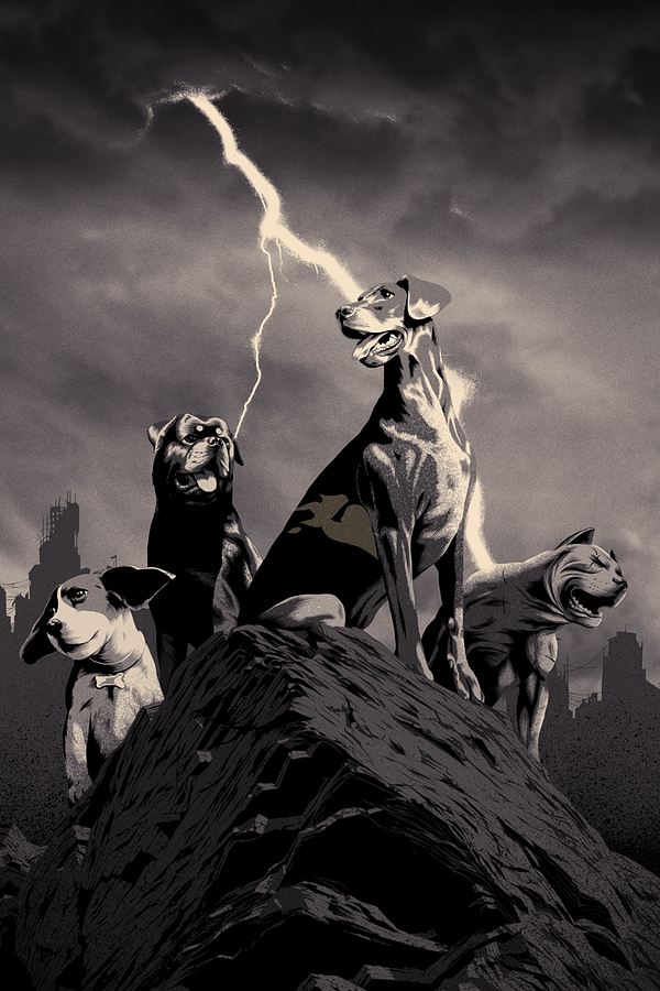
Once I have the image complete in black and white, I add in colors. For this image I wanted the light to be eerie and haunting, so I tinted it with oranges and yellows. I wanted the darks to feel unnatural, so I tinted them with purples. These colors are also complements on the color chart so they pop strongly when juxtaposed.
8- Dressing
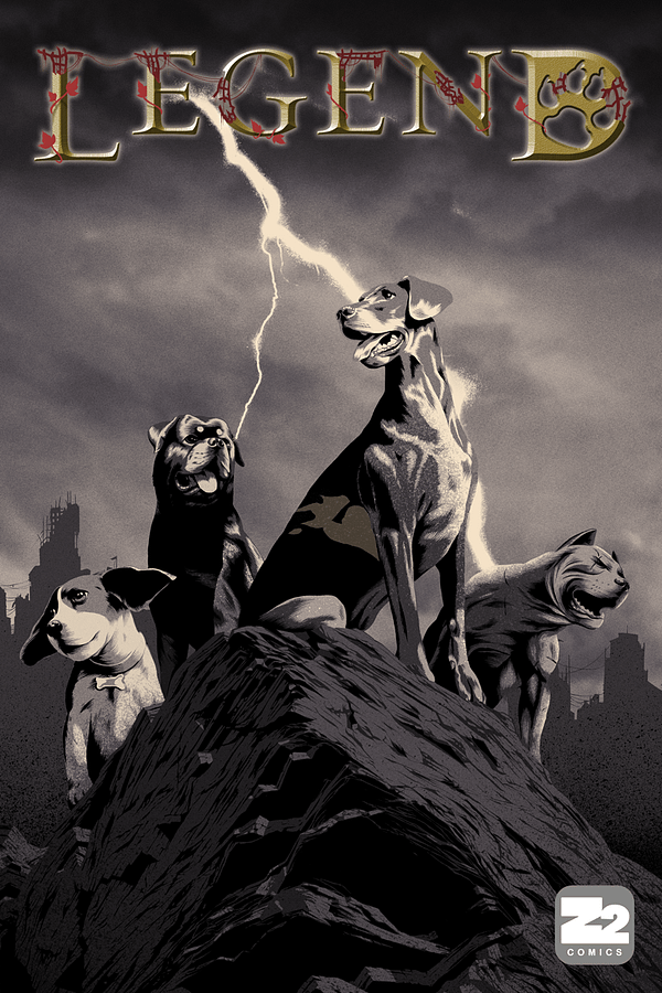
After the art is done, the title is added in
And that is how a cover is made!
Let's run the gif…
Enjoyed this? Please share on social media!
Stay up-to-date and support the site by following Bleeding Cool on Google News today!