About
About 


Lunar Distribution announces their comic book retailer alcohol meet-and-greet event for San Diego Comic-Con 2026
Posted in: Comics | Tagged: artists edition, barry windsor smith, Comics, conan
Conan: Red Nails – The Great "Matte Or Gloss" Debate Of 2013

Comic book retailer Tim Finn of Hub Comics, Somerville, MA, wrote to Bleeding Cool, concerning the recent Conan Red Nails volume from Genesis West, reprinting the original Conan art of Barry Windsor Smith. He writes;
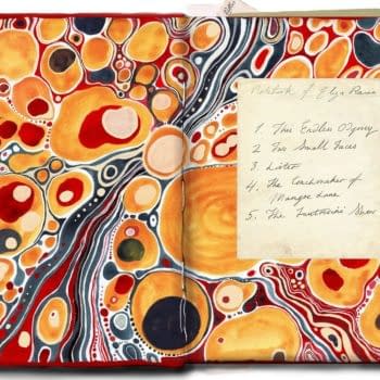
We received Genesis West's CONAN RED NAILS: ORIGINAL ART ARCHIVES HC at my store, Hub Comics, yesterday. Big slipcase, nice art, and an introduction by Roy Thomas. Looks good. We were a tad disappointed by the glossy paper, though. If the point of an "Artist Edition" (I know only IDW can use that term, but you follow me) is to as accurately as possible recreate the experience of having the original art boards in front of you, then matte paper is the way to go. Yes, ink doesn't bleed on coated stock, but glossy pages reflect a lot of light, and an oversized book such as this is already a lot to wrangle in your lap or on a table. It's hard to take in all the art in one view with such big glare bouncing back.
This next bit I'm neutral on — each two-page spread has only a single page of art. It's on the right-facing page. The left page shows a single panel or detail from that right-side page, blown up somewhat, a vignette on a black field.
Hopefully Dynamite will go matte for the Red Sonja book, and GW as well for their next go-round.
We wanted to hear Genesis West's take on the production decision on this book, which launched at San Diego Comic Con and its place in the now-growing original art reproduction market. Pete Koch told me;
Thank you very much for your input. We went back and forth ourselves on the glossy vs. matte selection. As art collectors ourselves our basic goal is to come up with the product that we ourselves would most want to own and hope that others would see it that way as well. Our goal is indeed to most accurately recreate the experience of VIEWING the actual original art- but this is not entirely compatible with recreating the FEEL of the art boards. When the printer ( who also prints IDW's books ) handed us proofs on the regular AE paper and also on the glossy paper it was clear that there was no comparison in terms of capturing the true nature of the art- as opposed to the feel of the paper- between the glossy and matte stocks. As we compared our glossy proofs to say the TARZAN and ROCKETEER books, again the was really no comparison. Take a look at RED NAILS for a while, then look at the books I mentioned, and ignoring the feel of the paper, judge for yourself which is really looks like the ART. As I said, in our view it wasn't even close. As art fans whose actual goal is to see and recreate the true artistry of guys like BWS, Kubert, Stevens etc. we have to go with what's more faithful to their work.
We toyed with the idea of going with a 50/50 print run of glossy and matte but we felt that as people looked at the matte book for a while and compared it to the glossy version, they would ultimately feel bad about having the matte version. We might give it a shot for the next one, but I can almost guarantee you that once anyone holds the two versions side by side, at the end of the day they would prefer the glossy version ( and like I said, we are using the same printer as for the ARTIST'S EDITIONS ).
So… what do you think?
Enjoyed this? Please share on social media!
Stay up-to-date and support the site by following Bleeding Cool on Google News today!