Posted in: Comics | Tagged: Comics, Elvira: Mistress of the Dark
Creators' Commentary – David Avallone and Dave Acosta on Elvira: Mistress of the Dark #1
David Avallone and Dave Acosta, creators on the new Elvira: Mistress of the Dark from Dynamite Entertainment, provide a creative team commentary to their first issue, out last week.
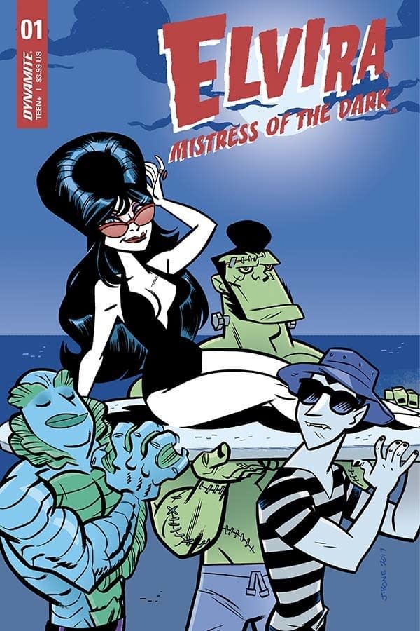
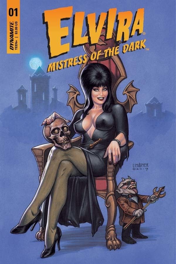
DAVID AVALLONE: So many great covers on this one. Joseph Michael Linsner with his classic pin-up look. I love the old paperback style of the Hack/Francavilla cover, and the crazy characters on the Jason Bone cover. Vampire Gilligan? Franken-hellboy? All that said… it's hard to top the photo cover, with Elvira herself…
AVALLONE: When Joseph Rybandt offered me this job, he knew I would want Dave Acosta on it. Neither of us knew Dave was a giant Elvira fan, which is a plus. Dave really helped me write this: he sent me covers of old Bob Hope and Jerry Lewis comics and reminded me that this had to be really light and really funny, in spite of the horror aspects.
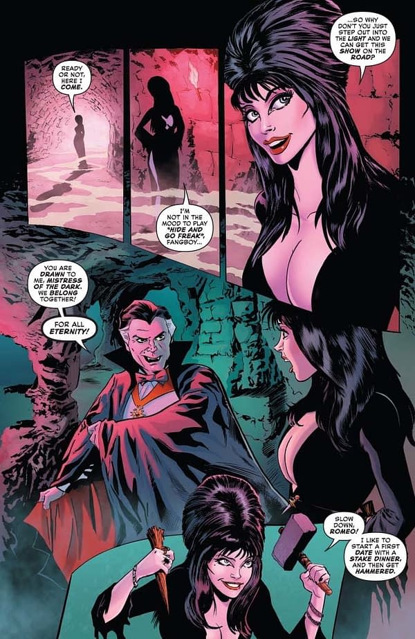
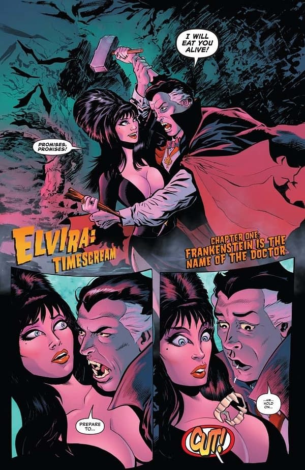
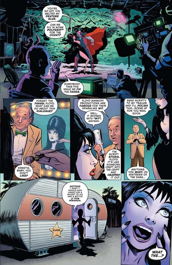
Eagle-eyed viewers may be able to identify the photo models who "inspired" our Dracula actor and our film director Floyd Mankoff. The name itself, "Floyd Mankoff," is not a particularly subtle tribute to a beloved and legendary independent filmmaker. Dave's choice for Dracula was entirely his, and cracked me up when I recognized him… at first "bite."
PAGES 1-3:
DAVE ACOSTA: I've been an Elvira fan since I was eight years old. When I found out Avallone was writing this series, I told him he'd better go ahead and put my name on it too; any other artist would have to fight me for it. Thankfully, it all worked out without any bloodshed.
Since we are taking a comedic approach here, I decided to adopt a cleaner, brush inked style. Much different from my previous work. I decided to try and not use any cross-hatching, only feathering, which is a good rule of thumb when drawing beautiful women; the less lines used, the better. My chosen aesthetic here is something like Angel and the Ape meets Tomb of Dracula.
I ended up penciling page 1 twice. I scrapped the first attempt and started over completely. It was okay, but it wasn't "right". Sometimes it takes a minute to get into the groove of a project. You gotta know when you scrap a page and start over.
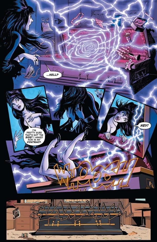
PAGE 4:
ACOSTA: This is a good example of why Andrew Covalt is an incredible colorist. The inks for this page were a bit cluttered. Andrew's colors brought clarity to the chaos and really helped the storytelling.
The comic in the last panel is the cover for Twilight Zone/The Shadow #1, another Avallone/Acosta adventure.
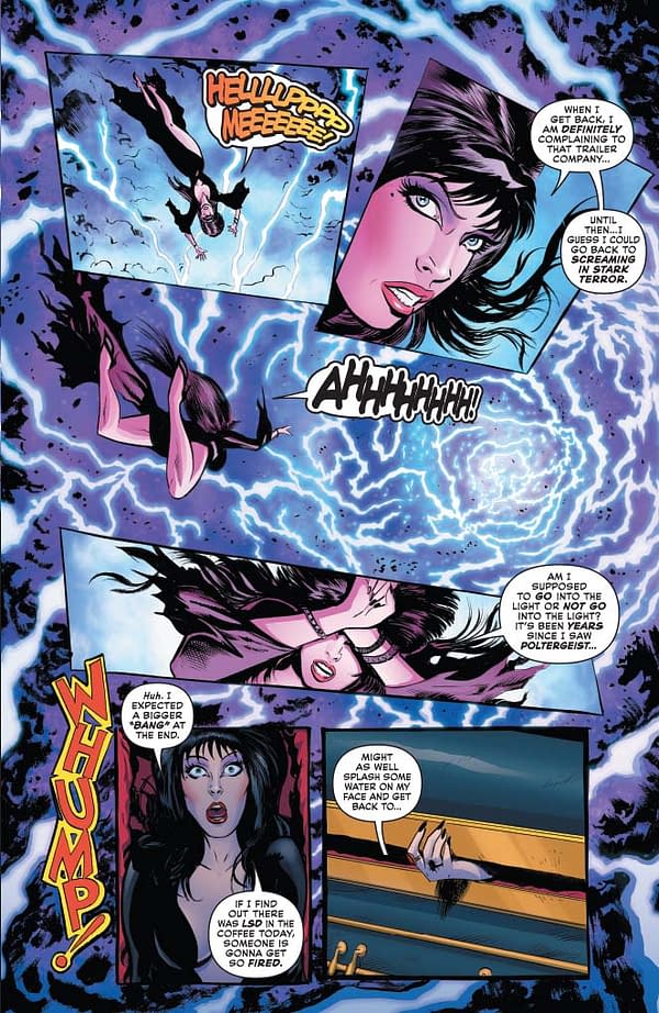
AVALLONE: Here we get the first (of many) fourth wall breaks. I read an early review of this comic which compared it to Deadpool (because of the humor and the fourth wall breaks). I've never been a big Deadpool reader (with apologies to Gerry Duggan), but Bugs Bunny and Groucho Marx pioneered the aside to the audience and it seemed perfectly in keeping with Elvira.
PAGE 6:
ACOSTA: Bride of Frankenstein is one of my all-time favorites. When David said we were visiting Mary Shelley on the night she first dreams up Frankenstein, giving a nod to Elsa Lanchester seemed appropriate.
AVALLONE: Elsa Lanchester looks nothing like the historical Mary Shelley, but the comic/satirical bent of this series makes me relax my obsession with historical accuracy a little bit in this comic. I re-watched Bride of Frankenstein prior to writing this issue and couldn't get over how gorgeous Elsa was in it. I thought it would be fun to use her "look" for Mary, as in that film's prologue. Also… Dave denies it was intentional, but Byron & Shelley REALLY remind me of Bill & Ted (of Excellent Adventure fame) in this comic.
PAGE 9:
AVALLONE: I love Andrew Covalt's work as much as Dave does, and I want to draw attention to the candle/fireplace effects throughout this sequence. Really great stuff.
PAGE 12:
ACOSTA: I went through a lot of different looks for our villain. We decided to go full tilt-comics and give him armor, the fur cloak, everything. David envisioned a Sean Connery Zardoz look to him, big and brutal. He also asked for him to have a hat you've seen in a lot of portraits of this historical character, but it was too damned silly, I couldn't make it work.
AVALLONE: It's a silly hat. No argument there.
PAGE 13:
AVALLONE: I wanted to get rid of the poets and boil it down to our villain and Elvira and Mary. They were fun while they lasted.
PAGE 15:
AVALLONE: A rewatch of the first Elvira movie reminded me that her knife is a cheap toy with a retractable blade, gifting me with this sight gag here, which Dave pulls off perfectly.
PAGE 16:
ACOSTA: Trying to draw the right amount of jiggle using pencil and ink — drawing comics is hard work, I'll tell you.
AVALLONE: Elvira will probably make a joke about variant covers in every single issue. Just warning you now.
PAGE 18:
ACOSTA: Drawing Elvira is such a dream. The silhouette and body language is so ingrained in the character. Makes it easier to draw tiny figures, like the ones on this page, and still have the figures be easily identifiable.
AVALLONE: I should say again how amazing Dave's work is on this book. He captures Elvira's expressions, and her beauty, without compromising either. Impossible to pull off this comic without that.
PAGE 20:
ACOSTA: The hardest part here was drawing a younger, baby-faced Poe, and still have him be recognizable. He'll probably look a lot older when Elvira's through with him!
AVALLONE: A good spot to draw your attention to the work of letterer Taylor Esposito, who gave the "Edgar Allan Freaking Poe" the size and emphasis it called for. Tune in next time for 20 pages of kooky fun with Elvira and Poe!


