About
About 


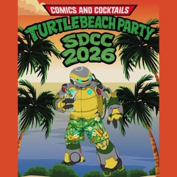
Bleeding Cool's Very Small SDCC San Diego Comic-Con 2026 Party List... a First Draft. Send in all your evening events to add to the list!
Posted in: Comics | Tagged: Comics, Doctor Who: Prisoners of Time, Federal Bureau of Physics, Itty Bitty Hellboy, overtaken, The Wake: Director’s Cut, tom strong
Live From The Comic Shop: Itty Bitty Hellboy, Overtaken, Doctor Who: Prisoners of Time, Tom Strong, Federal Bureau of Physics, The Wake: Director's Cut
Hannah Means-Shannon, senior New York Correspondent for Bleeding Cool writes;
It's a fairly big week for new issues, though next week promises to be a real maelstrom. That makes it the perfect time to grab a few quieter moments and appreciate some of the solid storytelling that's ongoing and splash around a little in genre comics. I'm here at my local comic shop Conquest Comics in New Jersey to check out the books as they come in and I'm anticipating some pretty alluring artwork this week.
 Itty Bitty Hellboy from Dark Horse is my top pick for the week, having waited since the announcement of the book with barely contained impatience after enjoying the collected Hellboy Junior trade. Art Baltazar takes on writing and art duties and Franco also features as writer. The cover is alarmingly pink and starry, but don't let that mislead you—this is Hellboy we're talking about, no matter how cute he is in this incarnation. The humor in the book is outrageous in its simplicity and ingeniously upbeat from page 1, panel 1. From reinforced "forts" made of cardboard boxes, gags on Roger's underwear, and Hellboy cheerfully ruling the roost, there's still an underlying super-seriousness of kids playing at war, making alliances, and puzzling out their own internecine conflicts. This is definitely a meta-commentary on the Hellboy universe, told in a comic strip-like style in a series of shorts, and is still a fun read even if you're not adept at the inside jokes. It's a book screaming to be created at some point, and luckily, it's here, and psychedelically, childishly strange and interesting.
 This is Aspen Comics 10th Anniversary year, and this week they launch the new sci-fi comic Overtaken written by Frank Mastromauro, pencilled by Marco Lorenzana, with colors by Wes Hartman. It ambitiously starts off with the beginning of life in the universe with some attractive cosmic artwork and the assumption that at rock bottom, all life is fighting for "power" and struggling against other life forms. Darwinian struggle gives way to small town Minnesota life for some newlyweds destined to be drawn into interplanetary schemes. The book promises "aliens and the unknown" in its future, though we don't get too much in the way of teasers for the upcoming plot of Overtaken. It's a story with potential, uncluttered artwork and engaging colors, but it will definitely take another issue to be sure exactly where things are headed.
 Doctor Who: Prisoners of Time from IDW has been running its course through twelve months of issues leading up to the Doctor Who 50th anniversary this autumn, with eye-candy covers from the pulp master Francesco Francavilla featuring the different Doctors in turn, and a plot that wends its way through the snatching of the Doctor's companions by a malevolent force. This week #8 comes out, written by Scott and David Tipton, with art by Roger Langridge and colors by Charlie Kirchoff. The 8th Doctor pursues a fairly lighthearted adventure with Grace on a puzzling Utopian alien world with medieval resonance before readers get a little more fodder about the Doctor's pursuant enemy, material which has been carefully doled out in small increments as the series has progressed. Here we learn that the hooded figure is the Doctor's "mistakes come to life", and there seems to be a building confrontation between the Doctor and his stalker, with psychological motivations at work rather than attempts at purely physical harm. Hints and subterfuge are meant to prompt the Doctor's memory, urge him to confront some kind of perceived wrong doing and acknowledge it, and until he does, everything will be taken away from him. Issue #8 takes us one step closer to revelations, and keeps up the pace on this tribute series.
 Tom Strong and the Planet of Peril hit the ground running in stellar first issue and it continues this week in its second instalment, written by the estimable Peter Hogan in his blockbuster team up with the great Chris Sprouse on pencils, Karl Story on inks, and Jordie Bellaire on uber-Strongian colors. Here we catch up with the pulp hero on his mission to Terra Obscura in search of a substance that can help Tom's daughter Tesla through a life-threatening pregnancy. As Tom says of Terra Obscura, "Anything's possible", and this is backed up by a planet in alarming decline, where Science Heroes seem to be an object of fear. Colors shift into autumnal hues, and there's more than a little sepulchral about this issue which has deliberate echoes of Edgar Allen Poe's infamous story, The Masque of the Red Death, complete with plague-themes. Terra Obscura turns out to be a "world falling apart", another mission for Strong to take up in pursuit of his greater goal of saving Tesla. As usual, Tom can't just walk away from a situation requiring a stolid savior, even with family on the line. Tom will be Tom, and in this case, Terra Obscura is lucky that he's such an unwavering pillar of defending "the helpless". For fans of the Terra Obscura storylines in the ABC universe, this issue is a treat for revisiting some of its most iconic heroes, getting the old team together again against a particularly subtle nemesis.
 The comic Collider lost its name (due to an IP title lawsuit with an upcoming film), and I will try not to lament that too much, even though covers were already lined up when the series found it necessary to change its name to Federal Bureau of Physics, written by Simon Oliver, drawn by Robbi Rodriguez, with colors by Rico Renzi and covers by Nathan Fox. Collider was a gem of a title, but the comic is still a gem of a comic, and the cover choice in issue #2 is decidedly clever and gave me a laugh or two, at least. Here we see the original "Collider" title visible but obscured by the looming badge reading FBP, signalling the name-change and reminding us of the book's origins. No name change would have kept me from reading the second issue of this comic, to be honest. It was a page-turner in issue #1 and continues, unsurprisingly, to be magnetically attractive in issue #2. The "fundamental interactions at work" in the universe are laid out just for our edification as "electromagnetic, strong nuclear, weak nuclear, and gravity", with gravity the weakest and most malleable, enabling the plot of FBP to run riot. The science commentary in FBP is part of the glossy sheen of the series, just enough to pique the imagination, and introduce us to the operative factors at work in the lives of its characters. Flashbacks to origin stories for characters continue, as per the first issue, but with a greater introduction to the infrastructure of the FBP, and of course more "physics incidents" to keep agents scrambling, and in danger. But issue #2 does not ride the coattails of the first issue, instead upping the ante on the unpredictable as agents encounter a "bubbleverse" with grotesque effect. The color scheme on the issue is a little more subdued and threatening, with green, blue, burgundy, and orange, than in the opening issue, a wise move that affects the feeling of pace, and reminds you that this sci-fi comic may contain more horror than you think. "A rose by any other name would smell as sweet", as the bard said, and well, it's true. FBP is the same shot in the arm, and it will keep you coming back issue by issue as its universe expands and sucks you into its own gravity well.
 A "Director's Cut" of Scott Snyder and Sean Murphy's Vertigo series The Wake has also been released this week, and being a pretty enthusiastic fan, I picked it up to see what it had to offer. Firstly, it has a reinforced glossy cover, and also presents the first issue of the series in black and white, which provides a unique look at Sean Murphy's stunning inks. It's an alternate way of looking at the mechanics of the comic, and forms an interesting commentary on what makes The Wake work. I wouldn't recommend reading only the Director's Cut, since the colors of The Wake are truly evocative, moody, and downright strange in a good way, but for fans of Murphy's work (who has done plenty of impressive black and white art, like on Punk Rock Jesus), this is a book to pick up and keep in your collection. But there are other reasons to find the book desirable. About half the book consists of cover art sketches, commentary from the creators, color character designs, process scripts, process inks, discussions about color on the book, and variant covers. In short, you get many of the things you'd hope to find in a deluxe collected graphic novel version, and if you're anxious to see them now, or someone who collects the issues and isn't likely to collect the trades, it's a good choice. As I've suggested before here on Bleeding Cool, The Wake is a work deserving of critical attention, and gathering up these extra materials is a smart move if you agree and want to track the book's development and progress.
Other highly recommended books coming out this week include the third issue of Joe Hill's Thumbprint from IDW, the chock-a-block anthology Occupy Comics #3, its final single issue for now (in which I edited the Alan Moore essay for the folks at Black Mask), Matt Kindt's endlessly compelling MIND MGMT at issue #14, and the one shot bold, and of course mildly twisted adventure tale Damsels: Giant Killer from Leah Moore, John Reppion, and Dietrich Smith. Don't miss out on the American Vampire Anthology, either, which gathers so much talent between two covers that it reminds you how many excellent creators are out there right now. I'll be sitting down with these books this weekend with a strong cup of coffee, or several, and reflecting that this has been a pretty damn fine week for comics.
That's all from me live reviewing from my LCS until next week (when I might have finally finished reading all these other excellent books) and happy reading.
Special thanks to Conquest Comics in New Jersey. You can find their Facebook page here. They are currently dominating POP vinyl collectibles with their White Phoenix exclusive and taking pre-orders for their Metallic Harley Quinn exclusive.
Hannah Means-Shannon is senior New York Correspondent at Bleeding Cool, writes and blogs about comics for TRIP CITY and Sequart.org, and is currently working on books about Neil Gaiman and Alan Moore for Sequart. She is @hannahmenzies on Twitter and hannahmenziesblog on WordPress. Find her bio here.
Enjoyed this? Please share on social media!
Stay up-to-date and support the site by following Bleeding Cool on Google News today!