About
About 


Lunar Distribution announces their comic book retailer alcohol meet-and-greet event for San Diego Comic-Con 2026
Posted in: Comics, Recent Updates | Tagged:
Countdown To The Eisners – Best Lettering
By Cameron Hatheway
It used to be people didn't acknowledge lettering in a comic book unless it was bad lettering. I know that was certainly the case for me. One of the signs of good lettering in a comic is that you get lost in the story, for the font or style used feels organic and fitting with the rest of the comic. Sound effects can steal the scene in a comic, but the overabundance of dialogue or blocks text can make everything appear mundane and unreadable. With the letterers in today's category, it's just a skill that comes naturally. I could never letter a comic because the entire thing would look like a long prescription being written by a doctor, which I'm not (but I do play one on TV). Today I'll be focusing on the Best Lettering category. If you need a reminder of what's been nominated, you can find the entire list right here, and see what I chose last time right here.
Keep in mind I cannot vote for who wins (nor can you, probably), as per the rules. However, that's not keeping me from being vocal regardless!
Who is not eligible to vote?
- Comics press or reviewers (unless they are nominees)
- Non-creative publisher staff members (PR, marketing, assistants, etc.)
- Fans
Before I get back to submitting my own font Cammy Sans to Comicraft so I can be eligible for next year, let the games begin!
Best Lettering
Paul Grist, Mudman (Image)
Throughout the entire series, the lettering seems a bit shaky, as if the narrator is constantly nervous about what's happening. The sound effects are large and colorful, but it feels like bold emphasized words are sometimes being used too much.
Troy Little, Angora Napkin 2: Harvest of Revenge (IDW)
Review copy unavailable.
Joseph Remnant, Harvey Pekar's Cleveland (Zip Comics/Top Shelf)
With a voice like Pekar's, one must embody his essence on every level including down to the lettering. That's what Remnant does in Cleveland as he adds the loose lettering that doesn't stay completely uniformed, giving it that slight worldly feeling. If old men had a font, it would be 'The Harvey Pekar' by Joseph Remnant.
C. Tyler, You'll Never Know, Book 3: A Soldier's Heart (Fantagraphics)
C. Tyler plays around with several different kinds of lettering, assigning a certain style to each character. Even the sound effects and background noises have their own unique personalities, and always keeps the reader's attention throughout. And unlike some other artists who write with cursive, I can actually read Tyler's without any problems.
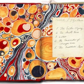
 Chris Ware, Building Stories (Pantheon)
The lettering in Building Stories is just as precise and intricate as the art itself. Every sound effect has its place, every word balloon is a certain size only filling up with so many words for a specific reason. Huge blocks of text don't seem daunting, for Ware's lettering is extremely easy on the eyes.
 Who I think should win:
Chris Ware, Building Stories (Pantheon)
This certainly will be the year of Chris Ware thanks to the several fantastic layers of Buidling Stories. Keeping things simple yet aesthetically pleasing, he's able to guide your eye wherever he wants with his superb lettering, and you'll follow with no questions asked. Whether it's cut-off, unfinished, over lapping, etc, your eyes are glued to the page and rightfully so.
Ware deploys some wonderful methods in how to letter, and you'll find something new and inventive in each story format. He letters things in a certain way for a reason, and when you realize that it will blow your mind.
Who I think could win:
C. Tyler, You'll Never Know, Book 3: A Soldier's Heart (Fantagraphics)
The lettering is just so inviting in You'll Never Know, as if Tyler is telling you to come for the story, and stay for the art. She keeps you on your toes with what style of speech will debut next, and why some words are deserving of the emphasizing and others not. The use of color at times is dazzling, and refreshing from the regular black and whites.
The legible cursive is also a high point for the book, for while it may be a dying art to some, Tyler keeps it alive and well and shows what's truly possible when done right.
Who I think should have been nominated:
Stan Sakai, Usagi Yojimbo (Dark Horse)
Bold and original, Sakai is a master at making the text and imagery so distinctive, that they pop right out of the word balloons!
Who do you think should win / been nominated?
Cameron Hatheway is the host of Cammy's Comic Corner and Arts & Entertainment Editor of the Sonoma State STAR. You can help him hunt down the bastard who created Comic Sans on Twitter @CamComicCorner.
Enjoyed this? Please share on social media!
Stay up-to-date and support the site by following Bleeding Cool on Google News today!