Posted in: Comics, Halloween | Tagged: aliens, Comics, Corinna Bechko, dark horse, dynamite, entertainment, Garbiel Hardman, Javier Garcia Miranda, vampirella
Corinna Bechko Does Commentary For Aliens / Vampirella #1
Dynamite and Dark Horse have released the first issue of a new series combining two horror icons… Vampirella and Aliens. The series is written by Corinna Bechko, drawn by Javier Garcia-Miranda and has a cover by Gabriel Hardman. Here we have the writer's commentary for the first issue by Bechko.
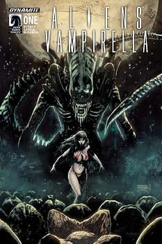
Page 2 – Aha! There's the first half of our equation! It's important that the introduction of our main monster be frightening, and that just what Javier delivers here. The mystery remains though. Where is the vampire?
Page 3 – Action! These people are fighting for their lives, and the battle is violent. If you've read this far you know that you're in for some serious bloodshed.
Page 4 – A big reveal on the page turn, one that Javier and I discussed quite a bit. Here's a vampire, but it's not Vampirella. Suddenly, the fight seems a bit more fair. Well, for a moment anyway. Readers of Nancy Collin's run on Vampirella will recognize this guy as a Nosferatu, which will hopefully make them ask even more questions. People who haven't read those earlier comics won't be lost though, since it's clear that he's a vampire of some sort, a point that will be very important later.
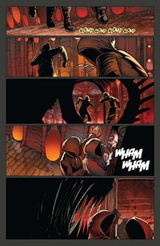
Page 7 – Hmm, this base seems to have a human crew. Not a vampire in sight. I felt that it was important to have some characters that were recognizably not alien since our hero is a bit of a monster, and our villain is very much a monster.
Page 8 – After that lovely shot of Vampirella in her iconic outfit, Javier and I decided that she should wear something more practical when actually on Mars. She still totally, confidently owns it though.
Page 9 – Some more introductions, and a bit more information about what's going on, including a hint about just how different Vampirella is from the humans that she's been hired to help. One of the challenges of writing a miniseries is making sure that the stakes are established pretty quickly, but not swamping the first issue with a bunch of exposition at the expense of action and mystery. It's a fine line sometimes.
Page 10 – The mystery deepens. I love how Javier handled that spooky second panel.
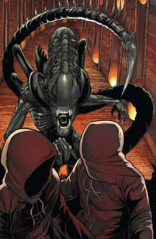
Page 12 – Some very creepy stuff here, and now Vampirella gives voice to what's worrying her. But the reader knows that she was concerned even before seeing these mummies. And that hopefully builds the tension better than a simple shock.
Page 13 – A bit more exposition, but coupled with something active. I feel like it's important to never do a big info dump all at once. This is comics, after all. People want to see more than words on a page.
Page 14 – Here's a bit of a trick. The reader already knows the horror that this page represents, but our characters don't just yet. It took me a little while to figure out a way for the scene to retain tension and not bore the reader, since they know what to expect and are waiting for it now, but at the same time allow the characters to act naturally as they discover the facts for themselves. Hopefully it worked.
Page 15 – My solution was to inject a little levity while ramping up the threat. But none of that would have worked if Javier hadn't done such a good job with the body language of the characters.
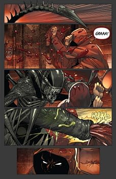
Page 17 – And… Now we see, right away, that even Vampirella isn't up to this fight. These creatures are dangerous! The reader knows this, but I felt like it was important to reestablish the stakes, and at the same time do something unexpected. In a book like this everyone is waiting for the big fight. I figured if we got it out of the way in a hurry, and it went badly, everyone could sit back and relax into the story from here on out.
Page 18 – A dream sequence! Yes, everyone loves to pick on them, but I think they can work if they help the pacing and the mood. Plus, it gives Javier a chance to create a really disturbing page.
Page 19 – 20 – Another place where fans of Alien will be way ahead, and that's okay. This is a downbeat, threat-is-past moment, except that it hopefully feels very tense because everyone reading knows what's coming. In the scripting stage, I had forgotten to specify that there should be dead "husks" on the ground near the group, but Javier and I talked about it when he was doing layouts and so they were included after all. It's really helpful when writers and artists can collaborate like that, and it makes for a better book.
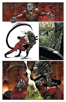
Page 22 – The chestburster scene in Alien scared me to death when I was a kid, so of course I'm happy that I got to write my own version here. Javier gave it great impact, and I love how you can compare the teeth on Vampirella and on the chestburster. So pointy, so wicked! Traditionally, a lot of Vampirella art is about looking at her chest, so I'm pleased that Javier and I found a new reason for that to be the focal point of a splash page.
For more information on Aliens / Vampirella #1, click here.


