Posted in: Comics | Tagged:
Kieron Gillen's Writer's Commentary on Peter Cannon: Thunderbolt #1
Kieron Gillen's Writer's Commentary on Peter Cannon: Thunderbolt #1 from Dynamite, out yesterday.
Hullo.
I actually do a bunch of these elsewhere for other books, so I'm always stroking my chin while thinking about how to do them. Not least that my chin has a beard on it, which implies how I can go if left to my own devices. When a book is doing all the things that Caspar, Hassan, Mary and myself are clearly doing this it can just come across as "Hey – this bit was clever. We're oh so clever, wait, why are you punching us?" Ideally, I'd rather avoid that. In which case – er – jokes? Random thoughts? We'll see.
Peter Cannon: Thunderbolt is our revival of the classic 1960s character Pete Morisi. It's about the characters' influence, and the influence of the characters he's influenced and other things.
Inside Front Cover:
I was at Marvel when the general page count in the industry dropped from 22 pages to 20 pages. Also, due to schedules, my books were among the first which dropped from 22 to 20. This sent me, to use the technical term, into a "tizzy." I started looking for ways to add extra pages to my comics which didn't come from the art budget. As in, you can have 20 pages of actual drawn art. If you can do a page which ISN'T drawn or re-uses art you can add more content for free. This started spiralling so it's basically now a major part of my style on creator owned books – we did a whole issue of WicDiv that was literally made from remixing panels from the rest of the series.
Anyway – a text page to give a little more context is an easy example of that. The Dynamite design folk and Caspar bounced it back and forth a bit. And lo! This! If it's good enough for Star Wars, it's good enough for me.
Page 1-5:
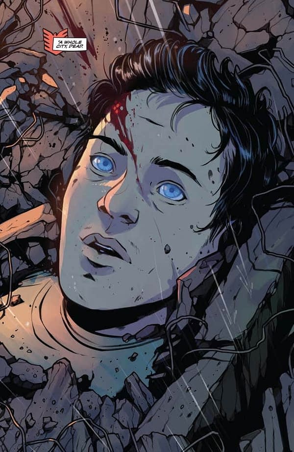
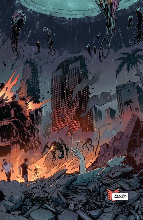
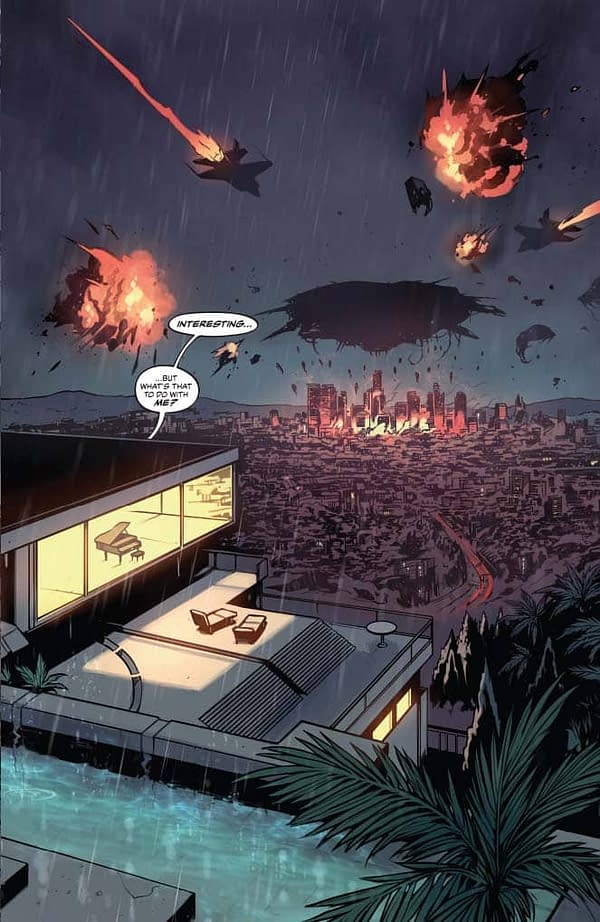
Splash pages! I'm not exactly someone who writes like this, but the set up for the reveal on page six demands it. And still – in a post Authority age, a splash page is meaningful.
A little word on the team – Mary has only really coloured her own work, and this is her first go at colouring someone else. Caspar asked her if she was interested, and it was (luckily) an angle she was interested in pursuing. As such, this adds so much of the pop appeal.
The captions are, I suspect, a flip of Morrison's opening page of ASS. How can you most quickly sum up a superhero plot? Two sentences. By the end of the story, what we're riffing on becomes pretty clear.
You have no idea how much we discussed the placement of the dialogue balloon on page 3. It's not even funny.
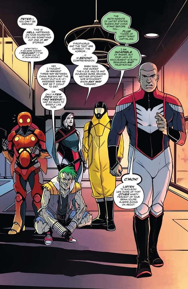
If we're doing five splash pages, we have to at least have a meaningfully large bit of key information in each page. We go to nine panel grids later, which adds a lot of density, but it's still taking a lot of space. This one is the one which does most, introducing our key supporting cast, who Caspar and I cooked up for the book. It's an interesting one to see how folks are going to take them. Some people who've seen stories in the press as "This is basically an unofficial Watchmen sequel" are almost certainly spotting the analogues, but I'm hoping folks who come in colder (i.e., don't know that at all) may be spotting analogues in another way. "Russian secret agent, hyper-tech suit, radiation-powered hero with unusual emotional issues, patriotic American hero and team wildcard with weapons for hands."
Analogues are interesting, conceptually. No comic "age" name has stuck after the Dark Age of comics. Gold, Silver, Bronze, Dark and… nothing. A name I liked (which didn't stick) was the Priasmatic age. The late 90s and 00s, a time where playing games with analogues was one of the dominant modes of credible comics. Hell, even stuff like the Ultimates universe fits in there, if you squint, and aligns with fanfic culture going supernova. Analogues allow you to talk about what you find interesting in a concept and jettison everything else – it's telling that, on a personal level, my favourite Superman stories are either Elseworlds or done with Analogues (Stormwatch CHANGE OR DIE, for example, or anything with THE SAMARITAN in Astro City).
Anyway – the thinking with this bunch was characters who existed in a conceptual venn diagram between two existing heroes. That kind of riffing. THE HULK meets THE ATOM'S INFLUENCE ON DOCTOR MANHATTAN or whatever.
Oh, I'm rambling and doing what I said I wouldn't.
Let's give a fun fact on each.
PYROHORUS's other inspiration was insect obsessed novelist Adrian Tchaikovsky. You should read his CHILDREN OF TIME instantly, as it's amazing. Jamie McKelvie loves it too. I genuinely cried over a spider in it. An actual spider!
THE TEST's other inspiration was the old Looking Glass Software critique of most firstperson shooter games as "Edward Pistolhands."
BABA YAGA is just an amazing folkloric figure. She's on issue 2's cover, which I suspect means she's Caspar's favourite design.
NUCLEON's balloons were Hassan's ideas, which is reason one-million why we had to have him on the book. Here's his podcast which is going through Watchmen page by page.
SUPREME JUSTICE is a pretty good example of how riffing can go to fun places. "Patriotic American Hero" got me thinking about how America never gets magical heroes, which led to the idea of a superhero who has been around since Independence, being selected by the President each time, and so on and so forth.
Hmm. That's not an interesting fact. How about "We tried to work out a way to give him a gavel as a weapon, but decided that would just look stupid."
Caspar had lots of fun designing these, to say the least.
Page 4… This is totally nothing I would normally write. There're writers who really like the multiple balloons over a splash approach. While it obviously can work great, I can never do it – it's simply not what purpose splashes serve for me, or what interests me in a moment to moment comic. However, in this case, it's the only choice that makes the exercise work. That the group is kind of a homage/critique/parody/whatever to modern post-Watchmen superheroes means it kind of hangs together conceptually, right? Well, maybe. Go with me.
Look at the lighting in this page! Hail Mary! Er… I didn't mean that as a joke, but it's just sitting there. I bet she's sick of people saying that. It's like people seeming to think they're the first person in the world to realize my name is similar to Karen Gillen.
Anyway! Enough whining.
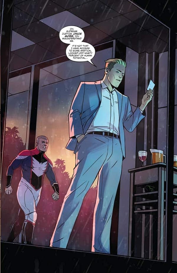
Page 5? And we meet our hero. "Hero." Protagonist, anyway. Starting him in a suit is just the way to go. Cannon's reluctance to "be" a superhero is one of his core traits, in basically any incarnation of the character.
He is so patronizing. I love it so.
The 90% of the brain thing is one of the things that fascinates me, because it's one of those facts everyone knows isn't true, yet still turns up all the time. Clearly, we subvert it here.
Page 6:
Basically "9 panel grid as superpower" is one of the ideas of the series. Despite someone who was transformed by Watchmen, I've never written a complete 9 panel comic in my whole professional career (though there's a handful of 9 panel shorts in my amateur days). Dancing with my biggest influences, in every way, was definitely a reason to do this comic.
Caspar similarly hasn't done anything quite this rigorous (though LIMBO has a lot of formalism). This sequence, with its clinical showing of Martial Arts involved research. I love the physicality in that eighth panel – look at the composition with the leg and face. Also – the sunburst glow in panels 4-6. Mary!
Page 7:
Oddly, I'm thinking Peter Cannon is looking like a dyed blonde Designer Supreme Rian Hughes in this panel. It's uncanny. Rian has never twisted my arm, but ironically, I did twist his arm to get him to design DIE.
Page 8:
Tabu is a total sweetheart and our whole team loves him. Honestly, he's a tricky character in the original comics, and working out how to place the relationship was tricky. The first line "He is not my master. He is my friend" pretty much cuts to the core of it, though we get a bunch more. Cannon is, as Supreme Justice notes, a prick, but whatever human we get of him, we see with Tabu.
I'm really interested in how Hassan made Panel 4 work – four balloons from a single character, and an implied story of vocal tone through it. Good work, Hass.
This is, of course, the origin sequence…
Page 9:
And the rest of it. There's a lot which is untouched, but there's various tweaks in it to move it to a different place. Cannon was already an archaeologist, and this curator-of-culture aspect seemed useful to bring forward. The "reader, guardian and interpreter of pre-existing culture" is, to state the obvious, also the position all of us are in, especially creators.
Page 10:
And big costume reveal! Re-worked in the modern style by Caspar, trying to take aspects from other versions. The Alex Ross version is definitely one of the high-up influences, but the angular lining approach is very Caspar too.
"I can. I must. I will" is basically Peter Cannon's superhero catchphrase, by the way. That's the interesting thing with working with a more obscure character, as you're aware parts of their architecture are entirely unknown to many of you reading. One of the weirdest things when I was working my way up at Marvel was to see how my work just got better reviews the second I put a bigger-name villain in them (or hero or whoever). As in, people just liked seeing Doctor Doom. People like the fan-pop moments of AVENGERS ASSEMBLE! And all the rest. And rightly so. But imagine how an Avengers book would work if barely anyone knew "Avengers Assemble" was a thing. You'd have to rebuild from scratch to earn that rather than just standing on the shoulders of all the previous work.
Comics are fascinating.
Page 11:
Wow. Seriously, look at these colours. The hot pinks, the blues, the energies and all the rest.
As the title may suggest, Cannon's ability to see clearly is very much at the core of the book. And, by implication, our ability to see clearly. Who watches the watchmen? Asked Watchmen. Obviously enough, we do. We should pay attention.
Page 12:
And we get vignettes to sell the heroes as actually competent beings. This punch through shot is very much an Apollo in the Authority beat – the use of the long-shot to show the scale of a superhero conflict rather than a mid-early-00s tight shot to show power. There is a lot of the Authority's DNA in this issue.
(It changes next. The series is a tour of moods and approaches to post-Watchmen comics. If this is Ellis, the next is Morrison. Spoilers!)
Good abs, Nucelon. Nice work.
Aloso – no
Page 13:
That Ellis liked the DO YOU LIKE BULLET VIOLENCE line pleases me, as I fear it's the most Ellisian line I've ever written. Writing THE TEST was a lot of fun.
As said – we're compressing a bunch here, but showing a storming in full flow is a lot of fun. Comic writers – note how we've slid into a three panel grid from the nine panel. I cannot tell you how much an artist will make a three panel sing if you give it to them.
Page 14:
I'm pretty much sure this whole page is just me doing Adrian.
Page 15:
In a couple of pages, we state what we're riffing on, but what strikes me when re-reading this is how close it is to the classical superhero team origin story. This really is the Avengers origin story, with alt-dimension Thunderbolt as Loki, if you squint.
(Peter Cannon: Thunderbolt is the Thor in this equation. Thunderbolt. Geddit, etc.)
I love what Hassan did in the balloons in the final panel. The long trail between the penultimate and final balloon implies time passing.
Page 16:
You know, when writing comics, it's all about what you choose to spend space on. We effectively do a pretty strong superhero battle in four pages, and then spend space to linger here in these moments with Cannon drinking juice.
In passing – if you're doing a quiet scene like this, it's always useful to give a character a prop. Artists need something for the characters to do, or the page looks dead – and that's doubly so when you're deliberately having a relatively static choice like here.
I smile remembering Hassan messaging me excitedly when he reached panel 5, which is the "Oh! THEY'RE DOING IT!" moment in the comic.
Mary's naturalistic lighting here rather than pop, which seems to ground the scene to me.
Page 17:
This is the most sinister extended orange juice drinking I've ever written.
Page 18:
AND PUNCHLINE!
We did talk about having SEVERAL DIMENSIONS AWAY in the middle balloon, but decided against it. No need to handhold.
Page 19:
I did an hour-long speech about Watchmen back in 2014. It was recorded, and put online here. This was inspired by my observation that Ozymandias in front of his screens is much like a comic reader in front of the panels (expanded by the brilliant Si Spurrier who notes that Ozymandias at a key moment in Watchmen is in front of 18 screens – as in, two 9 panel grids.)
Oh no! This was meant to be jokes. I've actually talked about real stuff. Sigh! I am the worst.
In passing, I look at this page and am really into how Caspar has made this both be a splash page while also functioning as a nine panel grid in a completely different way. Watch, indeed. Drinks on me, Caspar.
Page 20:
We could have made him blue, but we felt that would be too much.
Oh no. 2300 words. That's over twice as long as the two example commentaries Dynamite mailed at me. I am oh so sorry.
Thanks for reading. I've just been going through the pencils for issue 3, and laughing. We're having far too much fun. We're hoping you do too.
Next: Even weirder formalist stuff! Which is great, as Weird Formalist Stuff brings the boys to the yard. Which is great, assuming you want a bunch of boys in your yard. I can't work out why anyone would want boys in their yard. I don't even have a yard.


