
 About
About 


John Wagner, Creator of Judge Dredd, gets an MBE from King Charles III on the eve of the character's fiftieth birthday
Posted in: Batman, Comics, Comics Publishers, Current News, DC Comics, Justice League, Superman | Tagged: Corner Box, corner boxes, flash, green arrow, green lantern, nightwing, Titans, wonder woman
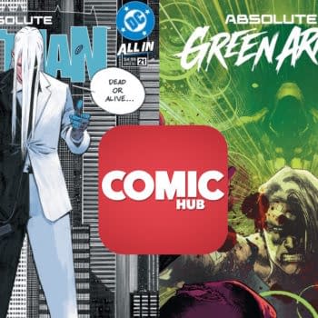
Looking At DC Comics' New Corner Boxes For 2024
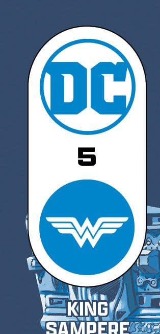
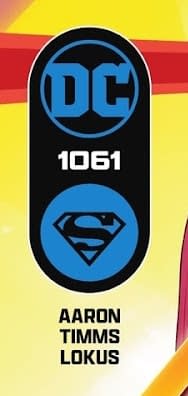
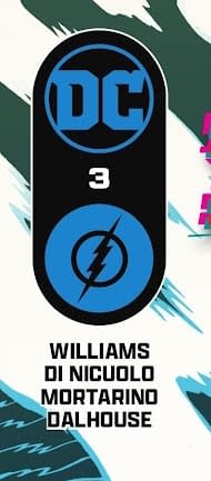
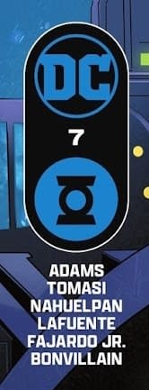
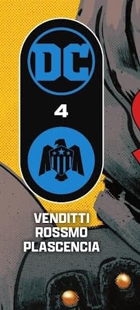
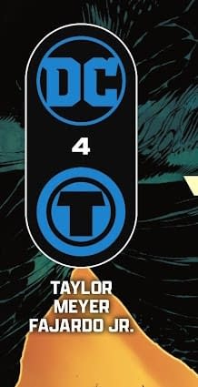
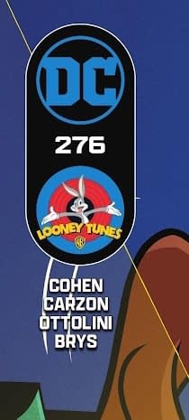
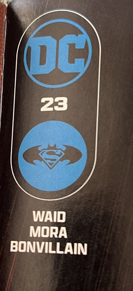
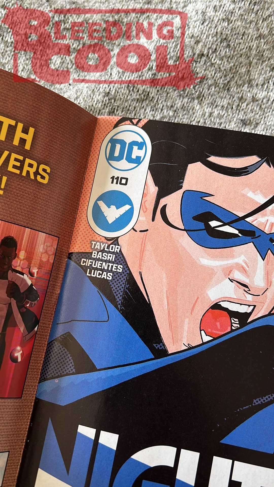
We now have a better look, across the line at DC Comics' new corner boxes logos, that delineate between the different "groups" of titles.
Article Summary
- DC Comics introduces new corner boxes in 2024 to categorize titles into groups.
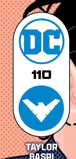
- Bat family characters share a logo, but Nightwing has a distinct corner box.
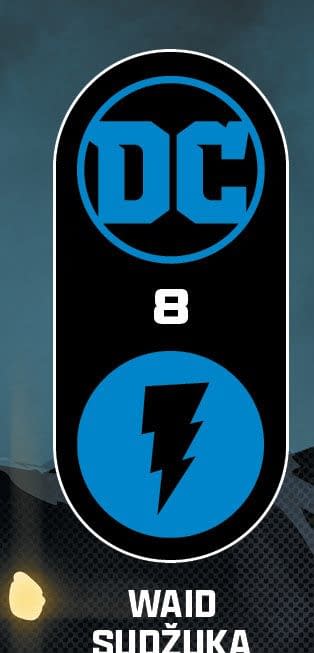
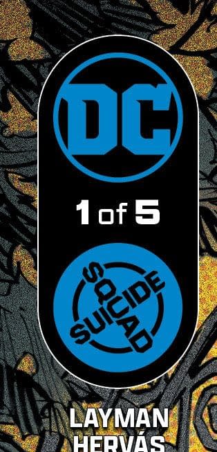
- Unique corner boxes created for Wonder Woman, Flash, Green Lantern, and more.
- The design approach harkens back to past branding attempts, now with a dual logo.
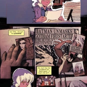
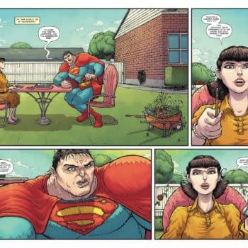
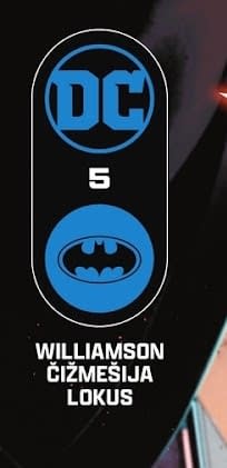
They began last week, but we now have a better look, across the line at DC Comics' new corner boxes logos, that delineate between the different "groups" of titles… Some are clear and expected, Batman, Superman, Titans and the like. While Catwoman, Poison Ivy, Birds Of Prey and Harley Quinn come within the Bat symbol, Nightwing gets his own, separate from Batman and from Titans.
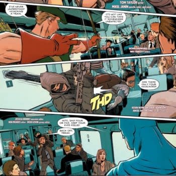
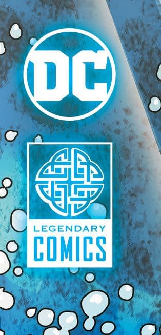
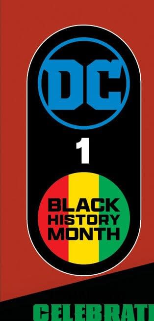
Wonder Woman, Flash, Green Lantern, Green Arrow, Suicide Squad, Looney Tunes and Scooby Doo have their own, while the DC Power oneshot gets a Black History Month logo all to itself. And rather than Justice League VS Goidzilla Vs Kong gettin a Justice League logo, Legendary has its own corner boxes.
Corner boxes have often been a way for both Marvel and DC Comics to try and add a little extra branding, whether the nme of the publisher, the look of the character – or characters – but this seems to be a more purposeful branding activity. And also lets you know that Catwoman belongs to Batman, but Nightwing does not. Though that may be a more accidental implication. And I do like the Green Arrow G as an arrowhead look, isolated like this.
In the '50s and '60s, DC Comics just used the publisher logo, then started to throw in Superman, Supergirl and other logo combinations, before we got the bullet logo of the seventies. DC Comics tried to copy Marvel's use of character corner boxes for a while… and may have even attracted one or two Marvel Comics readers to pick up a copy, but both publishers have droped that approach right now, with occasional sporadic revivals for nostalgic reasons,. Or because Mark Brooks really wants to do it. But now it seems that the double logo from DC Comics is the way they'll be doing this going forward.
Enjoyed this? Please share on social media!
Stay up-to-date and support the site by following Bleeding Cool on Google News today!