Posted in: Comics, Recent Updates | Tagged: Comics, dark horse comics, entertainment, greg rucka, Tony Fejzula, veil
A Stained Glass World Darker Than Hell: Veil Vol. 1 From Dark Horse
When I heard that Veil was announced at New York Comic Con about 18 months ago, I was particularly interested to see the comic, and when it arrived, I managed to pick up the first two issues before being side-tracked by the sheer heft of comics being published now and hesitating about which titles to read in single issue and which to try to catch in trade. When I saw that the collected edition of Veil had come out, spotting it on the shelf in a comic shop, I didn't hesitate—I would at last get to finish reading that story.

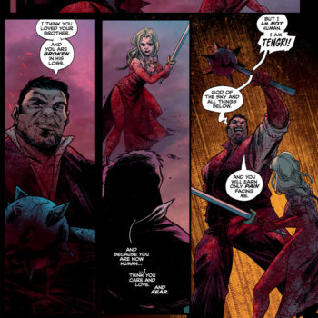
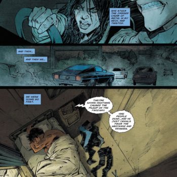
For me, part of the reasoning behind this was the really exceptional art by Tony Fejzula. His use of angles and geometric spot-shading, which you can even see at the planning stages of his pencils as extra material included in this trade edition, give the book such a distinctive look and make you more conscious perhaps than usual of the "art" behind this artform of comics. His colors, assisted by Aljosa Tomic, are just outrageously original. As a reader, I feel I am watching an entire narrative play out as screened through stained glass windows, an impression completed by the angular form of his linework. Anyone who has seen Veil must certainly be struck by its unique artwork, something that brings to mind poster art and Expressionist paintings just to name a couple comparisons that spring to mind among many. Why am I particularly happy to read a story presented like this in collected format? Because it reinforces through sheer number of pages the statement the artwork is making for me, and also helps me pick up and keep in mind the elements of Fejzula's style that are worthy of note.

But let's talk about Greg Rucka's writing for awhile as well, also. Firstly, he seems entirely aware of his co-conspirator Fejzula's need for room and air in the narrative and appears quite comfortable with the use of silences that simply "show" characters in the context of their environment. For that, Rucka had to build quite a significant environment that would play a role in the story in key ways. We have the heavy impressions of the subway where Veil first wakes up, the chaos of a Times Square like street situation she encounters, Dante's abode as a friendly stranger tries to keep her safe for awhile, and later the church where the mysteries of her occult existence are more fully explained. All of these environments suit a kind of tone for this Gothic story.
These locations are primarily dirty, dangerous, and predatory, and ironically, none more so than the church Veil encounters eventually. They give me the impression, though Rucka may not have intended it, that Veil is actually trapped in various circles and hells in keeping with the Dante theme introduced by her friend's name. Everything in the story is enclosing and "chaining" and it's wheels within wheels of corruption. How could anyone find their way out of that? How could there be any light? And by comparison, how could anyone seem worse, no matter what depth they might hail from, than the human beings who make their own world a hell in this story? So, yeah, deep things are going on thematically in Veil.
Rucka's biggest triumph here, in my opinion, though, is in the characterization of Veil, and by reflection, Dante. The whole premise of the book demanded that Rucka be able to present a character who has Infernal roots and yet is the being you're inwardly championing as a reader. How does one do that? Well, Rucka chose to take the path of presenting a great deal of vulnerability, or the semblance thereof, and giving us plenty of room to see the evil in human beings before revealing too much of Veil's dangerous qualities.

Since this collection is labeled Volume 1, let's hope for more from Rucka and Fejzula. They've created a unique perspective in the persona of Veil and a world worth exploring much further in terms of its heights and depths.


