Posted in: Comics | Tagged: marvel, uncanny x-men
Not a Single Foot Has Appeared on an Uncanny X-Men Relaunch Cover… The '90s Are Back, Baby!
It's the most exciting comic book revival in the history of comics! The return to prominence for an oft-abused franchise! It's… a bunch of characters standing around doing nothing?
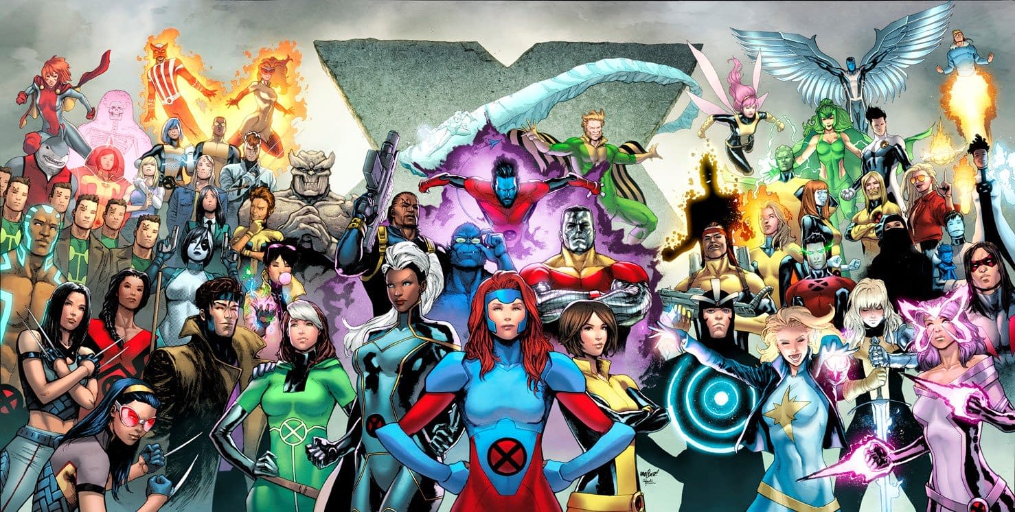
Last week Marvel revealed the creative team for the upcoming Uncanny X-Men Revival, and with it, a teaser image by David Marquez and Rachelle Rosenberg featuring a huge roster of mutants… standing around.
Which is fine. It's cool to see all of these characters gathered in one place. It's a teaser. It serves its purpose. It would make a cool poster. But when Marvel revealed the actual cover to Uncanny X-Men #1 this week, by Leinil Francis Yu and Edgar Delgado, once again, it was… just a bunch of characters standing around.
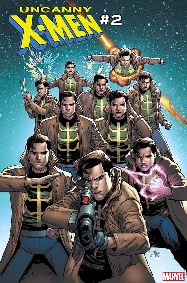
And the next day, when they revealed Uncanny X-Men #2's cover by Yu and Delgado, it was multiple versions of one single character standing around in the exact same poses as the characters in the previous cover.
Now, we don't want to nitpick and start off with a negative attitude about this relaunch, which we're genuinely excited about, but we do have to admit that the pinup pose cover is both a personal pet peeve and a tired and frankly lazy cliché which, and we're just sharing our opinion here so try not to get too offended by it, doesn't really do anything to sell a comic to anyone who wasn't already planning to buy it.
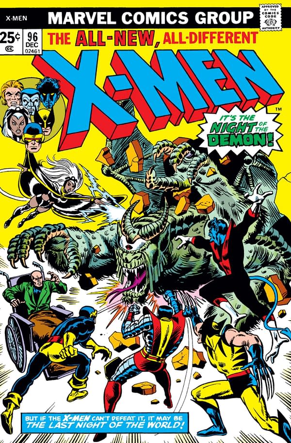
Let's see if we can explain what we're talking about. You could pull up pretty much any random X-Men cover from the book's classic years. Pick any random number… say, X-Men #96:
…and you'll find the visually exciting cast engaged in some action-packed or dramatic scene, often with a caption questioning whether the X-Men can possibly survive whatever threat they're facing down this month. One of these guys has metal skin. One has claws. One shoots lazers from his eyes. One is flying and shooting lightning. One is blue and has a tale. They're facing off against a grotesque monster. The caption tells us this could be THE LAST NIGHT OF THE WORLD! Well, we've got to see what's going on in there, don't we?
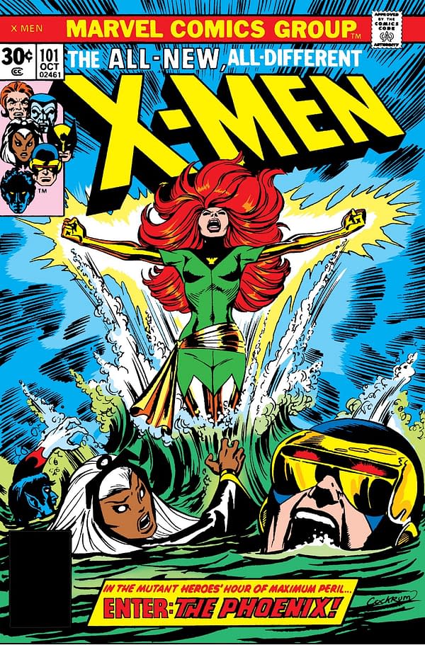
How about X-Men #101:
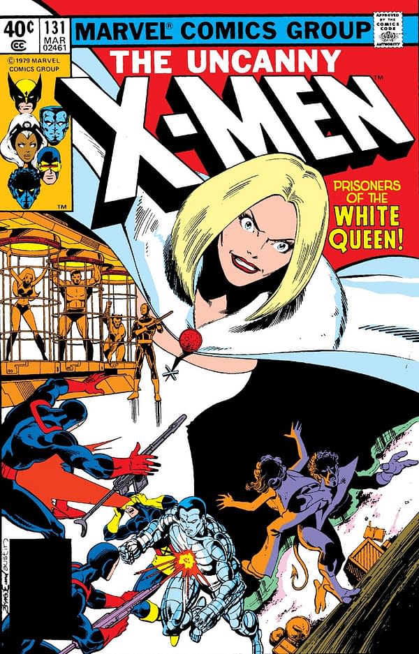
Or X-Men #131:
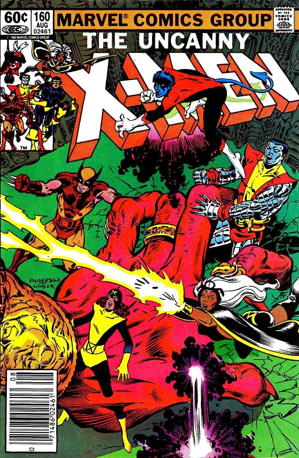
Or #160:
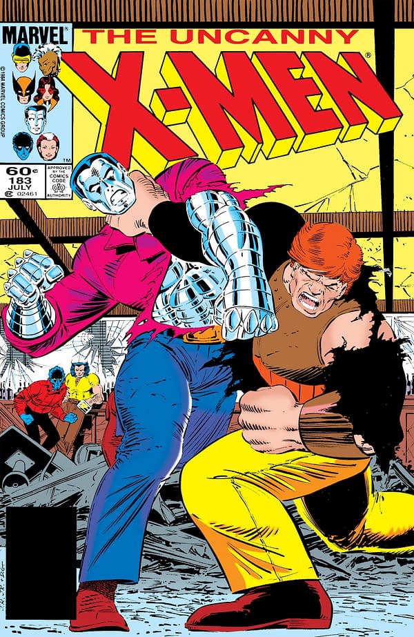
Or #183:
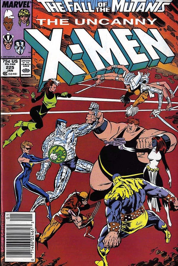
#225:
With any of these covers, a reader passing by one of these in a comic book store or on a magazine rack might have never read an issue of Uncanny X-Men before, might have no idea who the characters are, but can get still get a sense of what's happening in the book. They can get a feel for who the characters are and how their powers work. Each of these covers tells a story on their own. The covers serve as cliffhangers, and the reader needs to buy and read the book to see how these characters will get out of whatever jam they happen to have found themselves in.
For some reason, it seems these kinds of covers have fallen out of favor, replaced all too often with characters just kinda standing around, or at best making a half-hearted action pose directed at… the viewer? There's no hint of any kind of conflict that needs resolution. No clue as to what the story is about. Here's some characters that appear in this comic (or in the case of many Marvel line-wide variants, characters that have nothing to do with the comic at all).
We couldn't begin to speculate on why this happens. Is the original art for these covers easier to sell? Is it just a matter of getting paid for the minimum possible effort, phoning it in like we do when we post a clickbait article about someone said on Twitter (in which case we would at least understand it)? Is it a lack of ideas? Do the cover artists not know what's going on in the comic when they draw the cover? Or is there legitimately some creative choice where "characters standing and/or crouching" is seen as desirable over "characters doing literally anything else at all?" We know this sounds harsh, and we don't mean it to be. It's nothing against Yu or Garland, who are perfectly capable artists who could produce an exciting cover if they chose to. This is an industry-wide epidemic. We just want someone to help us understand what its purpose is.
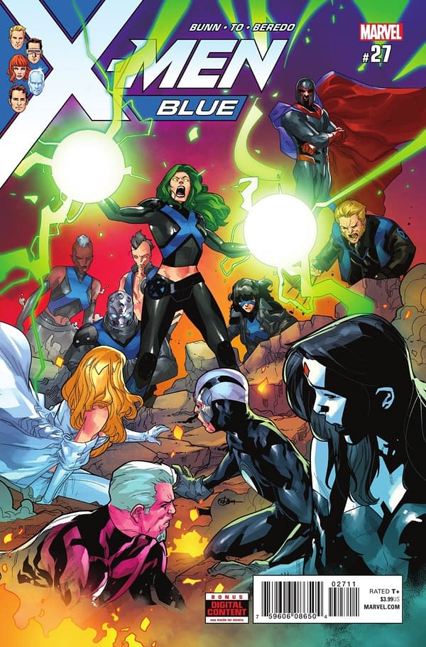
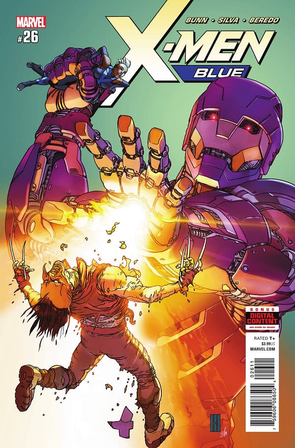
It's not like Marvel isn't capable of producing comics with exciting covers today. X-Men Blue has had some good ones recently, like these two by Uncanny X-Men artist R.B. Silva and colorist Rain Beredo:
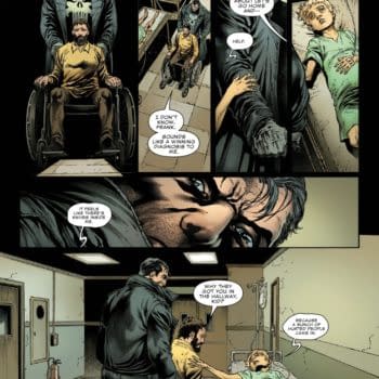
Or this one by Mike Choi and Federico Blee:
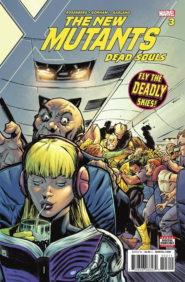
Or this amazing one for New Mutants: Dead Souls by Ryan Stegman and Michael Garland:
But when it comes to the big relaunch of Uncanny X-Men kicking off a 10-part weekly storyline with an all-star creative team, for whatever reason, we go with this:
It's not that it's bad. It's just that it's boring. Bad… might actually be better.
Though, now that we're looking at it, we are reminded of another observation. None of these characters' feet are shown on the cover (or for that matter on the teaser image either). On the cover, the X-Men are just standing on conveniently ill-defined rocky ground, with some of the characters seemingly floating in mid-air. Seriously, is X-23 standing on someone's shoulder? Can Beast and Jubilee fly now? Wait a minute! Now we get it! This is a '90s nostalgia thing, isn't it? Okay, at least we understand what they were going for… but we still don't have to like it.
What do you think about the covers? Are we way off base? Or do you agree?


