Posted in: Comics, Image, Review | Tagged: Esad Ribic, image comics, ivan brandon, nic klein, sci-fi, vs, war
VS #1 Review: A Vague Story Held Up by Ribic's Phenomenal Artwork
War is fought for sport now. Though it's still used to settle disputes, it's now televised, monetized, and soldiers are now celebrities. The current war is between the Industrial Guard and the Legionaries. We focus on the Industrial Guardsman, Flynn, who is wounded in the first outing we see. We follow him through recovery to when he gets back into action.
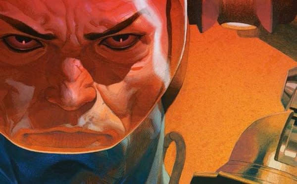
In terms of stories with this kind of premise, VS's first issue is most like Marvel Knights' Deathlok the Demolisher in terms of the focus on consumerism, war still being used for struggle in addition to sport, and the comparisons of soldiers to athletes. That being said, fans of Running Man and Hunger Games will find some similarities between those and VS. Oh, also that awful Gamer move with Gerard Butler and a little bit of Ready Player One I suppose. I would also mention Battle Royale, but that doesn't lean on the consumerist aspect.
VS does have its quirks that set it apart from this subgenre of sanctioned death for sport and consumerism. One thing that really stuck with me is the periodical mandatory commercials which Flynn must experience. Plus, the wars have to actually pause for commercial breaks, and there are penalties for not adhering to this. It also uses some videogame set-dressing with HUD elements and announcements with characters being killed or dropped into the game. I also think they have gamertags, but I'm not one-hundred percent sure of that yet.
VS's main trouble is establishing its characters. Its visual design is so out there that it's difficult to determine which technicolor humanoid with bits of metal strapped to them is which. On top of that, the opening sequence is so chaotic I had trouble distinguishing sides and character differences, and I didn't even know Flynn was the focus until he was laid up in the infirmary and named again. From there, things smooth out a bit, but Flynn's reserved personality doesn't help him stand out beyond that. He is somewhat like Mike Travers of MK Deathlok the Demolisher in that he is always eager to get back into the game, but he doesn't display as much personality as Travers—at least, not yet.
It plays keep-away with the wider context of all this too. That may be expanded later on, but, for example, I'm not even sure whether this is even set on Earth.
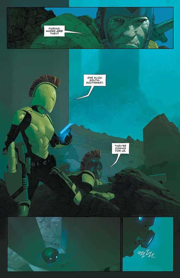
Esad Ribic, of course, the star of the show. He and color artist Nic Klein construct a visually unique world with a grim hyper-realistic style full of grimacing aliens and high-tech armor. The world is over-designed to a point—the extra arms that Flynn has strapped to him are genuinely distracting. That being said, the texturing and unique Ribic visual identity is genuinely awe-inspiring. The art has its problems, but it's still great.
Ivan Brandon, Esad Ribic, and Nic Klein make a fascinating if troubled first outing with VS. It's interesting, and Ribic and Klein's artwork is incredible. Flynn isn't the most compelling lead, but he may be replaced or improved as the story goes on. I can recommend this one though. Feel free to check it out.


