Posted in: Comics, Marvel Comics, News With Benefits | Tagged: marvel, wolverine, x-men, 🍆🍆
Did Marvel Censor the New Wolverine Logo Because We Were Too Close to the Truth?
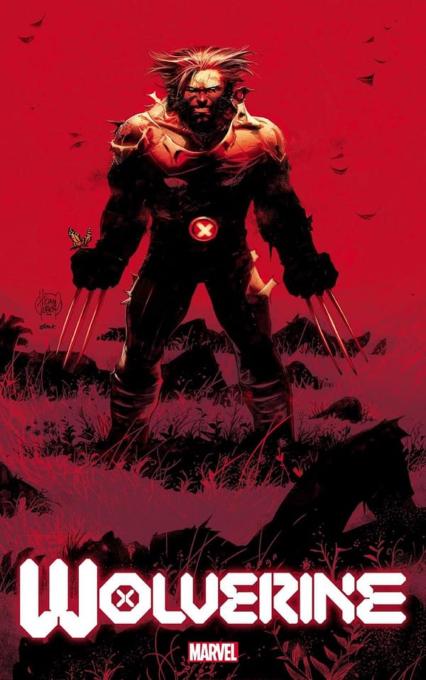
Marvel Comics has unveiled the final version of the new Wolverine logo on the cover of February's Wolverine #1, and it features some major changes from the preview we saw of the logo last month.
Designer Tom Muller first posted what appeared to be the in-progress logo back in October.
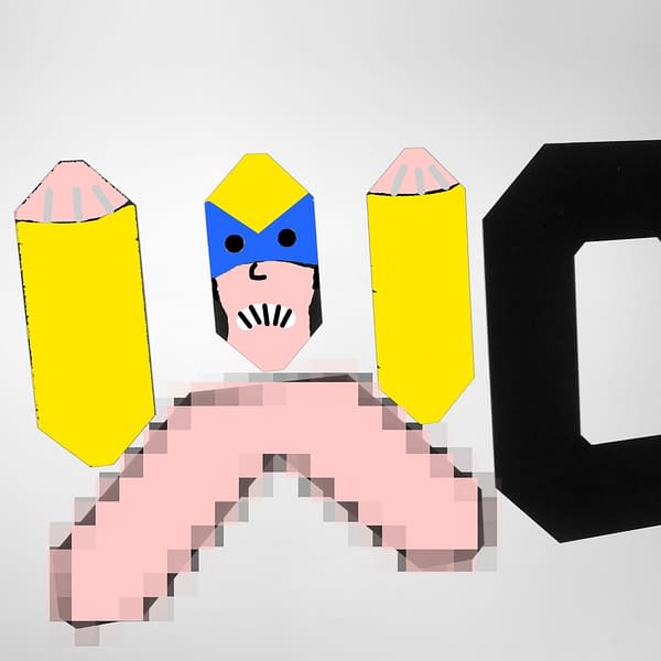
We were excited because the symbology of the W in the logo appeared to confirm a long-running theory about Wolverine: that he has two dicks, one for f**king and one for making love. We illustrated this by overlaying an image of Wolverine over the logo.
But the final version does away with the two-dick symbology. Why? Were we getting too close to the truth? What is Marvel trying to hide?
While our two-dick theory remains unproven for now, now that we've seen it, it's hard not to view almost all of the letters in the new logo as being a bit phallic (though if your dick looks like the one in the right-half of the R, please see a doctor immediately). Of course, this may just be us. We are cursed with the uncanny ability to spot dicks in logos that others might miss. You could say it's our mutant power.
Regardless, while Marvel may have backed off from confirming that Wolverine has two dicks with the new Wolverine logo, in our hearts, we will always know it to be true. Wolverine #1, by Benjamin Percy and Adam Kubert, hits stores in February.
Jonathan Hickman's bold new era for mutantkind in this all-new series starring Wolverine and his X-Men companions. Writer Benjamin Percy and legendary artist Adam Kubert bring the best there is to his new home in WOLVERINE #1.


