Posted in: Comics | Tagged: avatar press, hero worship, michael dipascale, scott murphy, zak penn
In-Depth with Michael DiPascale: Hero Worship

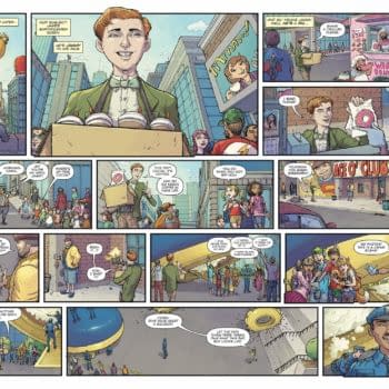
Before I get to the interview, though, it might be best to revisit the preview of issue #1, so you understand a bit of the context. Here you go:
How did the design of Zenith, the iconic superhuman of Hero Worship and public face of the far-reaching Zenith Foundation, come about?
Zak Penn and Scott Murphy wanted something that they could reproduce for movies, and they tried to stay away from anything that was similar to Hancock, another superhero film out at the time. They needed the costume design to be functional; I made it somewhat militaristic, with the belt, the bloused boots. I also wanted to make sure that I incorporated the letter "Z" into the design. The one thing that they were adamant about was no capes at all, which changed once they saw the first sketches. We ended up putting what they called a "functional cape," like a short cape. And then with the color scheme, I had basically free reign.
At first, I wanted to pattern Zenith's look after Daniel Craig, from the first Bond movie. But instead of just aping his look, we ended up incorporating his hairstyle, with a little crop that fell across his face. For his eyes, it was my idea that what would be the whites of Zenith's eyes should be black. Originally, for the irises, we wanted solid blue with no pupils. There was a bit of an internal struggle with that; we wanted him to have pupils, while William (Christensen, Avatar's Editor-in-Chief) thought it was a cool idea to have no pupils. We won that argument. (Laughter.)
Will Adam, the "everyman" who attains superpowers, get a costume, and if so, how did that design come about?
Adam will get a costume eventually. The people that worked in the Zenith Foundation complex, they have a specific look to their garb. Their tour guides especially, they have a specific look similar to Zenith's, but instead of a large "Z", there was a small "Z" across the top of their chest. And so we went with that for Adam also. We gave him the "Z" even though his name is Adam because it's the Zenith Foundation.
It's funny. Early on, I asked the writers, "Was the foundation named after Zenith, or was Zenith named after the foundation?" And they said it was a good question, but I never really got an answer. (Laughter.) I think it's kind of the point, that they're largely interchangeable, the organization and its "product." So we used that stylized "Z" for everything, for all the attendees and tour guides, and on Adam's costume. I painted a stripe on the side and basically made it a red costume with the dark blue, instead of the lighter blue like Zenith.
Is there a relevance to the color selection for the costumes? Were the colors selected simply to differentiate, or do they reflect elements of the character personalities?
We made it so that when Zenith uses his powers, his irises turn blue. We then made it so that Adam's turn red. We wanted the costumes to be red and blue. The costume reflects the color when their eyes change. And there's a reason for that, which you'll find out later in the series.
The premise of Hero Worship is that, in a world that reveres its sole superhero as an almost iconic celebrity, one of the most fanatic followers actually attains powers of his own… and then discovers all kinds of darkness behind the flash and heroics. Can you give us a feel for what's to come?
We'll see Adam explore his power at the Zenith Foundation complex, undergoing a battery of tests and running through all the questions he asks. At the root of it, Adam wonders, "Am I gonna be like Zenith?" And they're like, "Well, we hope so." Which, as we explore the magical mystery tour that is Adam's debut to the public, he'll learn that it's not all that it's cracked up to be. He's set up more as a media phenomenon than as a person doing good, and that kind of celebrity, well… there's a level of propaganda, of marketing. Essentially, Hero Worship is all about the image and how that image is controlled. And what happens when things then get out of control.
That's all I can say without giving too much away. I can tell you, though, there will be a lot of crowd scenes. I had to color so many crowd scenes that my hand hurt so bad! (Laughter.)
How far along are you with the artwork on the miniseries, and what's your speed?
I've been working on Hero Worship for three years. I'm currently working on issue #4, which is probably 80% colored. It takes almost two months to do an entire issue, from cover artwork to the last page. I can do the basic outlines of the characters and action at a rate of one page per day, and then when it comes to really getting into painting the pages, it can take a good two, three, sometimes four days, depending on how dense the setting. Like I said, some of the crowd scenes were something else. Sometimes I have to paint a thousand people. Oh my God, those scenes are tough to draw.
Considering that you're new to sequential art, have you found a general progression in your aptitude?
Oh, definitely. With each issue, I think my art has grown a lot. Issue #4 looks so good! The third issue looked really good. Hell, I still think that #1 looks good. Sure, I could've done things different on #1, which I'd only learned and started to use with #3 and #4. I'm really pleased with how #4 came out, and how the colors pop. But now that I'm on the spot, it's like trying to decide which kid you love the most; you can't do it!
When Penn and Murphy provide you with a script, how do you tackle it? How do you turn their script into a cinematic comic book?
I see the scripts as a sequence of scenes, each with their own distinct feel. I never view a comic page as a handful of panels, just what's in front of me, but rather as part of the overall ten- or twenty-panel scene spread over several pages. I try to maintain a continuity, the feel and mood of the scene. I try to make sure that I stay within that frame of mind for each scene, then start anew with the change of setting.
To describe the whole process, I get a script from Zak and Scott, read it through, and map out how to best lay out the panels to convey the story. I pay special attention to whatever specific direction that the writers give me, and where the direction is sparse, I try to think about how best to convey what they want. Then I make little pencil rough drafts, three or four thumbnail pages per sheet. They're real small, they're rough, but it gives us all a good idea of where we're going. I scan those rough drawings into the computer, and William sends them to Zak and Scott for approval. Once they've approved it, I stay pretty true to those roughs and acquire a lot of photo reference: different cityscapes, whatever settings that they need, some anatomy, body movement, things like that.
Speaking of photo reference, I've snuck Zak into the drawings a couple times, and I've snuck William into a panel. Zak's actually a small character in it. I don't think he realizes it yet. In the second issue, he's one of the scientists.
Anyway, I take all of that reference and start fleshing out the panels using the computer. I use Corel Painter instead of Photoshop, a different program than I think most artists use. Once I'm done with all the line work, Zak approves it again, and then I start painting over the lines. It's a little bit of a drawn-out process, but it works.
I know that you take photos of friends and family as part of your visual reference. Do you actually have them dress the part, or is it simply to capture the physical form and shapes?
I use the photo models for anatomy and perspective. There's no cosplay in the house. (Laughter.) There's no mini Zenith costumes in the house or anything like that. It's all basically anatomy, and how many people can I cram onto a panel without having my head pop. Where to move the imaginary camera, how should the light hit… Light's a big thing to consider, too.
Do you have a light assembly which you use for your models?
Yeah, it's called a light switch! (Laughter.) Seriously, though, I play with the lighting a bit. All artists have their own tricks.
Looking back at the work you've completed on the series thus far, is there a particular favorite image?
Oh, yeah. My favorite one shows Zenith punching a guy, and it'll be found in the second issue. He basically puts his fist through the guy's whole head. That's probably my favorite, although I realize that it's a bit disturbing to say so. See, it was a panel that I had a lot of problems with. I knew what they wanted, but I couldn't figure out the right angle to convey everything they wanted. When I originally drew it, I wasn't pleased with the outcome, and they weren't either, so we went back to the drawing board and I kept working on it. After all that effort to get it just right, it ended up as a really startling panel that really pops. It's the perfect end cap to really completed that page, and the entire sequence of events.
Prior to Hero Worship, had you ever done interior artwork before?
I've never done sequential art before, nothing that had been published, anyway. This would be the first time. I had always wanted to be a cover artist, but when I started working for William, he wanted me to do some interiors for him. And when he let me know that it was for a Hollywood screenwriter, I was excited and nervous, to say the least. But I wanted to do it, and I wanted to do a good job. I feel that I've been doing the best I can. They've been patient as I learn the ropes. (Laughter.)
How did you first become hooked up with Avatar?
Y'know, I've asked William that before and he believes that he saw my work at one of the Motor City comic conventions. It was probably a Sunday, when he was walking through artist alley. He thinks that's where he saw me. A week or two after that Motor City show, I received an e-mail from him, introducing himself and asking me if I'd be interested in doing some work, signing a contract with him.
So you think it was your pin-up artwork that first caught his eye?
Yeah, I think so. Before I worked for Avatar, I worked for Digital Webbing. I did covers for the video game character Bloodrayne. If anyone's familiar with that character, she's half-vampire and half-human, a real sexy girl, with long, red hair. I'm sure that image caught his eye. And I had done work for Boom Studios, too. I had worked on Zombie Tales and Eureka, along with Farscape, which could show that I had experience with likenesses and established characters.
What would you consider to be your artistic influences?
Growing up, I was a really massive fan of (Frank) Frazetta and Boris (Vallejo). As I got older, I discovered Brom and Justin Sweet. Thinking more about the comic style, I suppose it'd be Jim Lee. Everybody loves Jim Lee! Adam Hughes was a huge, huge influence on how I wanted to do things, especially with the comics. Greg Horn, too — I love how Greg Horn uses colors.
Were there superhero titles that influenced your work on Hero Worship?
Probably on a subconscious level. With the difference between the kid and the hero, I might say Captain Marvel from the Shazam comics. Now that I think about it, his costume might feel like Captain Marvel's. I know I didn't want to design Zenith to look like a Superman design. I knew that everything about Hero Worship was geared for a movie, or a movie style, so I didn't really look too much towards a comic hero to emulate, or draw from. I just wanted to make sure it didn't look like the Hancock movie, which was relevant at the time I started on this project. I wanted to make sure it was different, without comparisons to other projects.
Between your pin-up artwork at Boundless Comics and the more realistic feel of Hero Worship, you have a wide range of settings to play with. Any preference?
Oh, I have no preference. I love to go back and forth, from real-life to fantasy. It keeps everything fresh, it doesn't get stale, I don't get bored. Whether I like to do one more than the other, not really. I like to do them both equally. Anything that makes me push myself or work with fresh ideas. I suppose that fantasy really allows me to have a little more freedom to create an environment. There are no rules, especially with Lady Death, whose adventures take place in a landscape so much like Hell. There just aren't any rules.
That's unlike the more realistic settings. If you want it to look authentic, you really have to capture backgrounds realistically. In Hero Worship, which takes place in a city as universally recognizable as Los Angeles, you have to capture the haze in the sky, the smog, the exact layout of the cityscape. You have to make sure that it's right, with the right mountains in the back, the Hollywood sign. City streets must have all the grime and the dirt; it's not enough to just draw a city street, you have to capture the idea that it's been lived in, abused even. These environments are not clean. And then, when the setting goes out into the desert where the Zenith Foundation is, you have to capture that exact feel of the flat ground, where the sky goes from a yellow to a blue, the scarce clouds. You've got to make sure the whole book projects a genuine feeling of realism.
Let's talk about your work on Lady Death and War Goddess as a cover artist. When you're drawing these characters, what are you trying to capture?
Lady Death, her demeanor or her personality, is quite a task, because she doesn't have any eyes! You don't know where she's looking. So you really have to use her mouth, her eyebrows, to see whether she's afraid or she's pissed. With Lady Death, when Stephen Hughes created her, he didn't give her those eyes; it seems likely to me that it was a very specific choice to bring out her demeanor, accentuate where her wickedness came from, and why they gave her that smile. It's a chore to make sure to keep her face fresh, that it's not always this pasty blank face, that you make sure you get a lot of emotion with her eyebrows, around her nose, things like that — so you have to work extra hard. With War Goddess, you've gotta make her look hot and still make her look pissed.
Pandora from War Goddess is more like a smart warrior, she's got the guns they gave her, she's got the helmet, the long axe, the sword, and the knife. She's got a lot of weapons, and the armor. Lady Death is a little more regal in the sense that she's magic; while she may have a sword, even that's magic. Her demeanor is more royal. Even though Pandora is a goddess also, they're really written quite different.
Do you use real-life people as the basis for your illustrations? Actresses and models and such?
I don't try to use real people as influences. I don't want Lady Death to look like Keira Knightly, for instance. When I draw her, I want her nose to look a certain way, her jawline a certain way. I think the jawline with Lady Death is very important. The same with Pandora in War Goddess. Pandora has the visor, so it helps with how to design the hair, but as far as using an actress or model as a guide, I really don't use that.
HERO WORSHIP #1 Regular Edition
Written by Zak Penn and Scott Murphy
Cover & Interiors by Michael DiPascale
$3.99 Retail, Diamond Item Code: MAY120886
HERO WORSHIP #1 Wraparound Edition
Written by Zak Penn and Scott Murphy
Cover & Interiors by Michael DiPascale
$3.99 Retail, Diamond Item Code: MAY120887


