About
About 


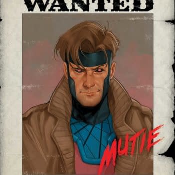
Paul Rabin, Mary Jane Watson and Peter Parker, Spider-Man... The Final Chapter? Venom #256 Spoilers hit the internet...
Posted in: Comics, Dark Horse Comics | Tagged: logo, mike richardson
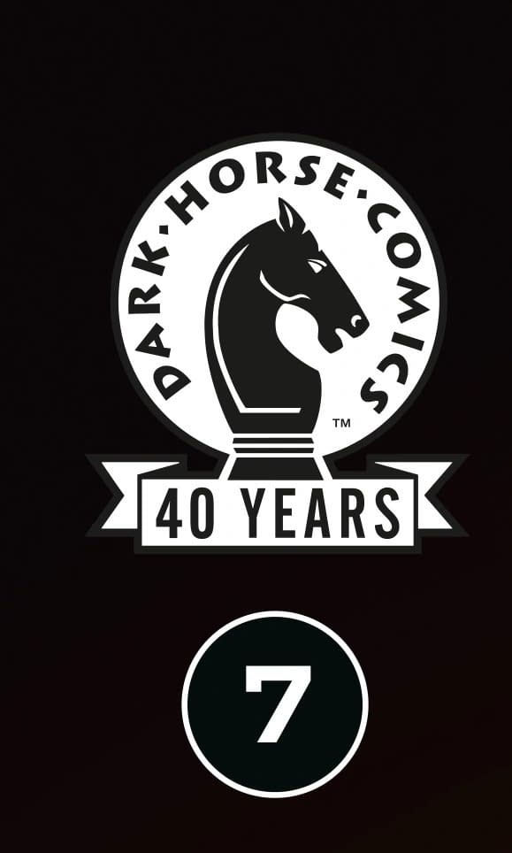
A New Look For Dark Horse Comics: Comics Nerds Since 1986
A new pixellated look for Dark Horse Comics: Comics Nerds Since 1986 - and a look back at all the old ones
Article Summary
- Dark Horse Comics unveils a new pixellated logo for its 40th anniversary, reflecting its 1980s roots.
- A look back at the evolution of Dark Horse Comics logos across four decades of publishing history.
- The new "Comics Nerds Since 1986" tagline hints at a playful, nostalgic direction for the brand.
- Gradual logo changes dispel rumors of sudden shifts.
As has been filling my inbox from all manner of folk, what appears to be a new logo for Dark Horse Comics. But it's been a little while coming. A familiar Dark Horse logo, the one that was originally used in the eighties and nineties, certainly, with lettering going for an eighties pixelised look, possibly to reflect that they started in 1983, along with a proud boast that, um, seems to come straight from The Big Bang Theory.
"Dark Horse: Comics Nerds Since 1986" Will this be the language and typeface appearing on Dark Horse Comics going forward? Here's a history of logos from Dark Horse over those forty years.
-
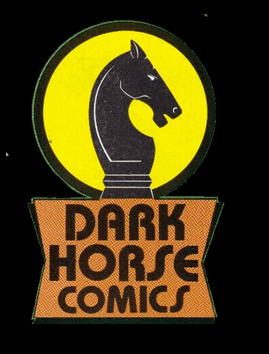
- Dark Horse logo from 1986
-
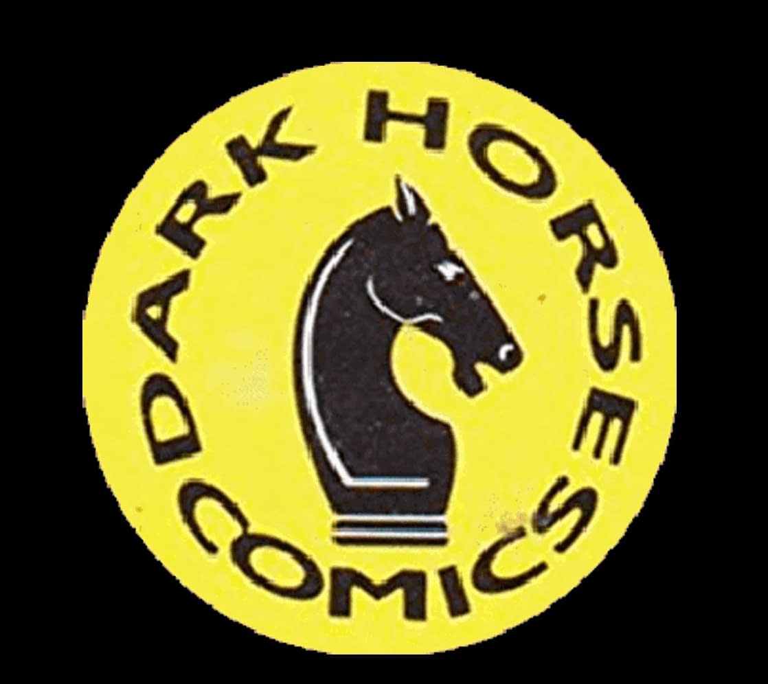
- Dark Horse logo from 1989
-
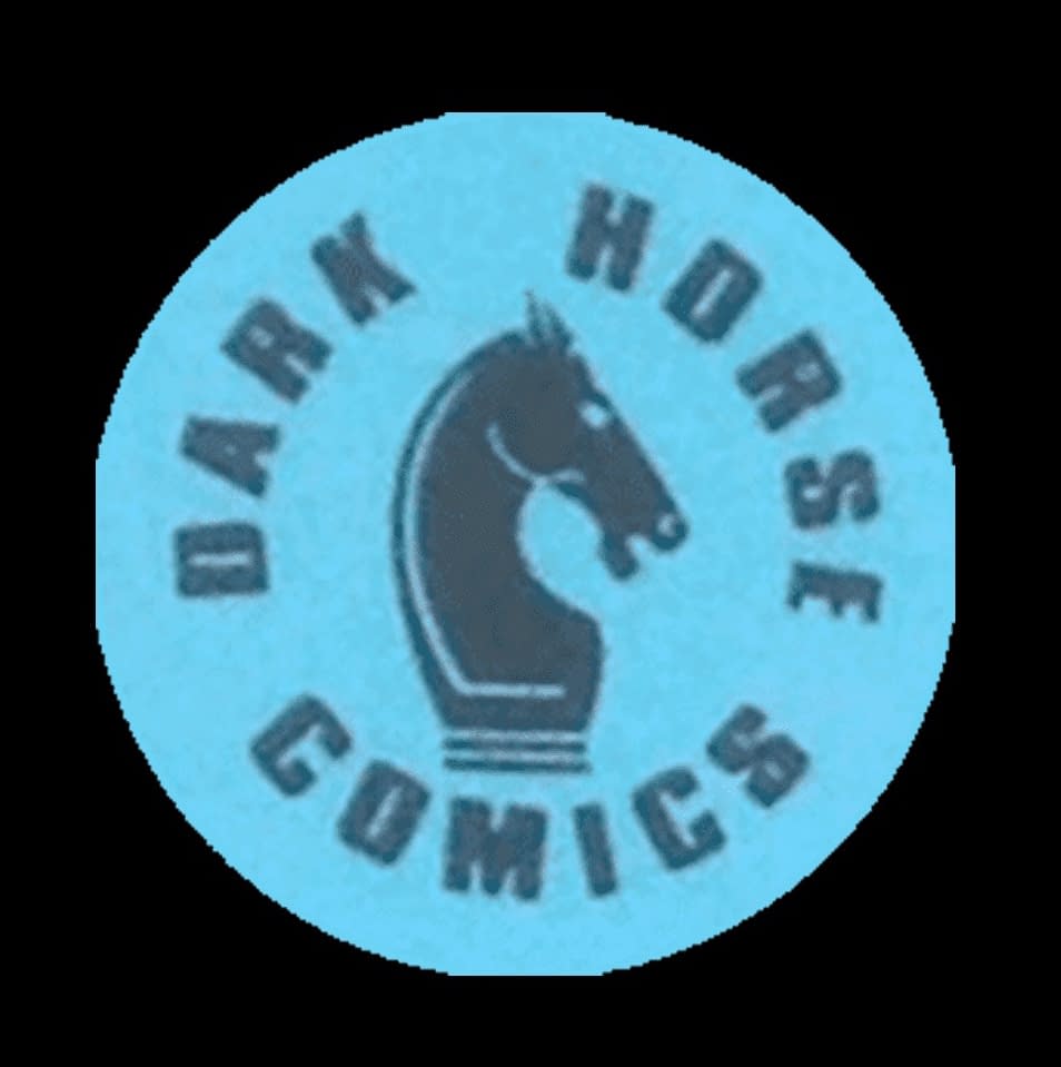
- Dark Horse logo from 1990
-
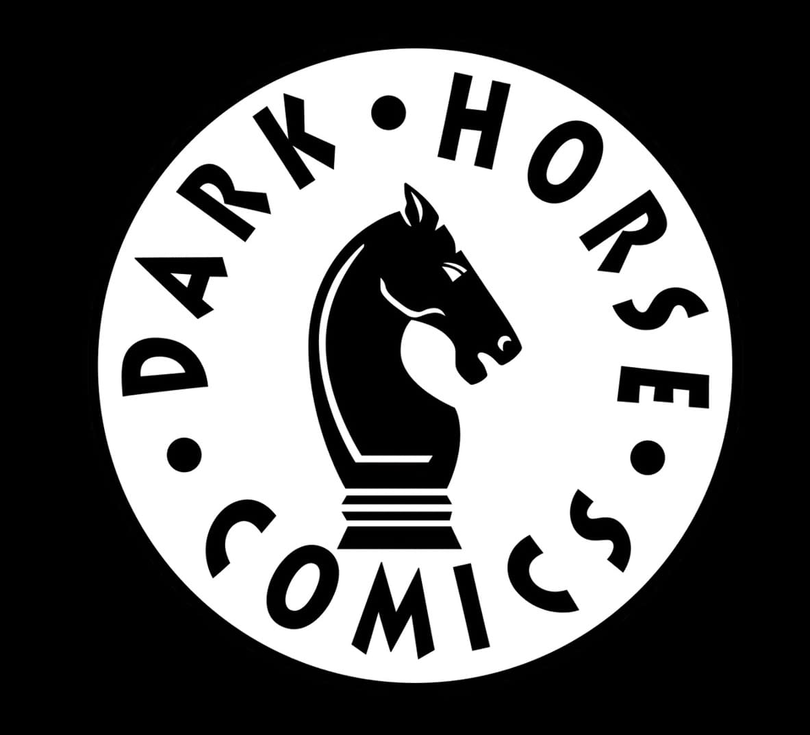
- Dark Horse logo from 1991
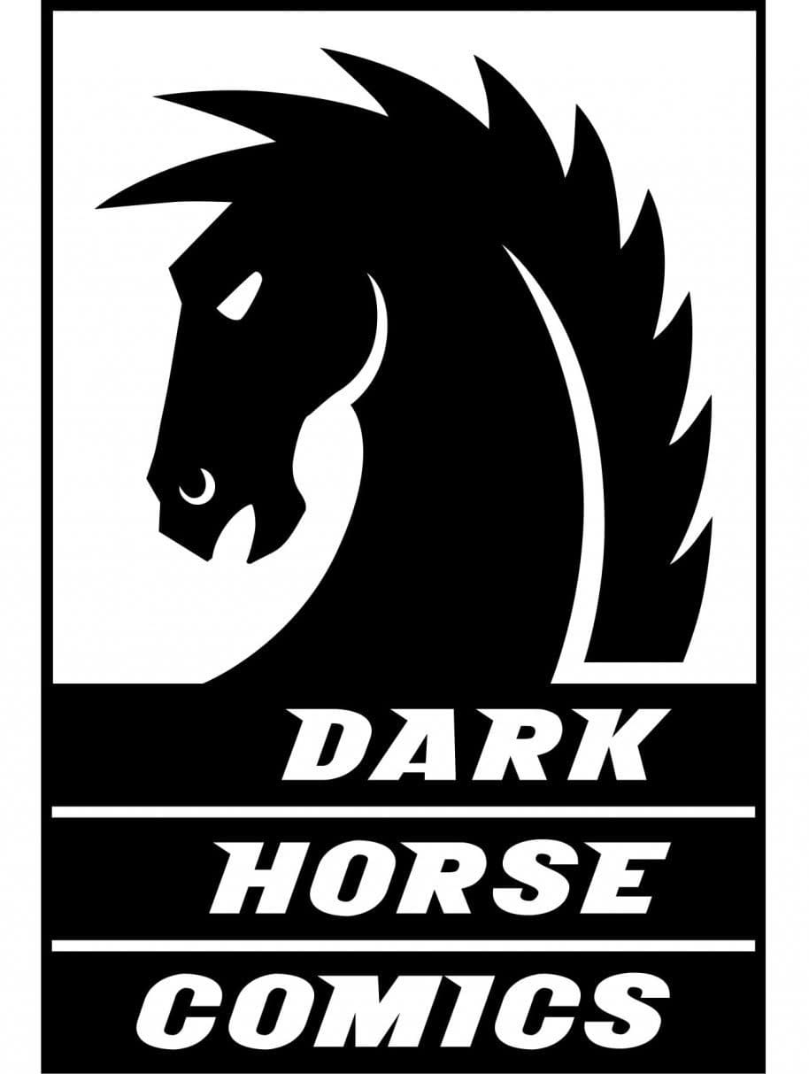
Then, in 2003, the logo changed more radically with a new, more angular horse. And that is how it has remained for 23 of its 40 years, until last year.
Because late last year, Dark Horse Comics switched from this kind of messaging on their catalogues (though it remained on their website until a short while ago)…
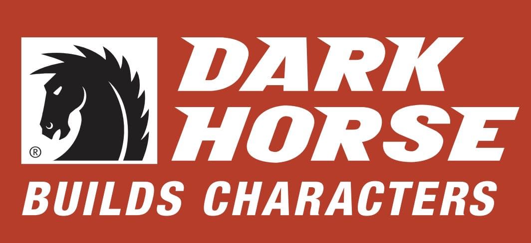
… to this one, with the classic logo, a new message for their anniversary year, but keeping the typefaces the same.
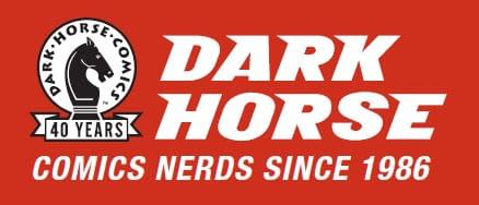
And in recent months, the logo has switched on the comic books as well, with this appearing on Dark Horse Comics published this year.
But the new logo has gone for an entirely different typeface. Is this just a one off for the website? Or is it going to roll out?
Either way, don't fall for people who say this is a sudden change or is just about founder and former owner Mike Richardson being kicked out. This is a gradual change, and who knows, they may have more changes yet to be implemented… Bleeding Cool has reached out to Dark Horse Comics for commentary, and I will update this article as soon as we hear back. And hey, we're all used to that IDW logo now, right? Right? Until then, this comes from the front of the current Dark Horse Comics catalogue for comics coming in July…
Dark Horse Comics was founded in 1986 by Mike Richardson as an offshoot of his comics retail chain, Things From Another World. With a goal of creating a welcoming environment for comics professionals, Dark Horse continues to publish the work of many of the greatest creators in the industry's history. Dark Horse, from its beginning, also has a track record of establishing new creative talent.
Early on, the company set a new standard for quality with licensed properties, including comics, graphic novels,
collectibles, and art books based on popular film and gaming properties. Dark Horse also began building a manga publishing line in the 1980s, going on to release such classics as Lone Wolf & Cub, Akira, Ghost In the Shell, Trigun, and Berserk. Richardson established Dark Horse Entertainment as a film division in 1989, finding initial
success with his own creations, The Mask and Timecop.
Recent hits from Dark Horse Entertainment include The Umbrella Academy on Netflix and Resident Alien on SyFy. In 2022, Dark Horse Media, LLC was established as Dark Horse became part of Embracer Group AB.
Enjoyed this? Please share on social media!
Stay up-to-date and support the site by following Bleeding Cool on Google News today!