About
About 
Hello BC readers, it’s been a while. I’ve been off working on comics (The Freeze Vol 1 trade from Image Comics/Top Cow is in stores now…) but after
Posted in: Comics | Tagged: A Clash of Kings, Comics, dynamite, entertainment, george r r martin, landry walker, Mel Rubi
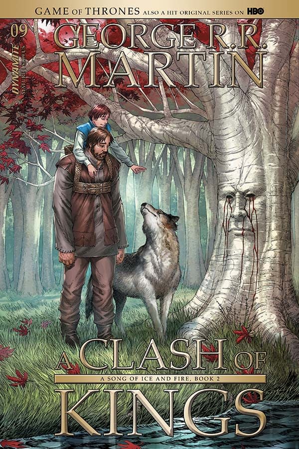
Writer's Commentary: Landry Walker Talks A Clash of Kings #9
Dynamite has sent us a new writer's commentary by Landry Walker for George R. R. Martin's A Clash of Kings #9, which is on sale now. It has a cover by Mike Miller and interiors by Mel Rubi.
PAGE 1:
It's hard to believe how fast this book is created. We are at a point in comics where I think fans largely take for granted the amount of work that the artists build into the pages of this medium – probably because the internet has largely devalued art through free distribution.
In trying to condense these chapters I lean back on several staging tricks – bearing in mind here that the nature of this series necessitates me scripting excessively detailed panel breakdowns – Close-in on the eyes for mood. Pull back on that shot for context and pacing. Establishing shot so we know where we are. Then the meat of it – the last panel here is an anchor on the page, as it's our new information. It introduces the elements that actually push us forward in the story. In an illustrated novel, this might be the only shot we would need. But comics…. You have to build to that moment, even when it means spending over half a page on panels that establish tone and setting rather than literal information.
One other quick note – the color here was an important choice. The time of day needed to give us a sense of morning. We have so few tools in our belt with such a translation between mediums that the passage of time and the color shifts it brings becomes a go-to. We will see that even more so as this issue progresses.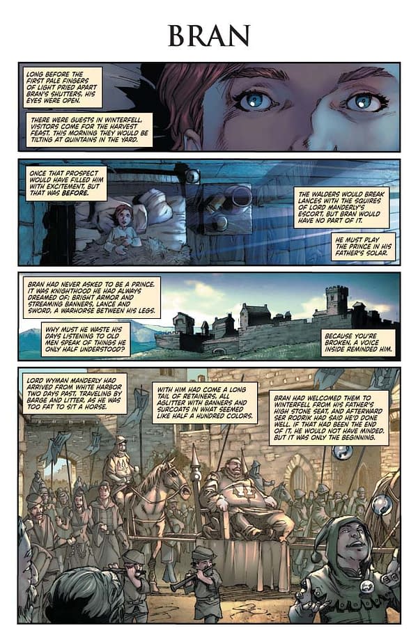
PAGE 2:
Speaking of time transitions – I wish this one had a better break. We jump in and it almost feels like the same moment as the previous page, right? But this is an entirely different day and time. So this page needed a little twist of some kind that is lacking, and it's something I will need to consider going forward.
The last panel shows another little trick I use frequently in this series. We have so many scene shifts to account for – they need exit points at the end of the page to help push that mental break between sequences. The long silhouette shot helps let us know that the figurative sun is setting on that particular moment.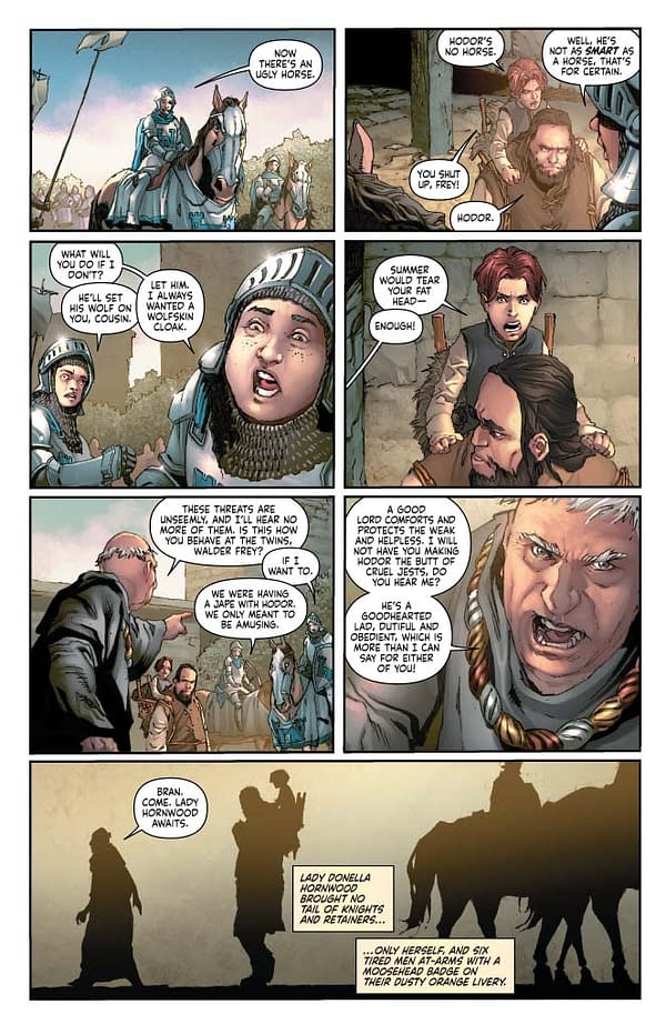
PAGE 3:
Simon Bowland (the letterer) is overworked and almost certainly under-appreciated. Just look at this page. In any other comics I would never place this much dialog. It's packed! And yet Simon makes it feel natural.
Again, we end the page (and scene) on an exit shot.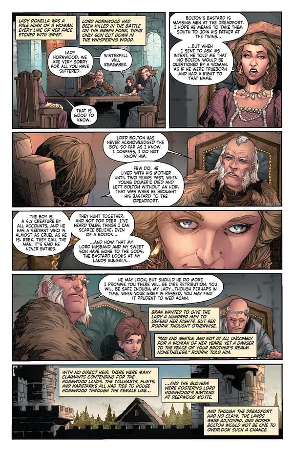
PAGE 4:
This tree creeps me out. That's all I have to say about that.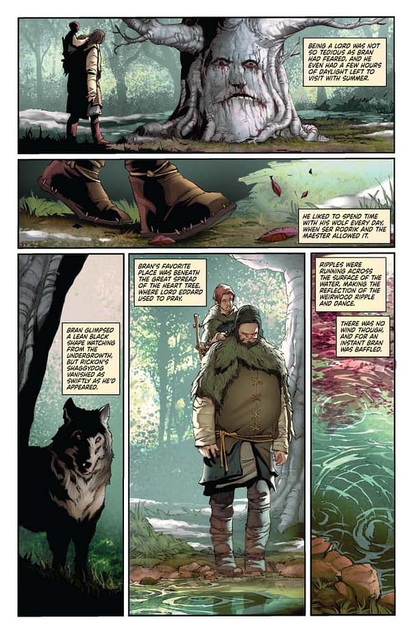
PAGE 5-6:
Mel Rubi (the artist) is extremely adept at drawing things beautifully. Osha is a hardened woman who has lived through unspeakable hardships. We need a certain sense of grace and also something that defies traditional standards of attractiveness. There was a few rounds of notes on this bit, but in the end I think it really came together.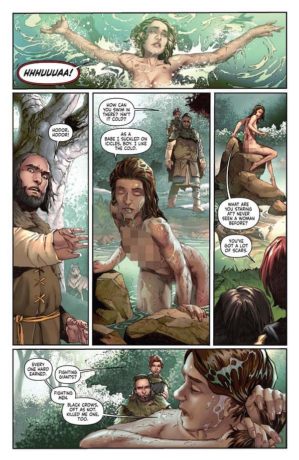
PAGE 8:
I'm not sure how this one comes off – only the reader can judge. The original idea outlined in the script is two parallel scenes during different times of day to help showcase the repetitive nature of Bran's life as more and more visitors drift in. The colors go a long way, but after the first round of art we needed something that helped stop the readers' eyes from drifting the traditional left to right and back again, so I suggested we drop a sword in to divide the sections. I think it might work better if the hilt and blade were lighter, thinner, more ornate? Learning experience.
Side note: Over the course of this series, I have been looking at the brilliant work of JH Williams (Promethea, Batwoman). His page layouts are impossibly beautiful and incredibly inspirational. In a series where I have to convey so much information in such a small amount of space, the kind of techniques he applies to his work are invaluable. I've adopted a few bits here and there, and more importantly, tried to upgrade the way I envision a page due to both exposure to his work and the difficult challenges this adaptation can create.
PAGE 9:
Basic techniques applied here – one panel split by borders to help change the sense of time flow – this is Understanding Comics 101, an important book to read if you are interested in… well… understanding the craft and art of comics.
Also: Back to that time of day passage of time on the static page thing.
PAGE 11 – 12:
Bran's nightmare sequence. Very happy with how this came out. I gave a lot of notes on this bit, to give a sense of how far afield we needed to veer from the usual art. This is a horrifying sequence when you really study it – and one that is very key to the evolution of Bran. Giving it a sense of surreal horror and other-worldliness was vital to the storytelling. What Mel accomplished is leaps and bounds beyond what I hoped, wonderfully accentuated by Ivan Nunes, the colorist of the series.
PAGE 13, 14, 15:
Oh Sansa. You sweet summer child. Figure it out already.
There's so much to unpack with Sansa's character. On one hand her head remains in the clouds, despite having already witnessed the truth behind her fantasies. And yet without that desperate hope that she is living in a story, what else does she really have? It's easy to dislike Sansa, and yet we're all likely more akin to her than we are anyone else in the book.
I made a choice to only take the repetitive "Come to the Godswood" bit as dialog. A mantra that poor broken Sansa is repeating to herself in an effort to find strength. The rest is all set as captions, which has the effect of distancing the feelings from the character a bit. Unlike dialog (and the late, lamented thought balloon) captions float, disconnected from the character. That does serve very well in this series, where the expository text is more literal prose than the standard comic. But in general, I believe captions are a crutch, used far too often to make comics feel more "mature".
PAGE 16:
Again. Shout out to Simon on the lettering.
PAGE 19-21:
My original script of this scene was fairly different. I hit a block in making this all fit, and my editor (Anne Groell) did what she does and somehow seemingly effortless inserted a whole bunch of stuff I would have sworn would never fit. I think I have said it before, but it should be said again – she deserves quite a bit of credit on how smoothly the storytelling flows in this series.
Enjoyed this? Please share on social media!
Stay up-to-date and support the site by following Bleeding Cool on Google News today!