About
About 
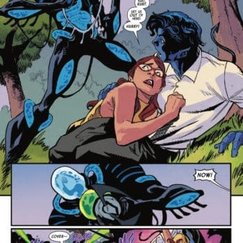
Iceman and Bishop team up to investigate a new attempted mutant massacre of the Morlocks in the tunnels under New York. Is it a good read?
Posted in: Comics, DC Comics, Review | Tagged: Alex Sinclair, dark nights: metal, dc comics, dc's new age of heroes, fantasy, immortal men, james tynion iv, jeremiah skipper, jim lee, Richard Friend, Ryan Benjamin, sci-fi, scott williams, superheroes
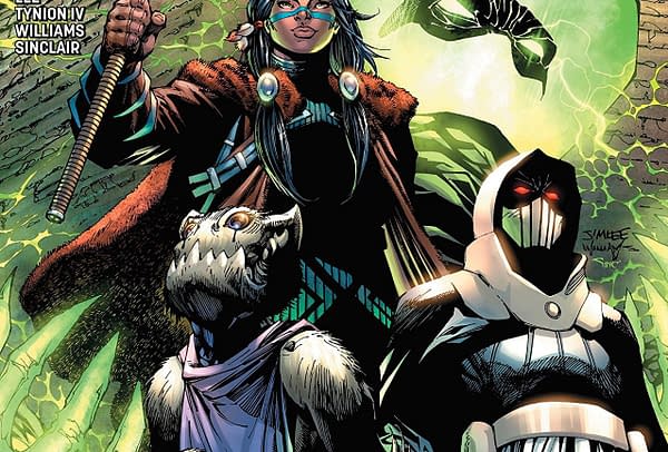
Immortal Men #1 Review: An Interesting Premise Hobbled by Lifeless Execution
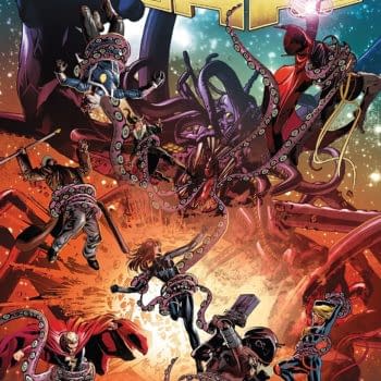
A young man named Caden Park has been having dreams. They have been dreams of a place set apart from the world called the Campus. He dreamed of a man with piercing eyes. Elsewhere, a secret race called the Immortal Men are killing one another, with the House of Conquest all but wiping out the House of Fighters. Only four from the latter House remain, and both Houses are looking for Caden Park.
First, weird observation, this comic has a very strong and odd smell to it.
Immortal Men #1 is trying to set up a dense and admittedly ambitious lore to it, and it's set apart from regular DC Continuity. It ties in somewhat to Dark Nights: Metal, both in the Immortal Men themselves and a certain guest star. However, the creative team behind this one is trying to create something new, unique, and heavy.
Unfortunately, it results in a lackluster first issue. Despite how appealingly bizarre the visual design of most of the Immortal Men is, there isn't a lot of energy in this book. It's mostly vague dreams, lightly establishing new characters and concepts, and Caden trying to prove that he is a special.
It comes off as a Harry Potter-esque story about a boy who is special even though the world thinks he's not. That's somewhat undercut by the fact that he and his family appear to be rich. That said, it could also work as a parable of discovering one's own sexual identity, and, with the great James Tynion IV behind it, that may have been intentional.
Unfortunately, the comic still feels lifeless. It has interesting ideas, but they aren't conveyed with any energy, excitement, or any other way to illicit an emotional response from the reader.
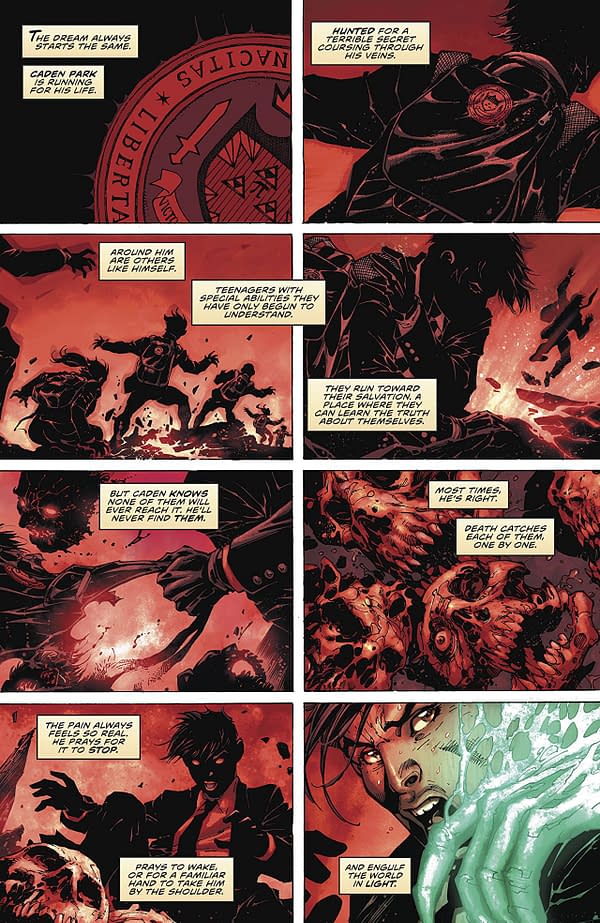
Jim Lee's artwork has lost none of its luster, as the comic does look really good. Characters are given distinct shape, form, and detail. There is an appealing comic book-iness to Lee's unique style. Eyes are often given a lot of detail in his books, and they make his worlds all the more striking. His line work can look a bit messy at times, but the inking team of Scott Williams and Richard Friend manage it well. Color artists Jeremiah Skipper and Alex Sinclair balance the palette well, allowing the more vibrant colors like that of Ghost Fist's green (yes, that's his name) to be tempered well by the world around it.
Immortal Men #1 shows some potential for an interesting sci-fi/fantasy superhero odyssey, but the first issue fails to set up the world in an engaging manner. The artistic team does some solid work, even if their visuals can't quite liven up the narrative. If what I explained to you sounds interesting enough to warrant a read, then feel free to give it a try. That said, I can't quite give a wholehearted recommendation.
Enjoyed this? Please share on social media!
Stay up-to-date and support the site by following Bleeding Cool on Google News today!