Posted in: Comics, Recent Updates | Tagged: Adam Withers, anime expo, Comfort Love, Comics, dark horse comics, entertainment, manga, Rainbow in the Dark, The Uniques, webcomics
Back To Basics With Manga At Anime Expo – Comfort And Adam's 101
By Michele Brittany, a West Coast Bleeding Cool Correspondent
It was serendipitous that I ended up attending the last half of Comfort Love and Adam Withers' panel on creating a character Friday afternoon at the 23rd annual Anime Expo, held again this year at the Los Angeles Convention Center. The husband and wife duo, who have created and self-published The Uniques and Rainbow in the Dark, presented character building blocks that were concise and were easy to understand, so I decided I would attend their Saturday panel titled Comfort and Adam Present: Let's Make a Manga.
Love and Withers took the manga and pared it down to the basics of starting with one page, and the goal is to communicate the story to the audience through the art. Assuming that the script was already prepared, the husband and wife duo explained to start with rough thumbnail renderings of each page. "The more time you take now, the less possible issues and mistakes later," Withers stressed. Artist should render quickly in small proportions and perspectives, so the effectiveness and efficiency of the layout can be examined as a whole page. This is important because artists typically have only 20 pages to illustrate a story. That may sound like a lot, but it really isn't. Doing this step now also has the potential for the artist to make better art.
The next building block considered the point of view. Here is where the artist will look to the writer for direction, assisting the artist in determining the best establishing shot and angles (low, high, top, bottom). The artist needs to include an establishing shot on each page or per scene, if the artist can do them very well. Love stated that, "you have to direct and guide your readers."
The artist has a couple of choices with establishing shots. One method is the emotional beat, so that could mean starting with a close up of panicked faces then pulling back to show that the two people are surrounded by a menacing group of people. The other method is the action beat, or long reveal, in which the story might open with menacing faces, counter with panicked faces, then reveal the two groups at odds with each other in a room.
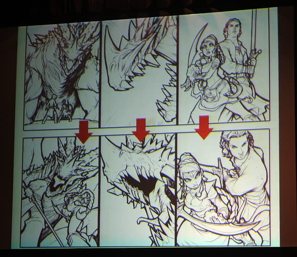
Love and Withers advised changing up the angles in each panel. They stressed thinking in 3D and give consideration to what is the best shot. "Every panel should be a different angle on the page," they said. Love and Withers showed a couple of examples of playing with the angles and then studying the emotions evoked from the angles used. It is likely to result in more interesting panel compositions.
Looking at the entire page layout, Love and Withers stated that not only does an artist want to incorporate different angles within the panel, but on the page as well by including different size panels so the action inside the panel does not run together. It guides the reader's eyes and It keeps the page looking fresh, not dull and repetitive.
The other important building block is to bring out the human emotion in every scene. The words express the emotion. However, there will be panels Love explained, in which the angle of the subject, the expression on the face, and the composition of the panel illustrated by a talented artist is likely to not require dialogue at all.
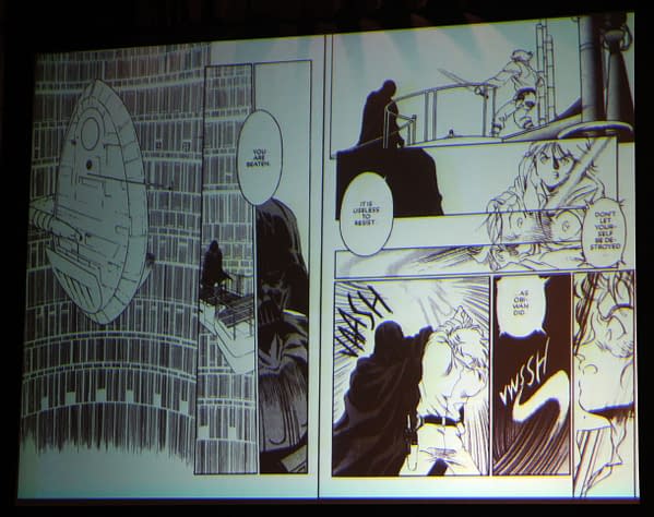
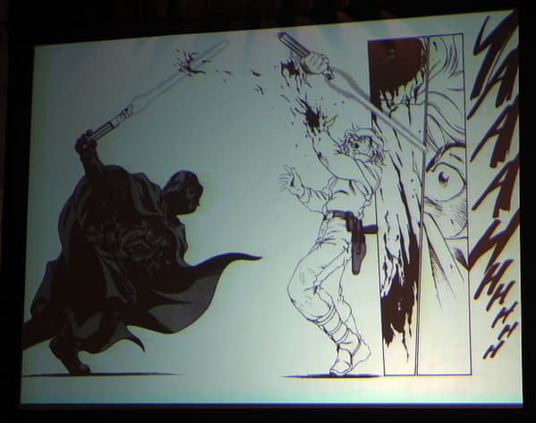
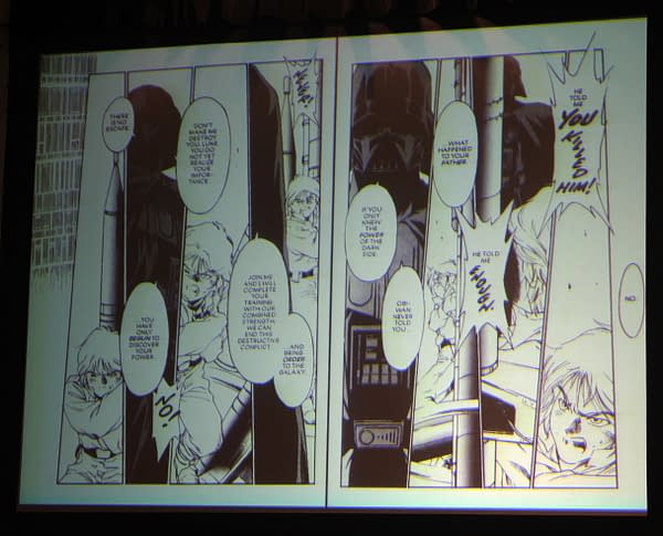
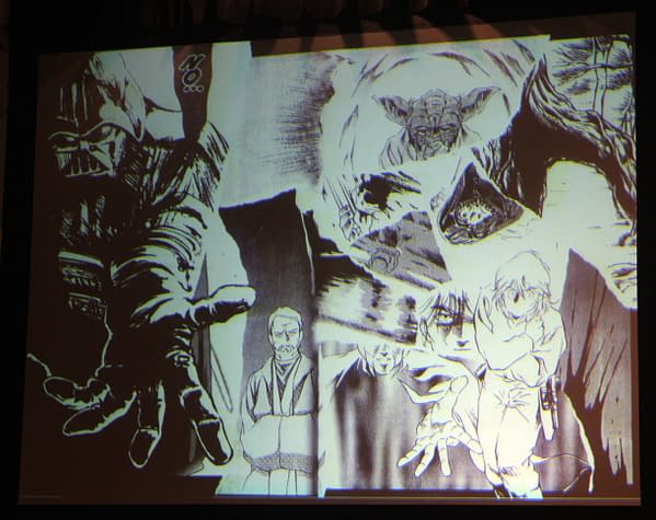
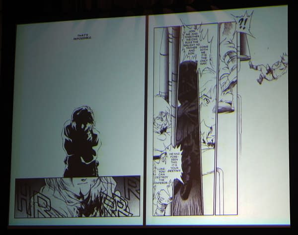
To pull all the building blocks together Love and Withers first showed the climatic scene in Star Wars: The Empire Strikes Back where Darth Vader reveals he is Luke's father (hopefully that is not a spoiler for Bleeding Cool readers). Then, as a comparison, Love and Withers went page by page the Dark Horse manga illustrated by artst Toshiki Kudo. They pointed out the page layout, the establishing shot, identifying the angles used, and the emotion of each panel. However, there were several other points made as well.
First, the tempo or time can be controlled by the panel size. Larger panels slow time while small panels increase time. Second, the use of Luke's scream – literally text on the page – as a panel until itself and emotion it conveyed in the context of the story. Third, the continuity of movement: in one two-page spread, Darth Vader's movement across the page is juxtaposed to Luke moving further and further away. In addition, it is full of emotion and symbolism of power. Fourth, Love explained the importance of the page turn, which should make the reader anxious to turn the page. An example is when Luke was processing that Darth Vader was his father. The two-page spread is a whirl of ideas, memories and – turn page – the realization that it was the truth.
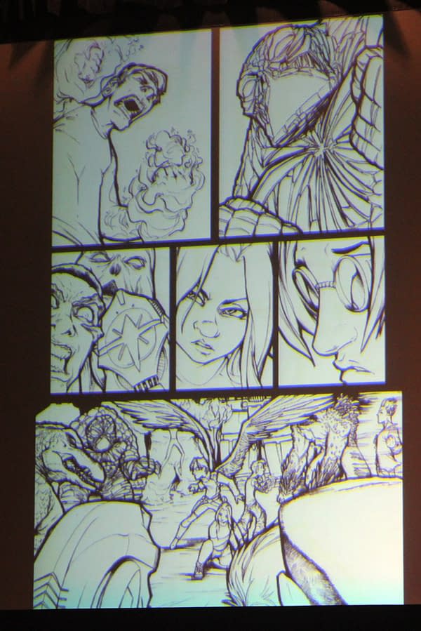
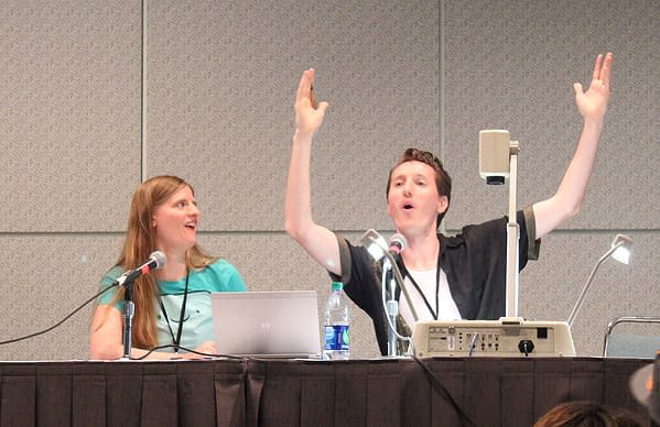
From that point, Love and Withers turned the tables and asked for audience participation for a real time demonstration of the couple walking through all the steps. The audience picked the genre, the location of the scene, the gender, the role, and the action. Withers found himself having to render a couple of quick page layouts of a corridor scene in a haunted castle in which a man is dying from a medication (really an illusion of his mind) while being chased by a tentacle beast.
Love and Withers pointed out a few things while the audience watched Withers sketch out quick a couple of panel ideas. One, keep it simple, especially if it is your first time. It is more important to get the story across to your readers. Two, thumbnails only need to make sense to you. They are not final; they are a draft layout for you experiment and see what works best. Three, create the sense of motion by moving the subject with the direction the eye is expected to for reading the page. For example, if someone is being chased across the page, the motion will be faster if they are moving left to right rather than right to left. Four, know that you trap the eye when you center the subject/action in the center of the panel. It's not like you should never do this; you just need to be aware.
A lot of material was covered in the hour, but there was still a couple of minutes to answer questions. The current debate between digital and paper was brought up. The couple between that we are at the point where the younger audience is more likely to read a comic/manga in digital format so the use of two-page spreads should be kept at a minimum. It was asked if inkers are still needed. Love and Withers said they mostly definitely are, especially to define lines of pencillers that tend to have rougher and looser line work. And, it was asked where publishing opportunities exist. As a creative team that has been successful for several years, Love and Withers are proponents for self-publishing and stated that it is still one of the best ways to get noticed by established publishers.
All photographs by Michele Brittany.
Michele Brittany is an independent popular culture scholar and semi-professional photographer currently editing an upcoming anthology on the influence of James Bond on popular culture. She regularly posts reviews and analysis on the spy/espionage genre on her blog, Spyfi & Superspies.


