Posted in: Comics, Recent Updates | Tagged: Comics, ec comics, horror
The Terrible 25 of Pre-Code Comic Book Horror

So when I saw a well-compiled list of these in one of my regular haunts from someone who knows the field, I knew I had to get permission to repost. Christian Slade is a writer/artist whose Korgi graphic novel series is currently in progress from Top Shelf. He's been known to conjure up some spooky stuff himself, and he also knows his Pre-Code Horror.
Here's his list of favorite Pre-Code Horror covers, along with his commentary:
#25
The Thing! – no.15
I think this is the best of Steve Ditko's "The Thing!" covers. Issue 12 is a close second but this one has more excitement and chaos. The drooling worm is pretty sick. Fans of this book know the inside stories are all Ditko and his signature placement on this cover is great.
#24
Worlds Of Fear – no. 10
Norman Saunders painted a few horror covers for Fawcett and I find them all to be amazing. This one is a classic and very well known.
-I wonder what the eye sockets would look like painted dark or pouring blood?
-This cover reminds me of Indiana Jones getting chased by that big boulder in Raiders Of The Lost Ark. Can you imagine if that scene was shot with a speeding giant eyeball?……Hmmm..Ok, maybe not
#23
Web Of Mystery – no.17
Over the last year, I have really gotten into ACE PreCode horror and the reason is because of the artist that drew this amazing cover right here. Lou Cameron has a real fresh approach to these stories. They are not usually over-the-top shock stories filled with gore. Cameron's style is creative and executed with some solid traditional drawing skills. There is a nice 1950's style to these. They sometimes feel like illustrations from a storybook.
When I first saw this cover, I was totally blown away by that witch face. My favorite part of the cover?…..the way the hair is drawn. That right there is an artist having fun!
#22
Astonishing – no.30
Ok, this cover gets big points for concept. Giant eyeballs shooting out beams has been done a couple of times but in a dark graveyard and causing the victim's flesh to melt away… Well, put it together and you've got one classic Atlas Horror cover!
Is it me or does that lady look like she's screaming at the victim in anger? Jeesh. Let a guy melt in peace!
#21
Witches Tales – no.25
In my opinion, THIS is how to draw a decapitated head! A lot of decap covers seem to cartoon the neck and head a bit for my taste. This creates a manikin-like effect. I mean if you have the guts to put a severed head on the cover, then make sure it looks as creepy and realistic as possible. Just my opinion.
This cover makes me sick if I look at it too long. I think it's one of the best Harvey ever put out. I'm not a huge fan of additional type cluttering up the cover design, but I like how the text falls in an "S" curve above the swinging bell.
#20
Web Of Evil – no.5
Jack Cole was in a class by himself. His Precode horror stories are nothing short of inspiring. Full of animation, these characters simply explode with expression. The way he drew the figure, often twisting and distorting anatomy, places him as one of the most unique comic artists ever. Personally, I think these Web Of Evil issues are undervalued at the moment.
A bright orange background fires up old sparky as the lunatic laughs aloud. Even those two guards in the background are not forgotten. Just look at the attention to expression he gives them. Not too many artists would take the time with "miscellaneous" charatcers such as these, but Cole does them justice.
#19
Horrific – no.3
You know, I think I figured out why this cover is so popular. When I look at my "Terrible 25" in thumbnail size, this cover jumps out at me. It is a masterpiece in design. The simplicity of it, is its strength. One large head against an appealing green background. What's not to love? Add a wonderful title like "Horrific" above it and by the time you notice the blood on top of each of the letters, your dime is on the counter and you are well on your way to cooking up some nightmares.
#18
The Thing!- no.7
"Injury to eye" is a classic motif however this type of brutal image is usually reserved for the inside pages. Not on this issue though.
I'm so glad I was able to get a Lou Morales cover into this list. He did some really wonderful work. I really like the thinner, sensitive linework. It sort of gives a nice layer of realism to this stuff. I love the multiple images of the gorgon's transformation. Totally horrific!
#17
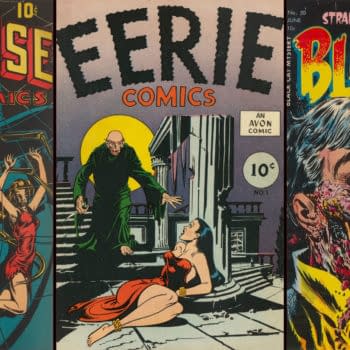
Eerie Comics – no.1 (one-shot)
This is one of the few examples in my "Terrible 25" that sports a cover for its restraint rather than showing it all. To further this effect, the overall colors have been muted and drained to a grayish-purple leaving what little color there is to go right to the two main characters; a burst of red on the bound girl and a bright yellow moon to frame the vampire.
Considered to be the first "horror comic" by many collectors, Eerie 1 was published a few years before the horror boom was in full swing and thus seems to have a different "feel" compared to the rest of the covers on this list.
#16
Weird Mysteries – no.4
This is also designated a classic cover by many. That said, I think it's often overshadowed by the wildness and fame of the title's next issue (Weird Mysteries 5). The fact that it is one of the scarcest books in the run doesn't help it's visibility to collectors either.
Animal/human hybrids are cool but insect/human hybrids might be even cooler. The dagger's overlapping handle onto the title logo is clever. My favorite part is the way the skull is drawn. So often the linework is lost in these covers due to the added color. It's refreshng to see a lighter area where all the delicate linework is preserved.
I think Bernard Baily was incredible and I assure you this is not the last of his covers to appear in this list!
#15
Chamber Of Chills – no.23
Who doesn't like maggots with their kisses? Well, apparently, this lady! I believe this is a Lee Elias cover and I love his horror work. The colors on this are especially neat. All the blues and purples work well against that deep red backdrop.
For me, a comic cover's appeal is not just in the drawing (although that is one of the things I look for in a great cover) but it's also about all of those other elements that make a comic's cover truly spectacular. Here are the qualities I looked into for each of the covers on this list:
-Concept
-Design
-Drawing
-Color
All of the books in the Terrible 25 are excellent in all of these categories. Of course they are! Otherwise they wouldn't be on the list!
#14
Fantastic Fears – no.6
Ok, I figure this one has got to surprise a few folks. This is indeed one of my favorites! I friggin LOVE this book!
One read through this comic was enough to sell me on Ajax-Farrell. There is something raw and crazy about the way these Iger shop stories came out. They are really really entertaining! Superior, Ajax-Farrell and Comic Media all feature these twisted tales.
Okay, back to old hippo teeth here! Not only is this one freaky looking dude, but the childlike way he holds the characters like cutout dolls sends this into another area of bizarre. This is made even weirder by that wild pink background. I love contrasts and this cover has plenty!
#13
Adventures Into The Unknown – no.1
Like Eerie #1, this cover's strength lies in its restraint in not showing too much. It's all about the anticipation and most importantly, the mood!
It is appropriate that the first issue of the first continuing horror comic series features two charactcers (America's readers?) at the doorstep of a haunted house, hesitant to enter. Ok, I'm totally reading into it, but this is still a classic cover.
#12
Mister Mystery – no.12
Ok, now things heat up. Literally!
This is a tough book to find in any grade. Whenever I see one for sale, it never lasts long. What can be said about this cover that hasn't already been said? Well, one thing I've noticed is that among these 25 covers, Mister Mystery 12 seems to have that winning combination that Horrific 3 has. A very simple idea, shown with extreme clarity. There is nothing subtle about this cover and it's boldness is what makes it rock. The harsh black background makes the white hot poker visually pop. Among a lineup, this book demands you look at it. It is that strong of a design.
#11
Mister Mystery – no.11
Bernard Baily sure knew how to draw a cover!
One of my favorite themes is animals getting the better of man. This scene evokes many of the same attitudes common in monster and B movie flicks of this era Those ants are way out of scale huh? It must be that toxic waste they ate before attacking this poor man.
Another thing worth noting is the recurring host of this title, Mr. Mystery himself. Often seen holding a cigarette, dressed up like some magician, and making wise cracks, he is my favorite PreCode host outside of EC's 3 famous narrators.
#10
Out Of The Shadows – no.8
Alright! Down to my personal top ten!
I spent a decade putting together the EC run of books. During that time, I talked to a dealer at a show about them. When I asked him about the other horror publishers of the 50's (which I was unaware of at the time) he said most of them were EC knock-offs but a few were really interesting and unique. He then showed me a copy of this book. I remember being impressed and it definitely left an impression on me.
All of the fine drawing details here really sells the scene. The guy boiling heads is like no other I have seen on a Pre-Code cover. The texture and bold colors on the cauldron froth are very cool too. All in all, I think this is one amazing cover…and it REAKS of horror!!
#9
Weird Chills – no.2
Every time I give this cover a long good look, I get the creeping willies! What the heck is going on with this poor guy and these little creatures? The more I think on it, this might be a more gruesome "injury to eye" cover than MM 12 and The Thing 7. To me this is what a real horror comic should do, make you squirm in your seat, overwhelled with discomfort!
You know what makes this even worse? This looks like someone I knew back in art school and they were a really nice person. Oh the horror!
#8
Black Cat – no.50
This is probably where people might get concerned that this book didn't crack the top 5. For the record, I love this cover. I'm a huge fan, but I think there is another one in a similar style from the same publisher, that surpasses it. For shock value alone, this book could easily crack the top five. Without a doubt, this book is one of the most "visible" to comc collectors outside of the world of PreCodes. A melting face, disolving into garish colors of green, purple, blue…. The scene is truly horrifying, like something out of a nightmare.
#7
Weird Mysteries – no.5
You knew this list wasn't complete without this one right?
Here we go with another heavy hitter! Even though this scene is disgusting, it appears to of been drawn with care. The rendering of the face, brain and the stipple-like hatching on the inside of the head, Bernard Baily gave this drawing a lot of love!
It seems to be an ongoing debate whether this is a human or a primate. I think it is the "cut-off" nose that makes it look possibly like a gorilla? Who knows? I bet the publisher and artist would think it was crazy that we are actually giving it this much thought. Whatever is going on here, this is one of the best (and expensive ) Precodes out there!
#6
Weird Tales Of The Future – no.7
My favorite Bernard Baily cover. Completely insane. All the creeps showed up for this one, and just look where they are walking out from! I grew up at the New Jersey shore in the 80's and 90's. This cover harkens back images of vintage funhouse signs, many with clowns, all along the boardwalk during the summers…. What a visual feast that was.
There is also an amazing sense of depth here which I find rare in comic covers….The foreground monsters parade back to the devil, then your eye goes to the excellently-rendered mountainside, finally stopping on the lake of fire with smoldering clouds on the far horizon.
#5
Haunt Of Fear – no.17
I don't care that the masthead and three narrators are covering part of the picture, this is a beautiful cover. Drawn by the original master of macabre, Graham Ingels! "Ghastly" Ingels is probably my favorite comic artist (At least he is my favorite "horror" comic artist). Here we have three zombies about to get close to you and say hi! I love the head tilts of the two background fiends and the excellent colors in their rotten faces.
I think Bernie Wrightson said it best that you could "smell" an Ingels drawing. Just by looking at it, you could smell the decaying flesh.
#4
Venus – no.19
This is probably the most romantic of the "Terrible 25". Bill Everett could sling ink with the best of them and no one doubts his place in the beginnings of comic history. I enjoy his early work in the thirties and fourties, but it is his 1950's work that interests me the most. My opinion is that he spent a decade or so honing his skills during the birth of the comic book medium. By 1950, it seems he settled into a nice mature style. The height of his drawing talents are on display here with Venus #19. The variety of textures and ink markings is masterful. This is sometimes tough to see on these darker, heavily-colored Atlas covers, but it's all there. This man was a master comic artist who could draw with the lights out!
The main couple is obviously the focus but my favorite part has got to be the trio in the background. I can almost hear them snickering wicked remarks in that splintered house.
#3
Horrific – no.1
I thought this one might be one of the shockers of the bunch. Yes, Horrific #1 gets third place and here's why I think so……
The first time I saw this cover, it blew me away and still continues to impress me. It is just one of those covers you look at and then try to forget but you find it creeping back into your thoughts. And we all know how a collector thinks…obsessively!
Even though we have the undead playing a band, it somehow is done without comedy. The expression of the conductor with its loose linework is truly creepy. On top of all of this you have a beautifully drawn female dancer performing on a bed of fire. The red and purple lettering against the green background is perfect.
There is also something else going on that isn't easy to describe…. The best way to put it is that this cover has an "indie" look to it, yet still retains a professional edge….not super slick, not primitive, but just right! The fact that it is a number one issue of a great title and pretty rare to find makes this already appealing cover a shining star to me.
#2
Tomb Of Terror – no.15
I love this cover so much, it took me over a year to find the right copy because I wanted one that was perfect for my collecting preferences. As PreCodes go, this is a pretty accessible book, probably due to the Harvey file copies that emerged years ago. It also has a bit of visibility and fame to it, often appearing in articles (and even a film) about this era of comics. If this book has gotten praise, I say it deserves every bit of it and more. It is a PreCode Horror masterpiece.
Lee Elias often worked with art director/artist Warren Kremer, collaborating on cover ideas. Whoever did what here doesn't matter, what matters is the timelessness this artwork creates.
Some of my favorite Tomb Of Terror 15 things include:
-The way the man's face is drawn. SO brutal, fluid and loose are the inkmarks and line quality. It jumps off the page!
-I think some of these comic artists would of been excellent animators. This drawing has so much power and life to it.
-I know about the interior story and that this is suppossed to be a robot, but collecting is what you make of it, and I say this cover can stand alone as a clock exploding in a man's face.
-Red is the color that evokes the most emotion and it is used liberally here.
-I don't know what else to say other than, exceptionally brilliant! I knew this was going to end up in my top 2 early on.
#1
Startling Terror – no.11
Could a list of the top 25 PreCode Horror covers, not include one from the cover master, L.B. Cole? Of course not.
After reviewing all of Cole's covers, I found this one to be the best by far. So much so that the other ones didn't even make the top 25. If the list went to say 50, I'm sure there would be a few more additions. Again, I don't consider Mask 1 & 2 "horror" comics so they are exempt from this, but even if they were included, I would put this one ahead of them for it's frightening originality. I know Cole recycled this idea from his earlier design of a Suspense Comics cover, but Startling Terror 11 is superior in many ways. The fact alone that he revisited the design, proves that he felt it was a great idea that could of been executed better.
Here is why it grabbed the number 1 spot:
-A giant spider with many sharp legs against a solid blood-red background.
-Oh yeah, because a giant spider isn't disgusting enough, the head of it is a grinning skull.
-And yeah, we've got Blood dripping from it's open mouth. Lovely.
-In it's grasp is a pin-up styled woman making this notable to GGA comic collectors as well.
-I don't think there is any question that the guy on the left is dead. The side of his face has a sickly greenish tinge to it. Perhaps the spider's poison has already spread through the skin… Ok, maybe I'm reading into things again, but it doesn't mean this cover is not a champion.
The best PreCode Horror cover.


