Posted in: Comics | Tagged: , ,


Review: Higher Earth #4

Review: Higher Earth #4Mark Robert Bourne writes for Bleeding Cool;

Credits:
Sam Humphries – Writer
Francesco Biagini – Artist
Andrew Crossley – Colorist
Ed Dukeshire – Letters
Dafna Pleban – Editor
Frazer Irving – Covers
Phil Noto
Michael Golden
Garry Brown
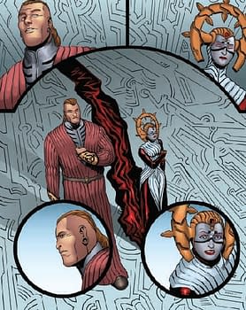
Review: Higher Earth #4To me, Higher Earth, published by Boom Studios, is a fusion of ideas used in many Sci-Fi based European graphic novels such as The Incal, Metabarons and in films like Twelve Monkeys and the Fifth Element; subject matters that have been treaded upon before. Those unfamiliar with the European graphic novels probably won't see the connections and those who do, like myself, are faintly reminded of the stirring and stylish Incal and/or Metabarons. Higher Earth's narrative constitutes bits and pieces from many recognizable sources and that's not totally a bad thing.

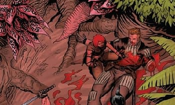
In issue #4 of Higher Earth, we find wounded hero Rex bleeding to death and the erratic Heidi ready to bail on the whole misadventure to live on this pre-historic alternate version of Earth. Much is explained about who they are and what's really been going on in these Multi-Universes. We know there are multiple "Rex's" and there are multiple "Heidi's" and that something is amiss in the Universe.

The dialogue and story by Humphries is laced with the spirit of the films/graphic novels mentioned above and is not at all amateur. Though, as a reader, I found the twists and turns easily guessed way before the turn.

Artist Francesco Biagini is pretty good in this issue and I believe he's on the verge of finding his footing. Previous issues I felt there was some storytelling problems and some direction choices that didn't quite work. Many times in the previous chapters, the angles and/or direction used, interrupted the flow of the story and pulled me out of the adventure. Similarly with backgrounds Biagini tends to rely on the colorist. The areas are filled with color instead of sets and in panels where they do exist, they are especially minimal.
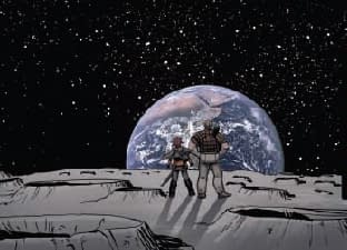
Review: Higher Earth #4Colorist Andrew Crossley's work, though, is bright and vivid. Had it been my choice, I would have rather seen a greater difference in the color scheme on each world. There was a slight difference but flipping thru the pages and looking at the coloring, it is all just a blob of intense pigmentation. The scheme on the pre-historic planet is too close to that of the high-tech center of the universe and I would have rather seen some diversity.

Seeing as I have a pretty good idea of where this is all going, I am hoping to see some sort of surprise twist to continue keeping things interesting. Higher Earth covers a lot of familiar territory but is an enjoyable journey so far.


Enjoyed this? Please share on social media!

Stay up-to-date and support the site by following Bleeding Cool on Google News today!

Rich JohnstonAbout Rich Johnston

Founder of Bleeding Cool. The longest-serving digital news reporter in the world, since 1992. Author of The Flying Friar, Holed Up, The Avengefuls, Doctor Who: Room With A Deja Vu, The Many Murders Of Miss Cranbourne, Chase Variant. Lives in South-West London, works from Blacks on Dean Street, shops at Piranha Comics. Father of two. Political cartoonist.
twitterfacebookinstagramwebsite
Comments will load 20 seconds after page. Click here to load them now.