Posted in: Games, Paradox Interactive, Vampire: The Masquerade, Vampire: The Masquerade - Bloodlines 2, Video Games, World Of Darkness | Tagged: the chinese room
Vampire: The Masquerade – Bloodlines 2 Drops Two June Dev Diaries
Paradox Interactive provided pair of developer diaries for Vampire: The Masquerade – Bloodlines 2 during the month of June.
Article Summary
- June brings two dev diaries for Bloodlines 2, revealing game art and design insights.
- Concept art showcases bonsai-inspired brass sculptures with neo-noir Seattle settings.
- Narrative design dives deep into ambient sounds, NPC dialogue, and world-building.
- Pioneer Square and Financial District get distinctive visual identities to set them apart.
June has been a busy month for everyone, and in the middle of all the announcements, Vampire: The Masquerade – Bloodlines 2 received two different dev diaries. Paradox Interactive and developer The Chinese Room provided a couple of updates this month, with various project leads contributing their thoughts. There is nothing about gameplay reveals or new clan additions, but there is still some significant content if you've been waiting on this game forever as we have. Dev Diary 13 covered a few topics, such as concept art, level design, lighting, sound, and the narrative for the game. While Dev Diary 14 went over famous landmarks in this version of Seattle, fictional districts, more about design and programming, and production. We have snippets from both, which you can check out at the links provided.

Vampire: The Masquerade – Bloodlines 2 Concept Art
Like every location, Weaver Tower needed some unique features. We wanted to have something both mysterious, yet ancient feeling. Naturally, the real world provides the best inspiration, and the meticulous care and time it takes for bonsai trees to develop is where we gravitated towards. However, we also wanted it to feel different. So by juxtaposing the organic form of the tree, we designed it to be made of thousands of brass wires seemingly erupting from a Smokey quartz. All of which was achieved in Unreal Engine 5 to really get an established idea of how these statues fit in the space and create the most impact for players.
Narrative
It is simply a tad too early to reveal what I'm working on right this minute, but I figured perhaps you'd enjoy hearing about how we as Writers create Ambience in games. Something perhaps players don't think of much (means we did our job right!), but that is still a big part of the overall experience. "Ambients" are the sounds you hear in the game outside of roleplay conversations; this can range from short lines you might hear from a passing NPC to situation-specific enemy dialogue. They're a vital part of developing the game's soundscape to help it feel like a fully fleshed-out world.
It's a process that involves close communication between Level Design and Narrative Design. Getting the ambients right requires understanding every fight, every location, every NPC, and writing unique dialogue to fit. How many enemies are there in this fight? Do they all appear at once or do they come in waves? Why is that NPC here? If you lurk before approaching, can you learn their motivation? Does eavesdropping on them give you a hint for where to go next? What can you learn about the wider world by listening to them? Ambients are a perfect opportunity for world building, we give each NPC their own personality and a brief look into their life, no matter how minor a part they play. So while it's fun for the player to get a glimpse into their world, ambients really reinforce just that: this is their world. So Phyre (and by extension, the player) is just a small part of it.
Pioneer Square Concepts
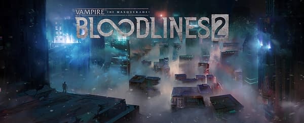
In these concepts we were exploring the look and feel of the Pioneer Square section of the city. We were tasked with making sure this area of the city feels cold, atmospheric and is bathed in neon light. One of the main focuses of our art direction is making sure we're always leaning into this neo-noir look for our world, a high contrast visual identity that is brooding and moody. Additionally, we were tasked with putting together several shopfront ideas that could appear throughout this area of the city.
Financial District Concepts
Like above, we were also briefed with exploring the look of the financial area of our city. With this we wanted to go in a very different direction, leaning heavily on a more cyan colour palette with high, glass front buildings. We wanted to make sure every area of Seattle feels distinct and instantly recognizable.


