Posted in: Comics, Digital | Tagged: cerebus, Comics, dave sim
Cleaning Up Cerebus – Dave Sim Looks At Volume One Again
NOTE ON THE 16TH PRINTING OF
CEREBUS VOLUME ONE
This printing marks the first time that I've directed fundamental corrections and restorations to be made in the original material since first producing it more than thirty years ago, a choice precipitated by George Gatsis making me aware of flaws which resulted from the conversion of the original photographic negatives to digital files several years ago (itself made necessary by the worldwide computer revolution which eliminated the possibility of continuing to print the trade paperbacks via the traditional negative/metal plate web offset printing form).
I have been advocating for some time that publishers of classic comic strips should be updating each successive printing of their collections with high quality scans from original artwork which has surfaced in the interim and came to the conclusion that I needed to "practice what I preached".
[I had tended not to because, frankly, I didn't think my earliest artwork on Cerebus warranted it. I was an enthusiastic amateur or — at best — a semi-professional and find it very hard to look at the work at all closely. So, I've pretty much just approved each successive printing after no more diligent checking than to make sure all the pages are in the right order.]
George Gatsis developed the CEREBUS PAGES IN THE WILD program (TheCerebusArtCollection.com) to try to track down as many original pages as still exist and which we could gain access to. A complete list of the original pages incorporated into the 16th printing appears on http://
Depending on the page, the reproduction has been modified digitally to provide for greater or lesser contrast and brightness. Page 541 is a good example of lesser contrast where the original brush strokes in the areas of solid black are now visible while leaving the black solid enough to keep the effect from distracting the casual reader. Light shadings of the original pencil — never properly erased, a recurrent flaw of mine — on Sump Thing's features are likewise retained. It's much closer in appearance to the original artwork, in other words.
Partway between greater and lesser contrast, we have the background greys on pages 527, 529 and 530 which were produced by means of "spatter" — loading up a toothbrush with india ink and flick flick flicking it over the surface after masking off all the areas that needed to remain white — the "poor man's airbrush". Just looking at the exponentially higher reproduction which has resulted from the digital scanners ability to "see" and translate these effects into 0's and 1's and to retain them with 100% accuracy in the printing stage as compared with the same effect on the surrounding contemporaneous pages derived from the original photographic negatives…well, it gives you a good idea of why we hope that more artwork still exists from that issue and can be located at some point.
All of the digital scanning from original source materials for the volume was performed by Alana Wilson at 1200 dpi or higher under George Gatsis direction and then George himself "tweaked" each digital file for the greatest possible coherence, to make sure all detail was brought out as clearly as possible. A copy was then printed out for me of the digital files so that I could offer further guidance where a page, in my view, had gone too dark or too light.
Some limited restoration has also been performed by George. Limited in the sense that none of the actual drawings have been in any way modified but purely mechanical flaws have been corrected. As an example, where holes or breaks have occurred in the 30% mechanical tone that was used on Cerebus, and where the break doesn't appear overtop of an actual ink line (which would necessitate recreating a 1981 ink line in 2012), neighbouring 30% dots have been digitally cloned and imported to the area in question under high-powered magnification so they could be matched up seamlessly.
Panel and caption borders which had broken up or faded have, likewise, been restored by digitally "cloning" the lines that remain and grafting them directly onto the empty areas. This has been avoided with the word balloons which are not composed of straight lines and which I, therefore, consider part of the artwork which can't be successfully restored because I don't draw them that way anymore. 2012 Dave Sim can't "do" 1981 Dave Sim or "correct" 1981 Dave Sim without superseding him, so 2012 Dave Sim is keeping his pen and ink to himself.
The Cerebus logo on page one was imported and reversed to white from a period logo rather than trying to restore the second generation photographic negative shot from an already degraded photostat.
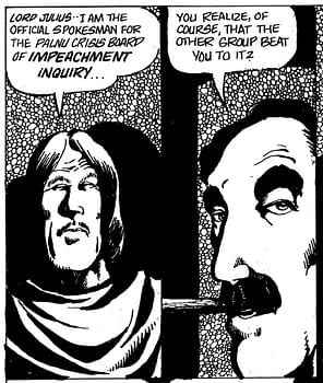
The only other form of restoration which I have authorized (and which, arguably, can be considered "borderline" defacement) is the restoration of the original lettering where that has faded by "cloning" adjacent letters and substituting them for their missing counterparts. It's at least "borderline" defacement because the "D" that you see is not the specific "D" that I put in place thirty-five years ago. However, weighing in the balance the resulting improved coherence and readability, I tend to think that there is great validity in the "trade-off". The lettering on page 206, as an example, has been a thorn in my side since issue 9 first came in with the page in this same degraded form — and which turned out to be a flaw in the negative itself, a fact which I didn't discover until after I had already sold the original page. The white gaps in the patterned ink hatching in the background of each panel might be the next thing "fixed" in the 17th printing but I haven't decided if it would constitute a lesser or greater form of borderline defacement if the few areas that have reproduced well are cloned and "wallpapered" or if I did fill in the blanks by hand (the pattern is pretty basic and can't be done in a substantially different way even by Old Geezer Dave). Or, with any luck, that page will come IN FROM THE WILD before the 17th printing becomes necessary.
Many thanks to George and Alana for their tireless work on this volume. If you own any of the original pages from the first 25 issues which don't appear on George's list, please see his specifications which follow the list and, if it all possible, help us to "swap out" one more second generation copy for a first generation one.


