Posted in: Comics, IDW, Review | Tagged: action, assassinistas, black crown, comedy, Gilbert Hernandez, idw publishing, Rob Davis, robin henley, Tini Howard
Assassinistas #3 Review: Clunky Plotting and Subpar Artwork Snuffing Out Good Ideas
Roz has trouble keeping up with the kid, and Octavia, Dominic, and Taylor struggle through a forest full of Roz's deathtraps just to survive the night. Dominic is forced to shoot someone, and Octavia and Taylor help him through it.

Above all else, Assassinistas #3 is quirky. It has one dangerous assassin in charge of a toddler over which she is ill-equipped to watch, and it has another assassin on a family mission with her son and his boyfriend. It has its funny moments, and the core story is interesting. A trio of friends who drifted apart due to life and circumstance, and they're being reunited under strenuous circumstances. That's not a new idea, but, with the conceit of contract assassins, it could still feel fresh.
Unfortunately, Assassinistas #3 doesn't quite get the idea to click. The art is a prime perpetrator in that failure, but we'll loop back to that.
The prominence of flashbacks that have little bearing on the story happening in the present trips up the story a lot. There is one revelation towards the end that ties back into the present scenario, but the rest comes off as filler. This really hurts the present-based narrative, as it doesn't advance very far in this issue as a result.
The fact that everyone comes off as short and ill-tempered with one another doesn't help sell the comic either.
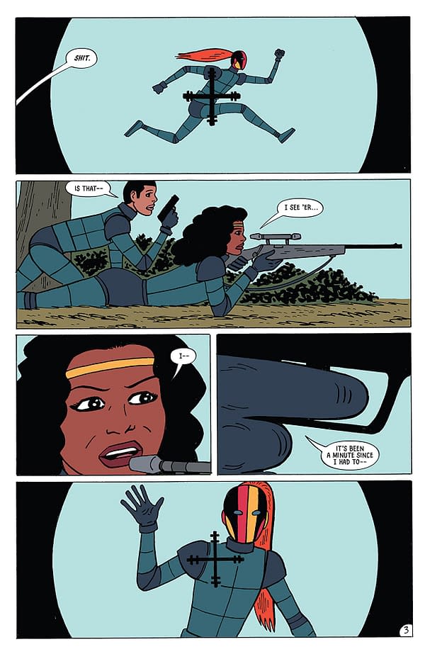
The art is the biggest killer though. I do my best to be kind to art and understand that not every style appeals to everyone. However, the art in this one is not good. There's no depth of field, the detailing is minimal, and there's nothing visually interesting. This kills the action scenes, as they're made uninteresting. The lack of color gradience and shading worsens the problem. Every part of an object is the same tone and has the same amount of shadow.
Assassinistas #3 has some interesting ideas at its core, but the clunky storytelling weighed down by superfluous flashbacks and the unforgivable state of the artwork kills any appeal it could have. I can't recommend this one. Give it a pass.


