Posted in: Comics | Tagged: avengers
How Did The Avengers Logo Get An Arrow In It?
Legendary Avengers comics writer Roy Thomas is giving us two-for-one today. Here's his recollection as to how the Avengers logo that we know and love – and has been permanently scarred into the collective unconcious thanks to the movies – came out. As sent to Bleeding Cool via Roy Thomas' manager John Cimino.
If I recall a-right, sometime around 1969 Stan had a house letterer design the new MIGHTY AVENGERS logo that curved in from both sides.
I never liked it, and soon found an excuse to revert to the old logo, designed (like the original FF one) by Sol Brodsky, which I considered to be lackluster but at least serviceable.
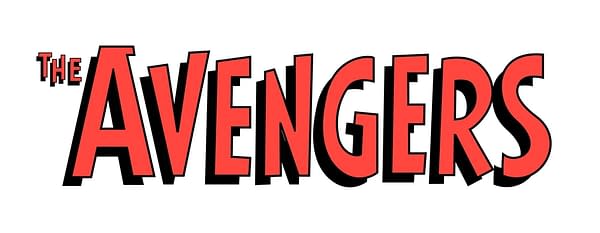
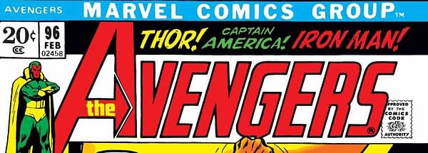
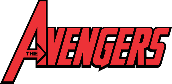
He came up with the new logo with the arrow in the "A," which I got Stan to okay, and some version of it has often been used since.
Somewhere along the line, it became the basis of the movie series' logo, probably because it was the only AVENGERS logo with any real character. Which makes sense, since the late Gaspar Saladino was very MUCH a character.


