Posted in: Comics | Tagged: comedy, francesca spallato, HRL, indie Comics, michael edwards, pulp affliction, seth levens, superhero
Indie Comic Spotlight: Pulp Affliction Is Absolutely Hilarious
Orson is just a regular guy trying to meet a girl for a blind date at a protest rally over an endangered species of termites. You know, as you do. As such, this protest is organized out in a forest in the middle of nowhere to obstruct a logging operation.
Unfortunately, Orson is led into a trap by angry miners, beaten, and strapped to a log sent downriver to send a message to the real protesters. Believe it or not, his day only gets worse — and weirder — from there.
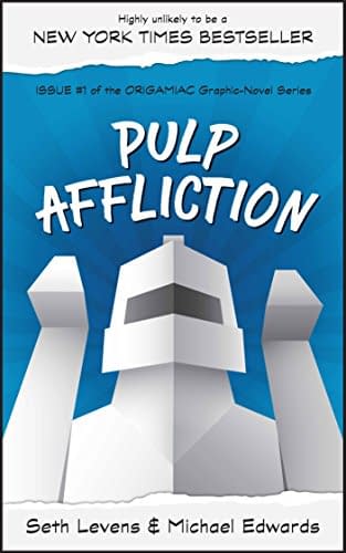
Pulp Affliction, written by Seth Levins and drawn by Michael Edwards, is a subversive and satirical story about contemporary society, superhero narratives, and life in general.
And it's frigging hilarious.
I've not laughed this hard reading a comic in some time, and I just reviewed Invader Zim the other day.
The dialogue in Pulp Affliction is sharp as a whip and wonderfully subtle. It's quite good at being unexpected in its humor, such as when the probable future villain of the story turns out to be the most morally conscious character right before firing every employee named Brian to make himself feel better.
That probable villain, Dr. Seethesome, is easily my favorite character of the story. He's just evil. He enjoys being evil. He's so evil his name is Seethesome and his hair is done up in devil horns. Why not? He's also hilarious and oddly charismatic. His assistant, Regina Unsavoury, is great in her own right and deserves way more respect from Dr. Seethesome.
The story does drag in the back half when Orson is, um — delivered — to his friend Peaks, who is the idiot stoner friend who would definitely be played by Seth Rogen in the film adaptation. The pacing comes grinding to a halt as Orson quite slowly gets his friend to understand what is going on. In fairness, I would have a hard time grasping the predicament as well, but very few would take as long to process it as Peaks. The humor gets a little weak in this section as well; a lot of the jokes become "because Peaks is stupid."

The art is a bit spottier than the story. While there are some great visual design choices, like the aforementioned Dr. Seetheseome and Orson's appearance in the last section of the book, the overall art is fairly rough. It is a very cartoonish styling, not too far removed from Groo the Wanderer. However, it doesn't keep the consistent visual quality of Groo and books like that. Coloring would also help out the book, especially given its upbeat and comical tone. There is nothing wrong with the overall aesthetic; it just needs some upgrading.
There is also the issue of lettering. Lettering is one of those things where if it is working as intended, you barely notice it. When it goes wrong, you definitely notice it. The predominant issue with Pulp Affliction's lettering is its tendency to throw dense, panel-covering text boxes at you. It gets to feel a bit dense and comes off as one of those imposing, multi-page paragraphs from a text novel. It's not a shattering issue, but it is distracting without a doubt.
Pulp Affliction is a joyous and comical ride through the worst day in the life of a guy named Orson. It keeps a good pace for the most part, the tone is handled astonishingly well (with a lot of the black humor, it's hard to manage tone), and there is a lot of potential in the art style. I definitely recommend it, and you should always support the indies.
If this has sold you on the book, it is available for purchase on Amazon at this link.


