About
About 


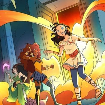
If you see Supergirl at AMC IMAX the weekend of release, you'll get the comic it was based on, by Tom King, Bilquis Evely and Mat Lopes, for free
Posted in: Comics | Tagged: A Clash of Kings, game of thrones, george r r martin
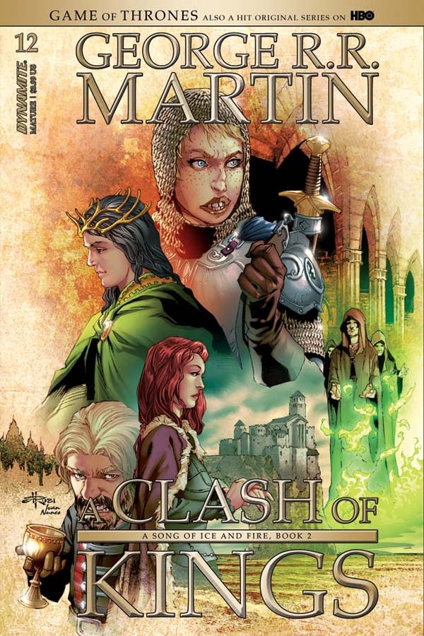
Landry Walker's Writer's Commentary on A Clash of Kings #12 from Dynamite
Landry 'White' Walker's writer's commentary on A Clash of Kings #12, from Dynamite, part of their A Song of Fire and Ice comic book adaptation.
PAGE 1:
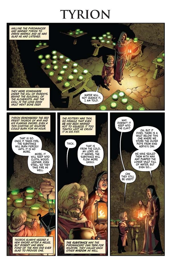
So here we are, taking a look at issue 12 of Clash of Kings. I wish we had an establishing shot here. But sometimes, particularly with an adaptation like this, you have to rely on the words. That's not my nature. I like to let the images do the talking wherever possible. Pretty sure Will Eisner covered that in Sequential Storytelling. Go read that. He knew his stuff.
PAGE 2:
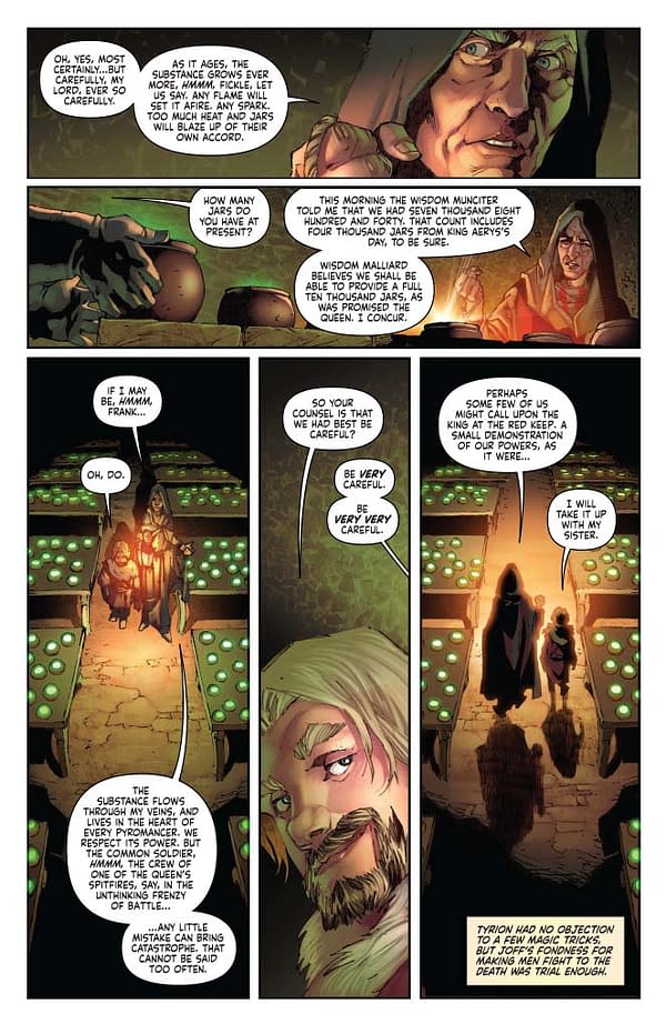
Mel Rubi framed the bottom half of this page well. I give heavy notes for layout, but there's a lot of times that Mel ignores me — and that's a good thing. The artist is always the front line of the story. As the writer, you can make all the plans you want. But in practice, you have to adapt. Point is, Mel saw an opportunity to frame the scene well with a shot that has the two characters walking away from the reader. That helps us know that the scene is closing.
PAGE 3:
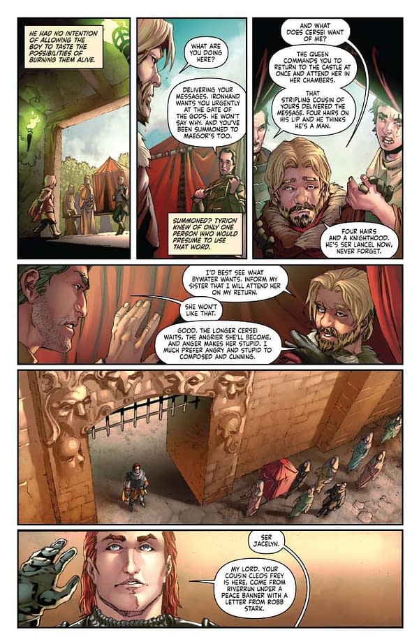
More compromise. The rule of thumb is to end and begin scene transitions on page breaks. But there are so many scene transitions and only so many pages! We should have done a full bleed on panel 5, that would have spread out the sense of time. Then we could have dropped panel 6 into an inset in the bottom, right? Second guessing is easy. Once the work is done, you can drive yourself mad looking at it and seeing ways you could have done things differently. It's important to do that so that you learn. It's also important to shrug your shoulders and move on with your life. Every page is a learning experience.
PAGE 4:
It broke my heart into tiny pieces to edit the Ser Cleos bits down. Mel did a great job showing the pain on Cleo's face on panel 5. Unfortunately, we had no room for the text that explains how desperate Cleos is to see the release of his own family, captured by the Starks. We also lost the opportunity to show that Tyrion feels legitimately sympathetic to Cleos, even as he prepares to use the situation to his advantage.
Goddamn George R.R. Martin for writing such nuanced characters. Cackling villains translate easier to the comic page.
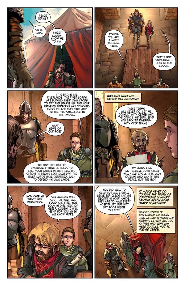
PAGES 5–8:
Anyone who has read these little behind-the-scenes babbling of mine knows that I am obsessed with the relationship between Cersei and Tyrion. Cersei really thinks Tyrion is wretched and evil. That's important. I mean, we know that her perspective is warped, but it's still the perspective she has.
So here she is furious, filled with honest rage to protect her daughter. And she can't. And she can't even take it out on Tyrion. And so she actually breaks down, which hurts Tyrion more than he would have ever expected. That expression on Tyrion's face in panel 4 is perfect. And the lines under Cersei's eyes on panel 5 show how honest her own misery is. Art leads the writing. Read page 8 without the words. It's easy to parse. And that's important.
Everyone is moving. That's how things are in the real world in a real conversation. I took drama courses when I was young. Your character in play is never just sitting woodenly, only coming to life when called upon. Motion is constant, even in tiny ways. Even if it's just a wrinkle of the brow or a protective arm drawn inward.
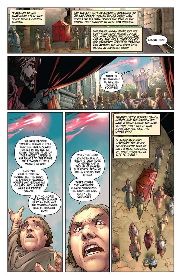
PAGE 10:
Let's take a moment and reflect on the lettering here. This is just bonkers. And note that this is a shorter than average page because of the need to add the chapter title at the top. Our letterer Simon deserves all the praise in the world here. A book like this could feel overwhelming, but instead it's smooth. I don't know how. Some writers call out balloon placement. Largely, I do not. Only once in a blue moon do I have that kind of audacity. Simon doesn't need me to tell him what to do – I'd just get in his way.
PAGE 11:
Flashback! Change the panel style. Change the coloring style. Hell, I wish we could go a bit further with it. You need to know without relying on comic-booky call-outs that we're looking backwards.
PAGE 12:
Hard to believe these trees and the ground and all of it are digital. This book is basically painted. Looks like watercolors.
PAGE 13:
Sometimes you have to give up real estate for impact. Wish we could have done a double page spread here. The insets at the bottom… remember earlier when I talked about using a full bleed and treating panels as insets. See how much more expansive it makes the shot? And how much it focuses on those speaking in the inset panels?
PAGE 14-15:
I enjoyed planning this one. I wanted it to look like the branching horns of the stag. Mel fashioned something less literal that captures the essence of what we needed perfectly. We have a ton of story and action here and just this two-page spread, and it had to be dynamic and bold. I'm really happy with the way Mel pulled it off.
Also, as my editors often point out, you have to keep the important art out of that thin line in the center on these spreads. The gutter in the middle becomes lost in larger collected volumes.
PAGE 16:
I love Brienne. Look how happy she is in the last panel. I know she's supposed to be ugly, but her happiness makes her beautiful.
PAGE 17:
A dense page. And we absolutely had to have a silent beat at the end with Renly and Margaery walking off into the background. They had to leave together. Renly has to exude confidence and power. He's a genuine contender for the crown, even if Catelyn sees boys pretending to be men.
Make room for those big moments. This is one of them. Can't do this book without them.
PAGE 21:
I played with lots of different closing scenes. In the end, the stag banner was the only thing that made sense. Renly and Stannis, at odds with each other.
Enjoyed this? Please share on social media!
Stay up-to-date and support the site by following Bleeding Cool on Google News today!