Posted in: Comics, Dynamite | Tagged: a song of fore and ice, Clash of Kings, Comics, coronavirus, coronavirus comics, covid-19, game of thrones, landry walker
Landry Walker's Writer's Commentary on A Clash Of Kings #3
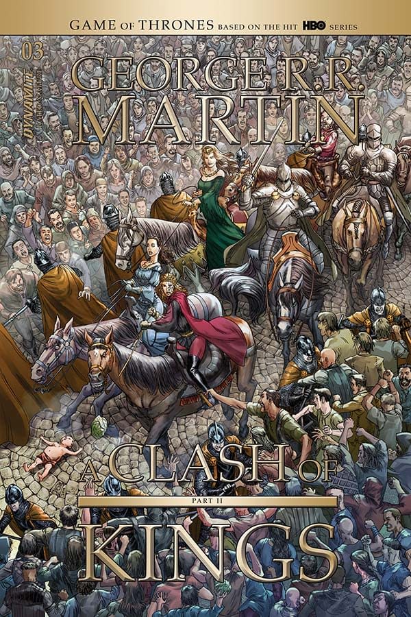
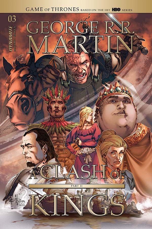
Landry Walker offers up a Writer's Commentary on the latest Game Of Thrones comic book from Dynamite Entertainment, A Clash Of Kings #3. It came out on March 25th just before the shutdown hammer came crashing down He writes;
Hi people! Things are crazy right now. I hope everyone reading this is well and safe and not completely burdened with dread. Things will be hard, but things will be better. So… let's dig into another look at how I butchered GRRM's deft writing.
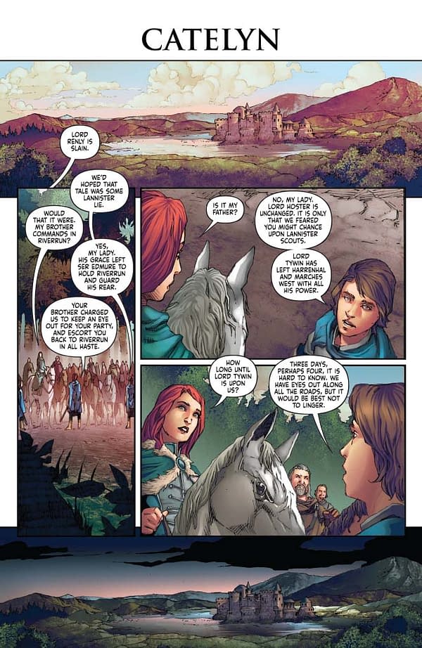
PAGE 1:
"Lord Renly is slain" – I should have directed this as a caption. Weird to have it as a bubble. That's on me. Why, you ask? Because it's weird to have a wide-open establishing shot with an balloon tail pointing off panel towards other panels. Bad structure. My fault – I fall upon this sword gladly.
I continue to use the open and close with the same shot but different times of days trick. Alan Moore once said that if you identify a trick you reuse in writing you should burn it and break it and never use it. But we also have an absurd amount of scene transitions in this series. And it's always better if they open and close on a page so that when you flip the page the illusion of the passage of time works to further transport you.
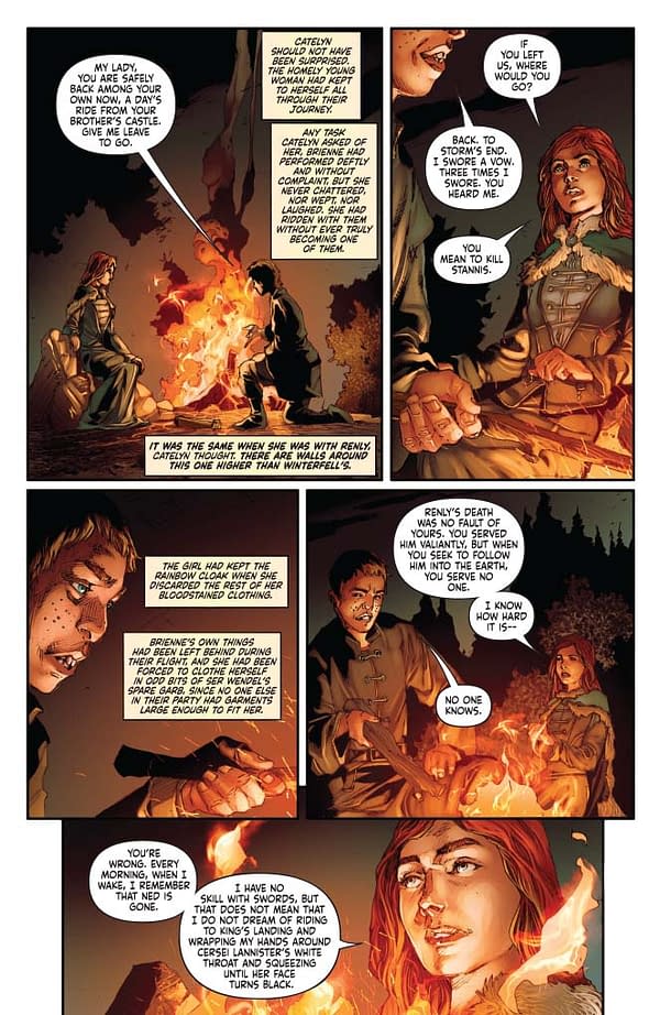
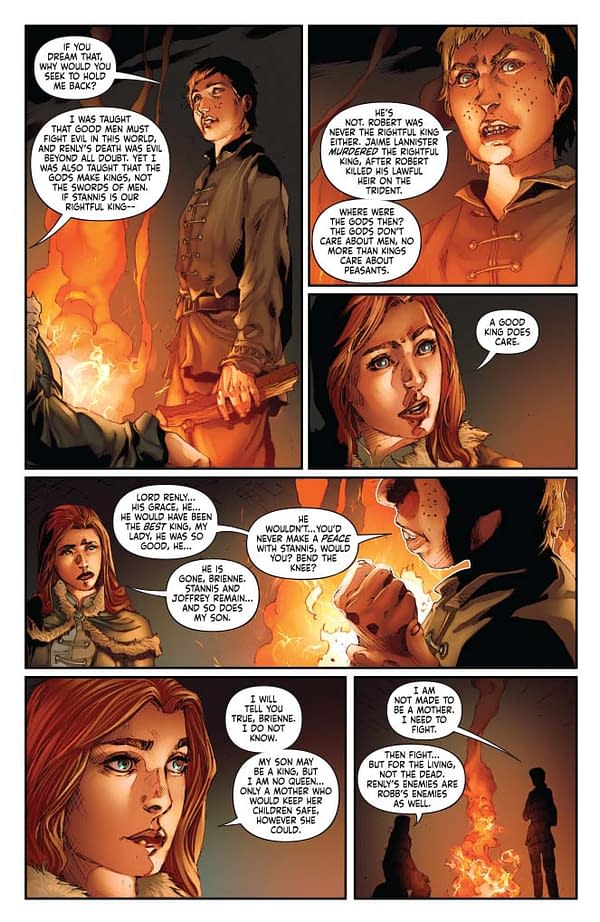
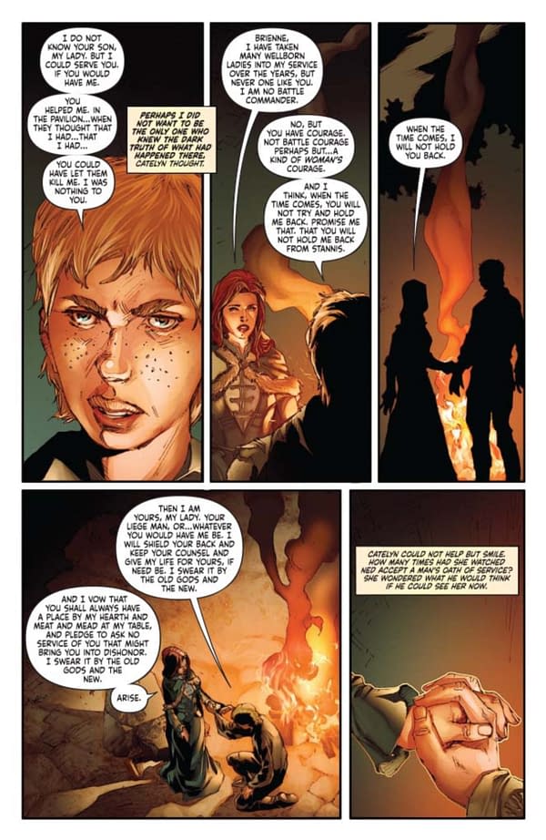
PAGE 2, 3, 4:
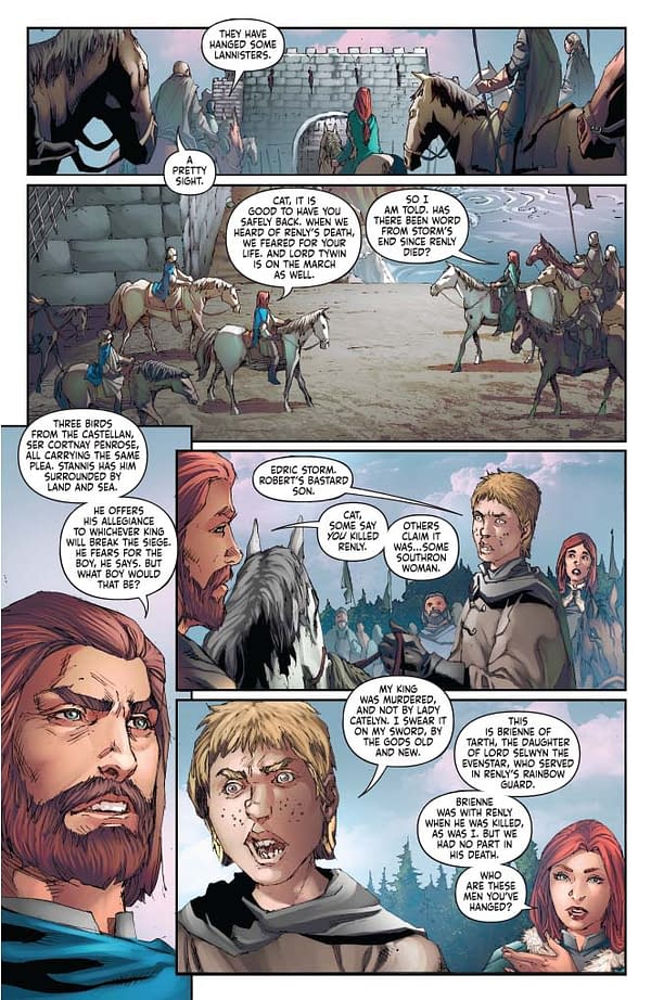
I love the way Mel draws Brienne of Tarth. Pretty much exactly as I originally envisioned her when reading the book.
PAGE 5:
Suddenly it's day. The colors here are perfect. Light and airy and bright, conveying security and optimism.
PAGE 6 – 10:
Taking this color note a step further: Notice it gets gloomier the further we go, finally ending on a skull. Crafting a comic is an exercise in storytelling. Not writing, but storytelling. People tend to think writers type words and artists draw lines and colorists paint colors and so on. Not really. Storytelling is about how a story makes you feel, even if you aren't aware of it. Creating claustrophobic panels and a sense of dread. Or open sunny images with bright optimism. Whatever you want to convey requires a different approach.
PAGE 11:
We should have run that last panel with a border. Perfect opportunity for a full bleed wasted. Again, that's on me.
PAGE 12:
I don't think the crazy lady with the dead baby looks detached from reality enough. She should be somewhere else, mentally.
PAGE 14:
I knew we needed a montage of sorts here. When working in a visual medium you have to sometimes shut up and let the pictures do the talking. I'm very happy with this page, though we lost the Lannister banner in the last panel at some point for some reason. That's too bad.
PAGE 15:
We cheat on this page! There's dialog on it that GRRM didn't write! Find it and message me and win nothing, save my adulation.
Gotta hand it to Mel Rubi… he had to get Tyrion off that horse, across the yard, and slapping Joffrey. And he made it WORK. A lot of this book is figuring out staging for characters that have a ludicrous amount of movement for a normal comic.
PAGE 17:
Joffrey is such a kid. Look at him in panel 4. Yes, he's a monster. But in fairness he's also a horribly raised and misguided child placed in an absurd position of power. The kid breaks through from time to time, and that's important. A monster who's never human is a cartoon.
And hey, see that last panel. Full bleed. Isn't' that nice. See why I'm mad I failed to suggest it on that earlier page?
That's all I got this issue. Again, take care of yourselves out there. I have to get back to typing. I'm in the middle of a crunch deadline for my new, original graphic novel with First Second – an all-ages superhero story called The Infinite Adventures of Supernova. Watch for it!
