About
About 
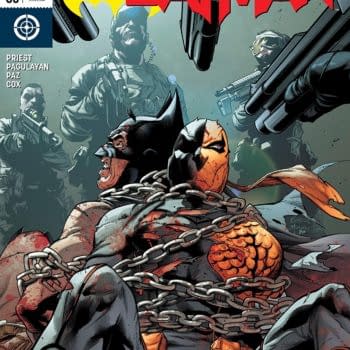
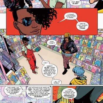
Iceman and Bishop team up to investigate a new attempted mutant massacre of the Morlocks in the tunnels under New York. Is it a good read?
Posted in: Archie, Comics, Review | Tagged: archie, archie comics, betty, frank tieri, horror, joe eisma, jughead, jughead: the hunger, Matt Herms, Pat Kennedy, Tim Kennedy
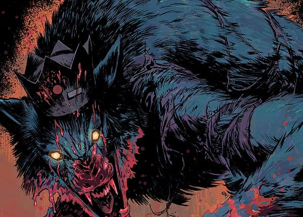
Jughead the Hunger #4 Review: Romeo and Juliet with a Woman Scorned Angle– also Werewolves
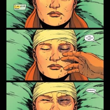
Elena Cooper is the spotlight of this issue of Jughead: The Hunger, as we learn about the conflict between her family and the lycanthropic Jones Family, and we learn of her personal complicated relationship with a member of the Jones Family.
So, Archie Comics are one of those things that have mostly passed me by. I'm aware of the general conceit and premise, though I've learned that the continuity is far more complicated and serious than I would have thought. I like horror and horror-adjacent things generally, so I decided to ease myself into this whole Archie thing with Jughead: The Hunger #4. Once more, take this as a disclaimer. I'm no Archie aficionado.
Knowing what I know about modern Archie comics, I should have predicted it would be something like this. It's a Capulets and Montagues situation but with werewolves and werewolf hunters, Jughead's Joneses and Betty's Coopers respectively.
That's silly, but it's not unforgiveable. Unfortunately, it doesn't get much better from there.
You see, and spoilers are incoming, Elena was also in love with another Jones in her youth. This is already a lot to swallow, considering this "feud" seems to be active and frequent bloodshed between the two families. Plus, she still kills her werewolf boyfriend, not because the Jones killed her grandfather minutes prior but because he refused to run off with her. Yay, another woman scorned character has been achieved. We totally don't have a deluge of those already.
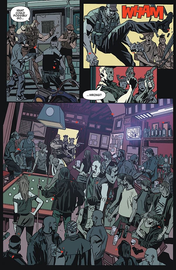
The artwork by Pat and Tim Kennedy as well as Joe Eisma holds together well throughout. Their styles are complimentary, though some scenes in the first half, done by the Kennedy's, look weird odd because of some body distortion. There is a Cooper who leads the family into a barroom slaughter whose arms look so much more massive than his body. Overall, both halves of the art look gritty and grim enough for the story. Matt Herms' color art is also quite atmospheric and dim too.
If this is your kind of trash, I can completely understand why. However, it just came off as equal parts silly and melodramatic while I was reading it. I personally can't recommend it. Give it a pass.
Enjoyed this? Please share on social media!
Stay up-to-date and support the site by following Bleeding Cool on Google News today!