Posted in: Comics | Tagged: ales kot, Comics, dynamite, entertainment, james bond, Luca Casalanguida
Writer's Commentary – Aleš Kot on James Bond: The Body #1
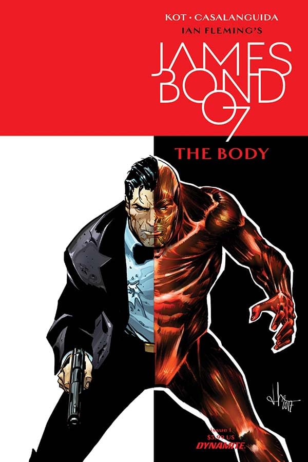
Dynamite has sent us a new writer's commentary featuring Aleš Kot talking about James Bond: The Body #1, with cover and interiors by Luca Casalanguida.
As Bond undergoes a post-mission medical examination, he relays the story of his previous mission to the examiner. Each cut, bruise, and broken bone connected to a specific event of the mission. A connection is made between two people with different purposes: one to save lives, the other to take them.
From writer Aleš Kot (Secret Avengers, Zero) comes a James Bond story that explores the secret agent in ways that we have yet to experience!
The commentary:
Page 1:
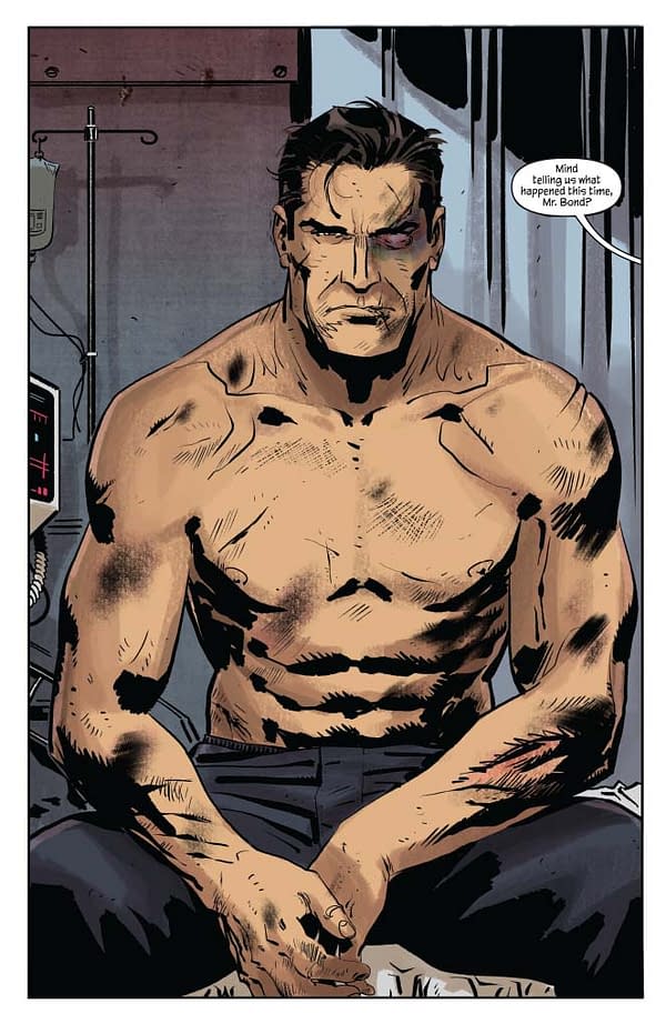
I love the Goran Parlov vibe this page gives off. It's not something I referenced directly, but I adore his work on Punisher and Fury, and I practically shivered when I saw this in my inbox. It's a Luca page, but it carries traces of this very specific lineage — and I didn't expect that at all. Bond here feels the way Fleming's Bond feels — he's not a happy man, he's someone who is broken inside and goes on breaking things and people. And here, we see how sometimes, things and people break him, too.
Pages 2-3:
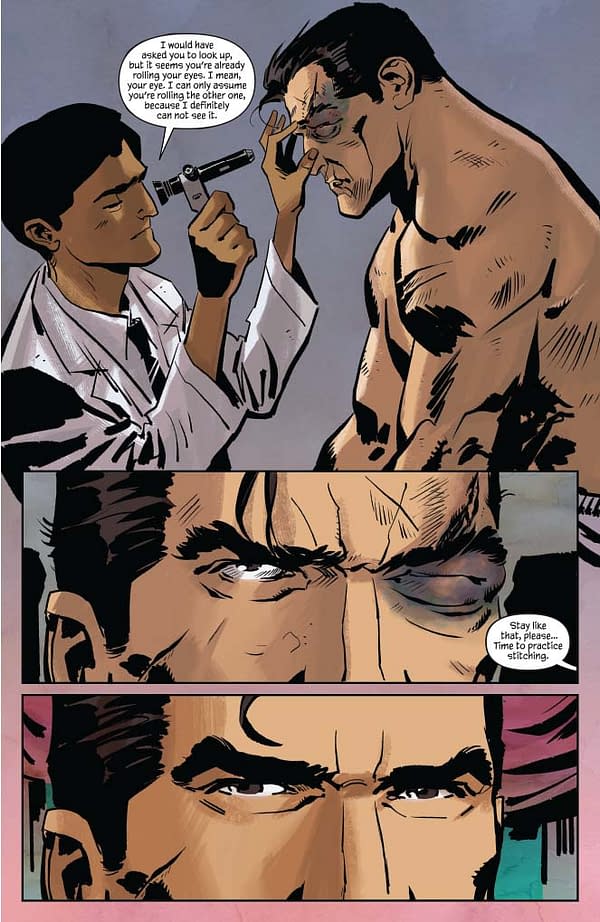
I think the original vibe in the dialogue was a bit more homoerotic, but sometimes you gotta pick your battles. I think I still managed to get the overall vibe across pretty well in the rest of the chapter. I also love Valentina's colors here, especially when it comes to Bond's swollen eye. Those are some very pretty ugly colors.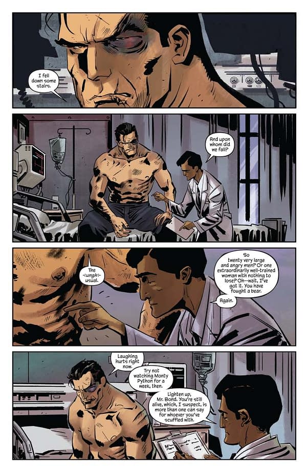
Page 4:
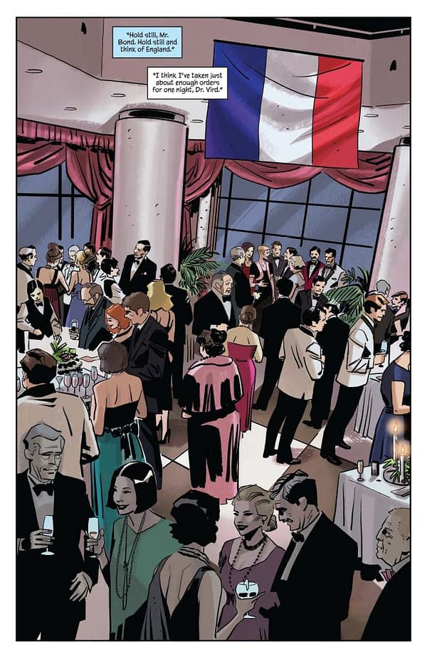
Oh yeah, the vibe stayed all right. I forgot about that first sentence.
Page 5:
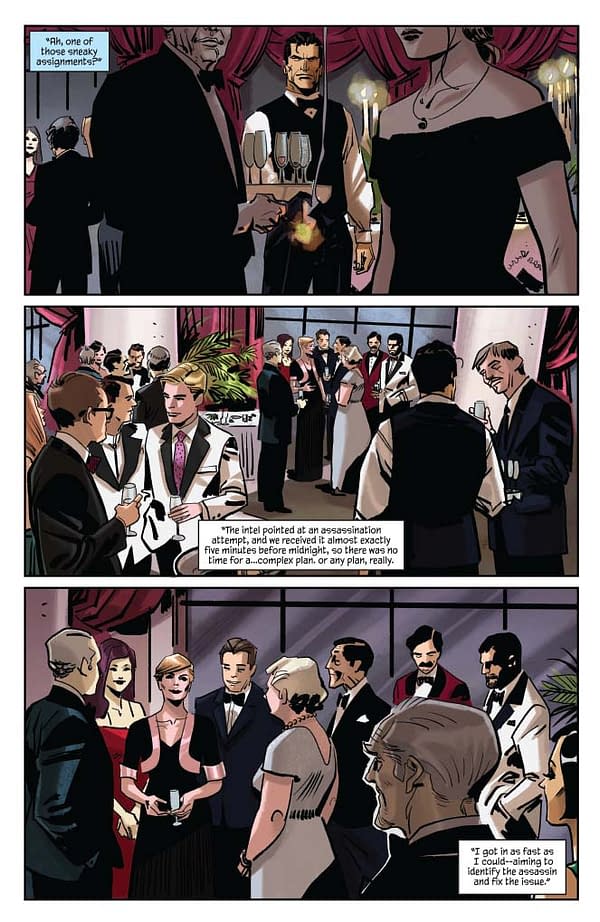
I don't remember how exactly I came up with the idea for this chapter, but I remember I wanted something propulsive. I wanted a ticking clock — throw you straight into the experience, tell you you're already running out of time. I didn't want to overcomplicate, though I did want to surprise. But most of all…I wanted to have fun, and dressing Bond as a waiter was a good opportunity for some of that. I waited tables for a while, a long time ago. It's a miserable job, but it's also pretty darkly comical.
Page 6:
Speaking of darkly comical — this page contains the first reference to Party Down. Last panel.
Page 7:
Here's another one, but I went a bit out of character for that character. Felt like a good place to show how sh*t people can be even when they seem perfectly nice at first. Not nuclear physics, really.
Page 8:
Could have gone 9-panel grid here, I figure, but it would have thrown off the dynamism of the rest of the script, and I would have had to figure out how and when to employ other 9-panel grid pages, and that would mean the other pages might have to change too because the dynamism of it all has to be unified. Which is probably why I chose to go with a six-panel grid, and keep the entire script, generally speaking, within the usual 1-6 panels per page tempo.
Pages 9-10:
Narration adds density. Always important. Also important: knowing when to shut up and let the images breathe. Clearly, this is not where I'm employing that lesson, but I kept it in balance.
Page 11:
The removed rib thing is most definitely a Marilyn Manson reference, specifically a reference to the urban myth — taken very seriously for a while — that he had some of his ribs removed in order to be able to perform self-fellatio.
Pages 12-18:
I really like how we paced this sequence. It's raw and clear. And it carries a sadness which really fully hits, at least for me, with the last page. Originally we had a much longer letter there, but it wasn't right. I don't think it's right to simplify horrifying conflicts and the ways they are waged by making people two-dimensional. I also don't think that's the right approach to violence. Unless we're talking about, let's say, playing Redneck Rampage, because Redneck Rampage is awesome. Can someone get on that and please redo it for PS4?
Page 19:
The opioid crisis is a worldwide problem.
Page 20:
Ayyyyyyy kinkyyyyyyy! And what a perfect mirror to the opening page. The repression! Anyway, what was I saying? Oh, yeah. Kinkyyyyyy!


