Posted in: Comics, Review | Tagged: adventure time, alex ross, star wars, sweet tooth, x-men legacy
Cammy's Covers – From Adventure Time to X-Men: Legacy
Cameron Hatheway writes for Bleeding Cool

With the launch of a new series, who better to illustrate your cover than Alex Ross? Now while it seems Ross is already illustrating every other cover for every other series nowadays, it's the epicness of a franchise like Star Wars that really has him bringing his A-game. You can tell just by looking at this cover that he put some blood, sweat, and tears into it, getting the reader all excited because this is Star Wars, the thing of our childhoods. Love it or hate it, I dare you to admit you didn't get a tad-bit pumped when you saw this cover, thinking of all that potential. Great illustration, and every child should have this poster hanging on their bedroom walls. The Force is strong with Ross.

As most of you know, I'm sometimes a fan of covers that are a little bit artistically different (in a beautiful way). Take this interpretation of Adventure Time by the talented Kevin Wada; gorgeous, isn't it? The tattooed Marceline is my favorite, but both ladies look nothing like their cartoon selves which makes it that much more awesome as they fly on the back of Lady Rainicorn, hair endlessly flowing in the wind. Although the facial expressions on Finn & Jake remind me more of Shaggy & Scooby, this cover is definitely a bizarre masterpiece, one I would love to own as a print.

With the final issue of this amazing series, I can't help but give Jeff Lemire props for his tip of the hat to the very first issue. I'm a fan of harkening back to the beginning, because while it's only been four years, it definitely feels like a lifetime. Gus looks old and decrepit, with wrinkles covering every inch of his skin; nothing like the Gus we first saw eating a candy bar back in 2009 with bits of chocolate smeared on his face. The leaves were much greener back then as well, but alas, age catches up to everyone and everything. This is a very nice cover to end with. Thanks for the memories, Lemire.

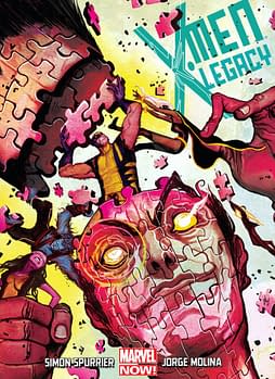
This is my favorite cover of the week, hands down. It's not just the radical puzzle design that swept me off my feet, but also the exotic blend of colors. The pinks and yellows really play well together, with a little electric blue thrown in for good measure. I know putting a puzzle together can sometimes feel maddening, but it appears Wolverine is taking it rather personally. No Logan, you can't just cram the pieces together to make it fit! Silly Canadian. The menacing eyes amidst the chaos are the cherry on top, for there's a lot to take in and enjoy with this cover. Bravo, Mike del Mundo, for your cover has officially intrigued me to buy and read this comic.
Cameron Hatheway is the host of Cammy's Comic Corner, an audio podcast. You can send him your modeling portfolio if you want to be considered for his NERD OF THE DAY 2014 Calendar on Twitter @CamComicCorner.


