Posted in: Comics, Image | Tagged: detective, Dry County, image comics, noir, period piece, rich tommaso
Dry County #2 Review: A Dull Detective Story with
Lou thinks things are moving forward with Janet when she mysteriously disappears, and her apartment is trashed. Lou assumes her ex-boyfriend is responsible, and Lou and Rob begin searching South Florida for her whereabouts.
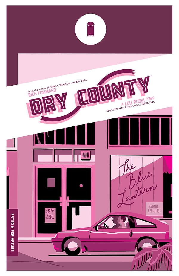
Dry County wants to be a pseudo-noir mystery comic about a comic strip writer searching for his potential girlfriend over whom he's completely enamored. The comic itself is a rather dull detective story with a quirky amateur-investigator protagonist and an unabsorbing mystery.
The comic should work better than it does. It centers around a surprisingly grounded mystery, the protagonist acts like the lead of Sunset Boulevard even though the world looks more like Hotline Miami with significantly less bloodshed.
However, I found myself completely uninterested in the proceedings. Lou is all quirk with no real personality. The text walls become tedious very quickly. The mystery is quite simple when you get down to it, and, even then, the comic spends its entire runtime running down a red herring lead that never succeeds in engaging me.
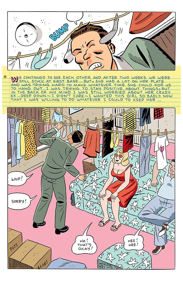
I know art is subjective, and I usually try to level my criticisms of the art at how well the aesthetic fits the tone of the comic or functional failures of the comic. However, the art of Dry County really turned me off. It's opting for the style of an older newspaper cartoon strip. While such stylings may work for a short sequence in the Sunday paper where space and simplicity are primary concerns, this aesthetic doesn't work when stretched out to a full comic. It's visually uninteresting and looks undercooked. The color art is vibrant and almost salvages the visuals, but the overall look misses the mark.
Dry County, for its narrative creativity and occasionally entertaining dialogue, failed to engage me on nearly every level. The pacing is slow, the text is overwhelming, and the artwork isn't visually grabbing. I don't like thoroughly taking a comic to task like this, but it really didn't work for me at all. Give it a


