Posted in: Recent Updates, Review | Tagged: military, Review
Review: America's Army #1
It's not often that the production staff of a comic book features the likes of Major Mike Marty and Colonel Casey Wardinski. But then not every comic book is based on the US Army's army-simulation computer games aimed at recruiting America's next generation of soldiers.

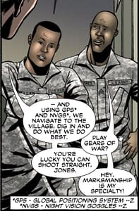
It feels incredinly asinine, sterile full of cardboard characters than anything approaching a real human being. Realism is reduced to incidental language, the right equipment, the right vehicles, the right acronyms. And that's tyhe part we're meant to praise, the aspect that received most attention in the production process, whereas the complecities of the human condition got lost. And, yes, not only is this a US Army produced comic, but it's one based on their computer game marketing promotion. Should I be expecting anything else?
There's one scene which feels like it should be taken as irony, given that the briefing on the enemy seems to have a good chunk describing much American policy over the last few years. I'd love to think that the despairing writer managed to slip it in as some kind of comment of the creative process he was engaged in, but, no I think we're meant to take it at face value. What do you think?
While the writing may repeatedly falter, the art steps up. While scenes of planning and strategy, set round hastily assembled tables may prove a drag, there are exceptions. One scene set around a dying witness uses clasped hands exceptionally well.
The scene approaching an enemy training camp looks like it was ripped straight from a Carlos Esquerra comic. And the use of silouhette, outline and negative space in the freefall drop splash page is perfect. There's lots of good use of Wally Wood composition, a strong sense of panel-to-panel storytelling and a clear sense of line and image. What story there is, is portrayed very well indeed.
But I guess most readers aren't looking for these things. They are looking at moral superiority in army actions, taking tough choices to ensure the best result, and use every acronym in their arsenal. But let's be honest. This is a fantasy, an idealised armed forces with just a little banter in attempt to define these soap opera caricatures and, frankly, GI Joe is a lot more realistic. And they use lasers.
On the upside, it's a professional looking comic that can pass the time in an adequate fashion, has some pretty pictures where the pixelisation and idiotic reader software doesn't get in the way and is, at least, free./ As long as you don't click on any of the 1-click Sign Me Up buttons…
America's Army #1 by M Zachary Sherman, Mike Penick and J Brown, free at http://www.americasarmy.com/graphicnovel/reader


