Posted in: Comics, Recent Updates | Tagged: art process, coloring, Gabriel Cassata, goners, image comics, inking, Jacob Semahn, Jorge Corona, lettering, Steve Wands
The Writing, Art, Inking, Coloring, And Lettering Collaboration Process With Image's Goners Creators
Jacob Semahn And Jorge Corona, writer and artist on the Image series Goners, as well as inker and letterer Steve Wands, and colorist Gabriel Cassata, have kindly offered to share their process work on the second issue of the comic, arriving this coming Wednesday, November 19th, in shops.
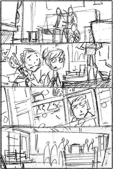
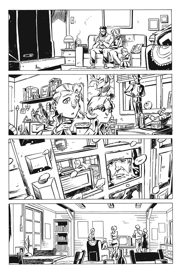
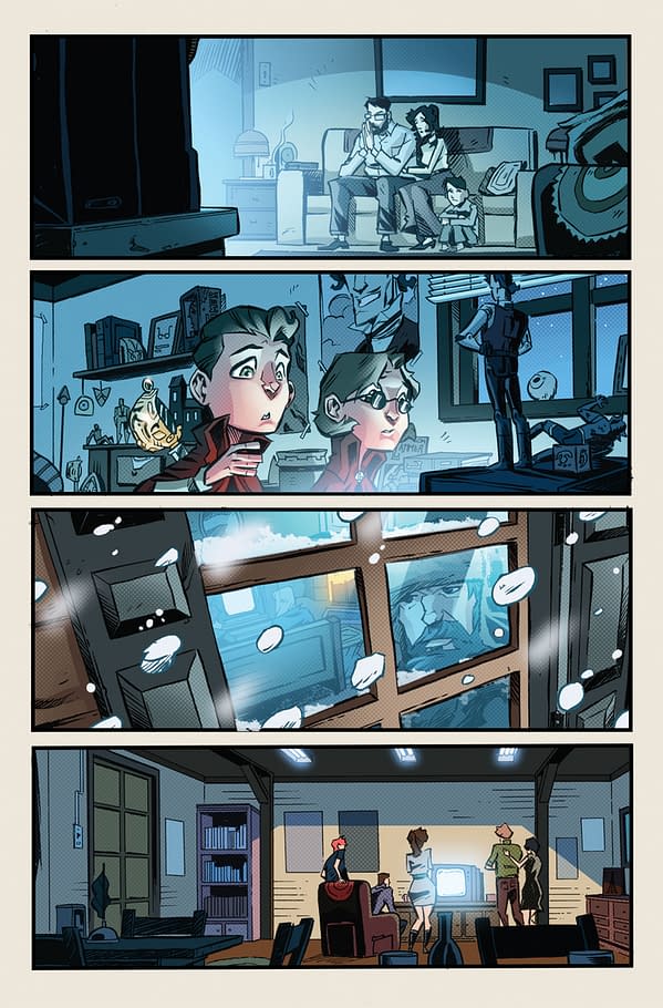
Page 3:
Writing and Art: The focus of this page was to establish the enormity of the situation at hand with the death of Raleigh and Evelyn Latimer. Like JFK or Princess Diana, it is a loss felt and followed by people around the world. And that's where Jorge centered his attention. Jorge's favorite panel in particular is the second one with the kids. Jacob wrote the panel description to show the reader how the Latimers were as much of a brand as they were a family. So Jorge went ahead and drew all the toys that he would have loved to have if he were a kid in this world.
Inking: Steve wanted to make sure he added enough depth by varying the line weight between foreground and background. The light sources were pretty evident so he knew where he wanted to use thin and thick strokes.
Coloring: The emotional core of this page was anxiety and despair as the world watched the brutal murder of their heroes on live TV, so Gabriel chose to bathe everything in cool tones to help heighten those beats.
Lettering: Steve's idea for this page was to have the reader zig-zag across the page, so if you go from one caption to the next you have to cross the scene. If Steve stacked them all on the left you could read them straight down and not even look at the art. To him, that would be a crime.
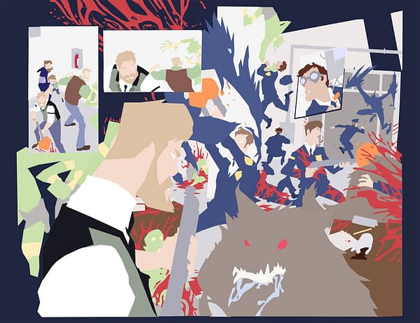
Pages 4-5:
Writing and Art: The big spread for this issue (if you don't count the cliffhanger ending). This page proved fun for Jorge… but it was also a nightmare to layout. There's a lot happening and the reader has to follow the carnage in the police station. Instead of pulling the reader out and establishing the shot from above, Jorge decided to place the reader in the middle of the action. Looking over the shoulder of Lyle as he tries to make sense out of this messy situation.
Inking: Line weights were key for this spread. There's so much going on that Steve wanted to make sure that everything separated and that Lyle and the Warg in the foreground stood out above it all, so they have an even thicker line weight. Steve also had a lot of fun adding dry brush to some of the monsters on this one.
Coloring: Here is the color process in action. Gabriel has two amazing flatters working with him on Goners: Virgil Noserale and his wonderful wife, Stephanie. They both do great work and keep him on schedule. Stephanie flatted this particular spread and you can see the journey from her raw flats to Gabriel's finished lighting and FX composite.
Lettering: Here Steve wanted to create an arc across the spread in which we follow the action and avoid obstructing it.
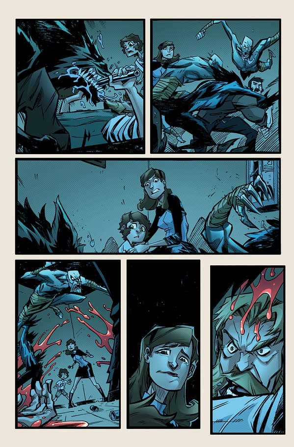
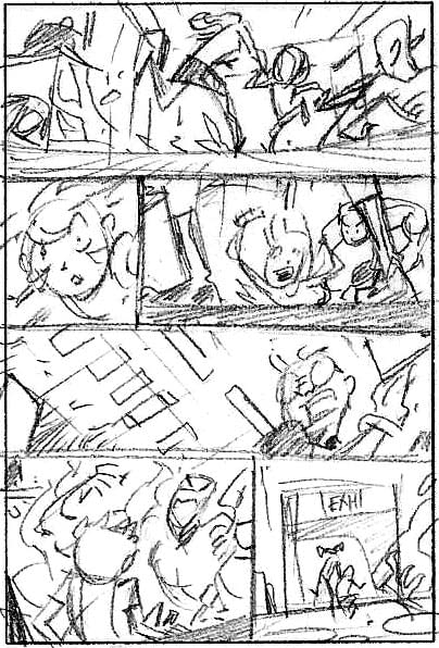
Page 6:
Writing and Art: Jorge turned the "camera" on our main characters. Bringing the overwhelming and dangerous situation to these two unprepared kids. Jacob's main idea was to show how the kids have to overcome their fears in order to make it out of this situation alive. It's a page where Jorge and Jacob establish a lot of action from Francis and Lyle, but added that moment between Josiah and Zoe where she tries to delicately comfort him before being cut off by Lyle screaming at them to run.
Inking: This is actually a special page for Steve as this was his "audition" page. Steve chose it because it had elements of both action and close up character moments, each of which show varying line weight and texture.
Coloring: Jacob really wanted this whole chase through the police station to be dark and moody. So the biggest challenge for Gabriel was to keep things dark and creepy but bright enough for the reader to see what is going on.
Lettering: There are some tight panels here and Steve wanted to stay off the art as much as possible.
Page 7:
Writing and Art: The action escalates as the kids have to make their way through the chaos and destruction on their own. Jacob sets up the stakes, as Zoe and Josiah not only have to survive the Terrors, but also the itchy trigger-fingers of the OWAT (Occult Weapons and Tactical) Officers. This page in particular is the darkest that Jorge had to illustrate for this issue, which helps set the mood that anything can be lurking in the shadows.
Inking: Any page that has Zoe and Josiah running through blood is good page. Steve recalls inking the blood and laughing at how much the flatters were going to hate it. "We're only at issue 2 and there's already so much blood."
Coloring: ON COME THE LIGHTS! Well, kinda… Gabriel now has a legitimate light source to work from for the rest of the issue. You'll begin to see how Gabriel employs his favorite cheat: Ambient-light-from-another-room. This can be seen through the rest of the issue and most of the series overall.
Lettering: The same can be said here and on panel five you can see that Steve wanted to maintain a color scheme for the Goners baddies, even when they're screams were treated more as a sound effect than a dialogue treatment.
And be sure to get more behind the scenes and updates on all things Goners!
Twitter:
Jacob Semahn – @SaxonJacob
Jorge Corona – @JeCorona
Steve Wands – @Swands
Gabriel Cassata – @GCassata
Facebook: www.Facebook.com/GonersComic


